BOX MAGENTA
Year: 2020
Category: Beauty subscription box
Illustrations and animations: Melt
Context
Box Magenta had been on the market for quite a while when its owners realized that it was time to rethink the company's strategy and visual identity.
What we did in this project
Brand strategy, visual identity and packaging (boxes)
Development
Before thinking about any visual elements, a few steps were taken back to define the company's positioning in the market, its promises and deliveries, brand personality, functional and emotional attributes, culture and values, purpose, DNA, and its brand manifesto.
At this moment, we defined the new positioning: “Monthly beauty products subscription box, filled with a selection of items that matches each subscriber’s profile. For women who want to be surprised, who want to know what’s new in the market and who want to have a delightful experience”.
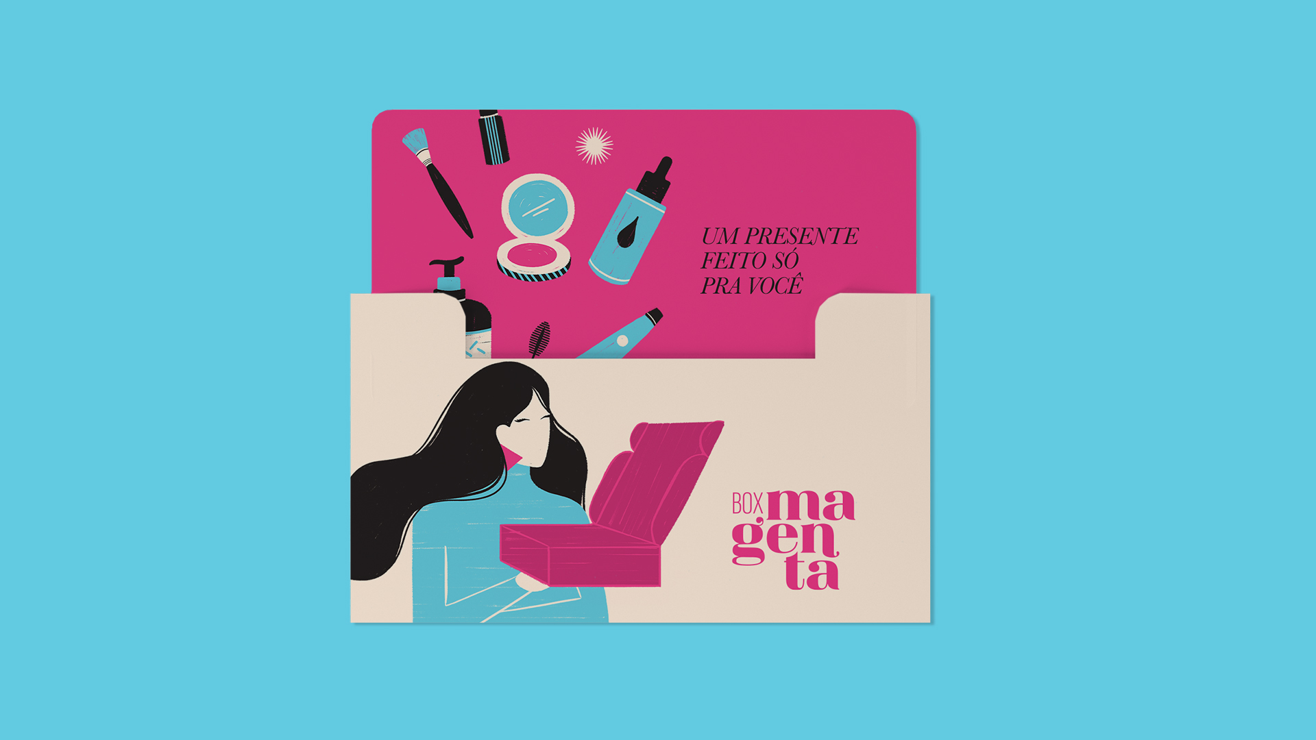
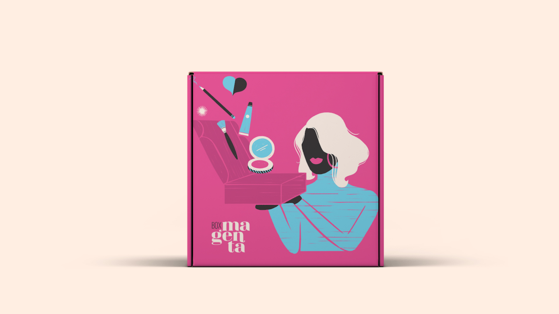
We understood that this new positioning could be further elaborated through graphic design. So we focused on the 100% female audience, on the beauty products and, of course, on the box itself, which is responsible for bringing delightful experiences to the homes of these women – every month, Box Magenta brings them a surprisingly good dose of self-care. The fluid lines in the illustrations connect with the consumers, while the bold colors allow a fun, young and inspiring visual identity..
