HOLY SOUP
Year: 2023
Category: Food
Context
The soups from Holy Soup do not contain glutamate, salt, additives, or gluten. The recipes have been very successful in online sales channels, and the company felt the need to update the packaging to keep up with the excellent reception from the public regarding the flavor of the product and how easy it is to prepare it.
What we did in this project
Brand strategy, visual elements and packaging design.
Development
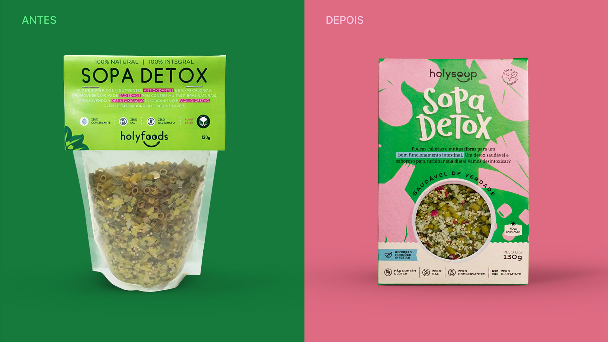
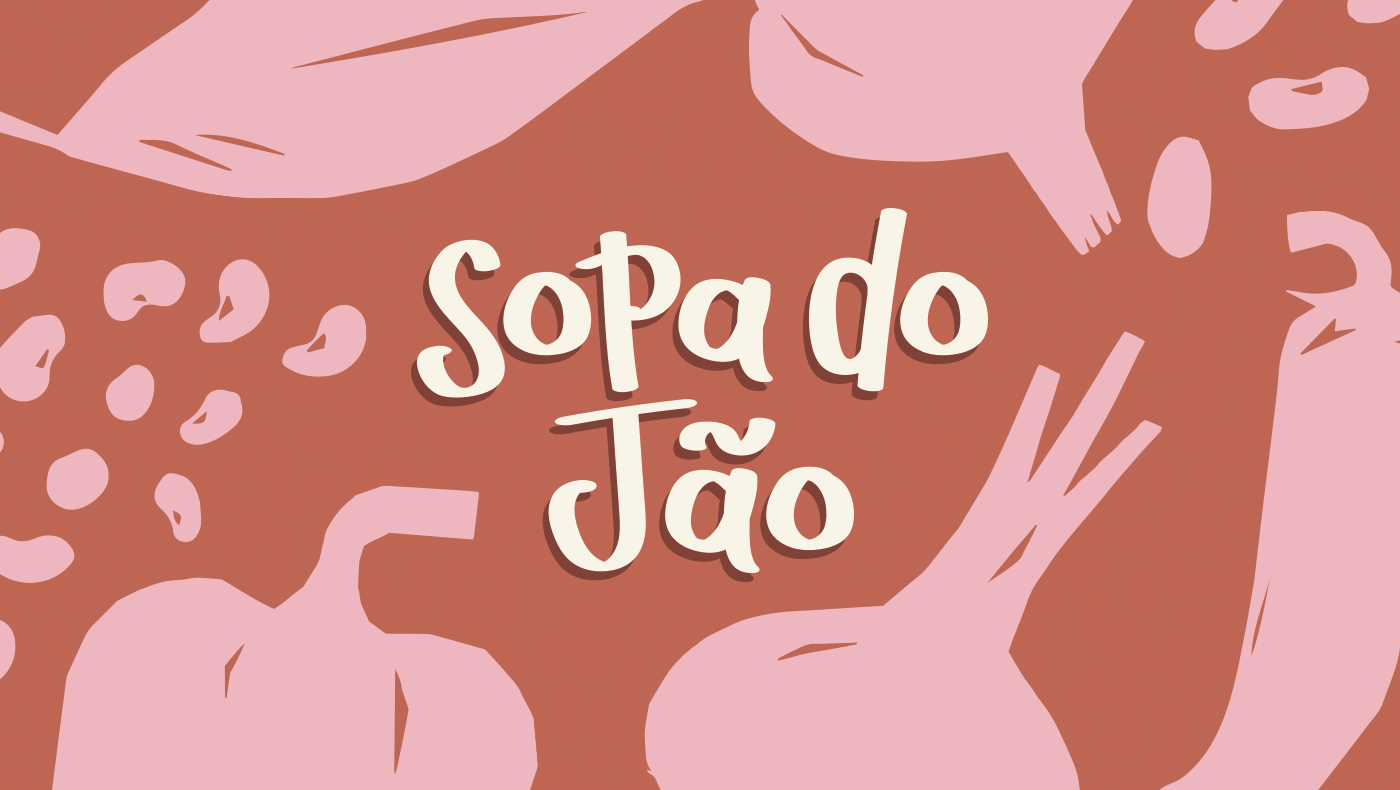
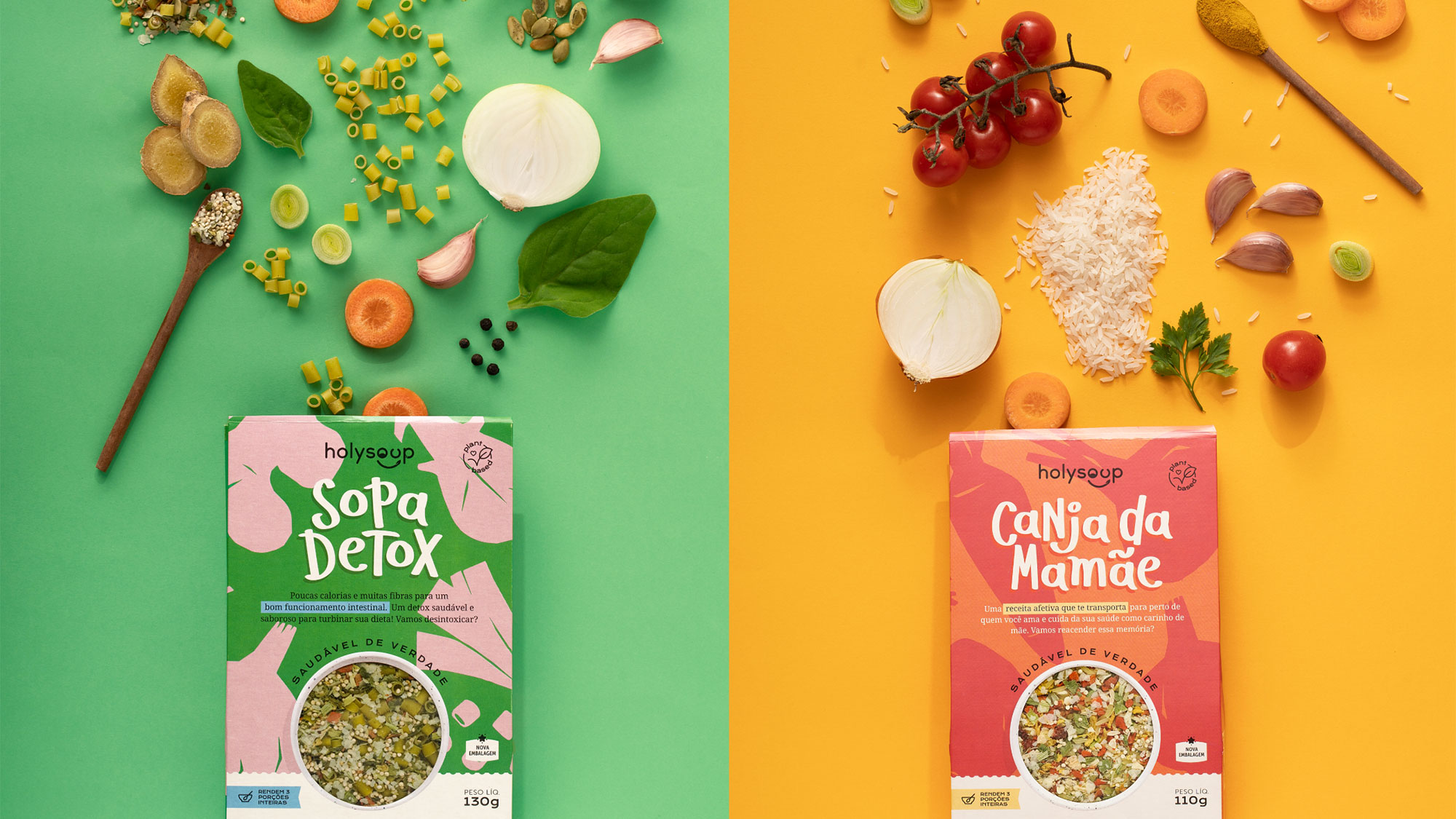
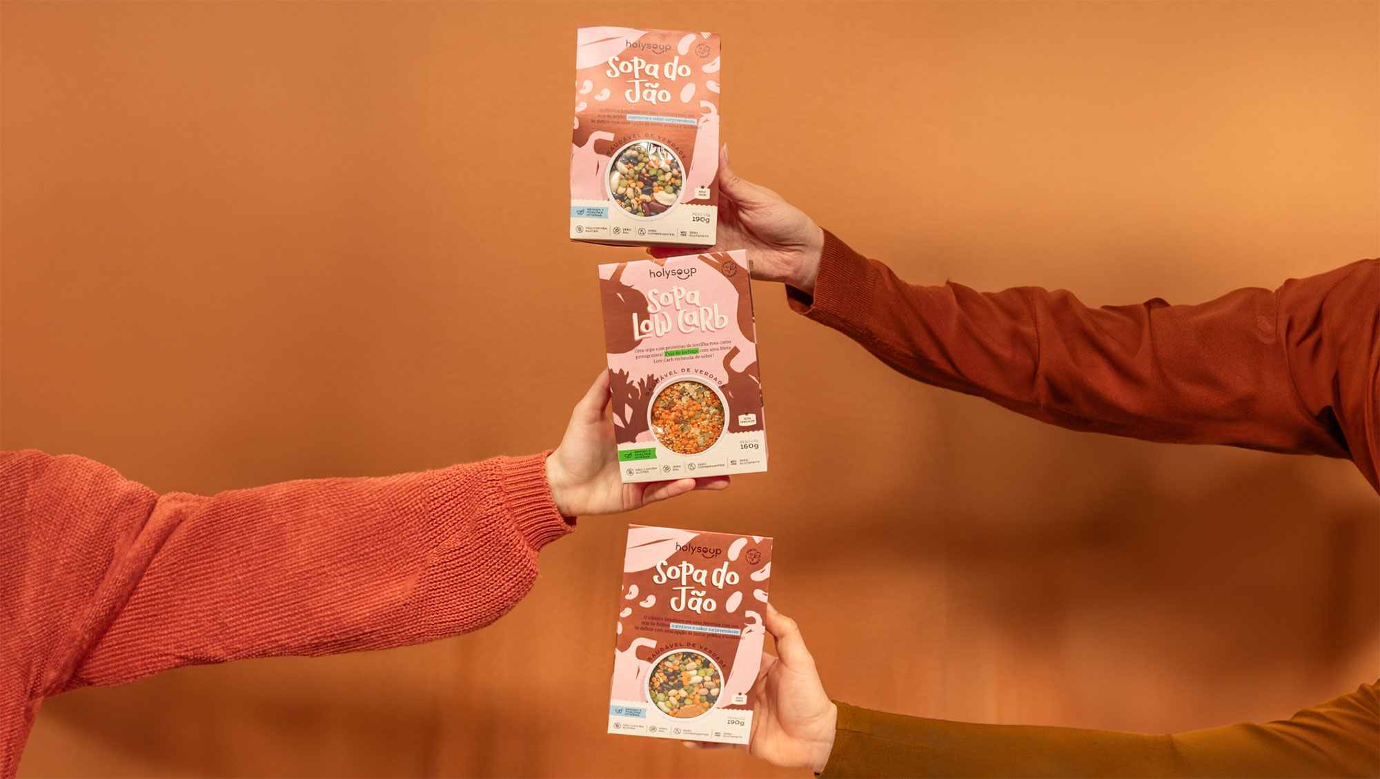
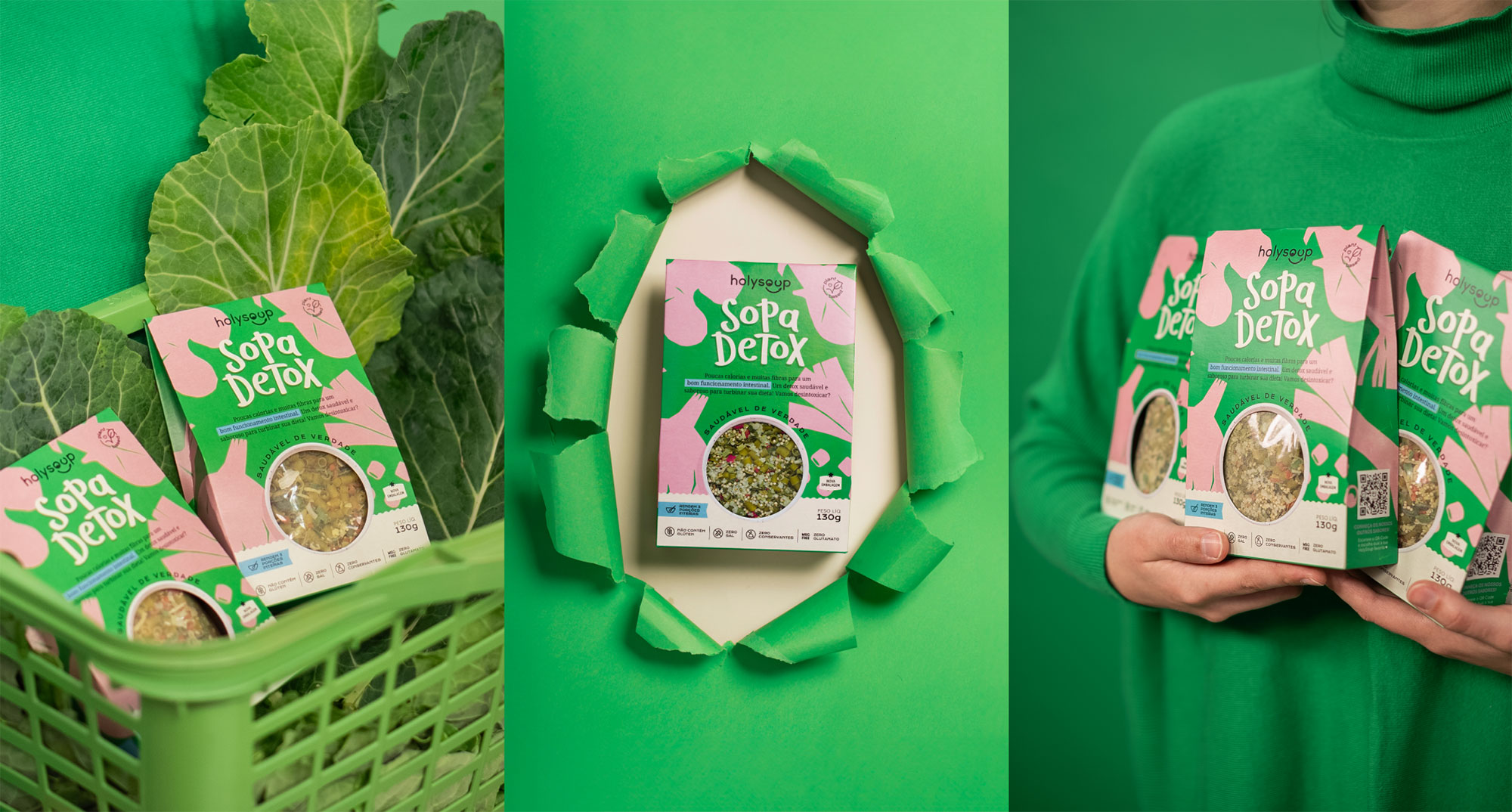
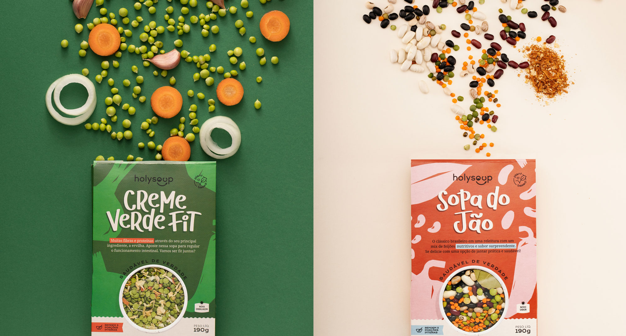
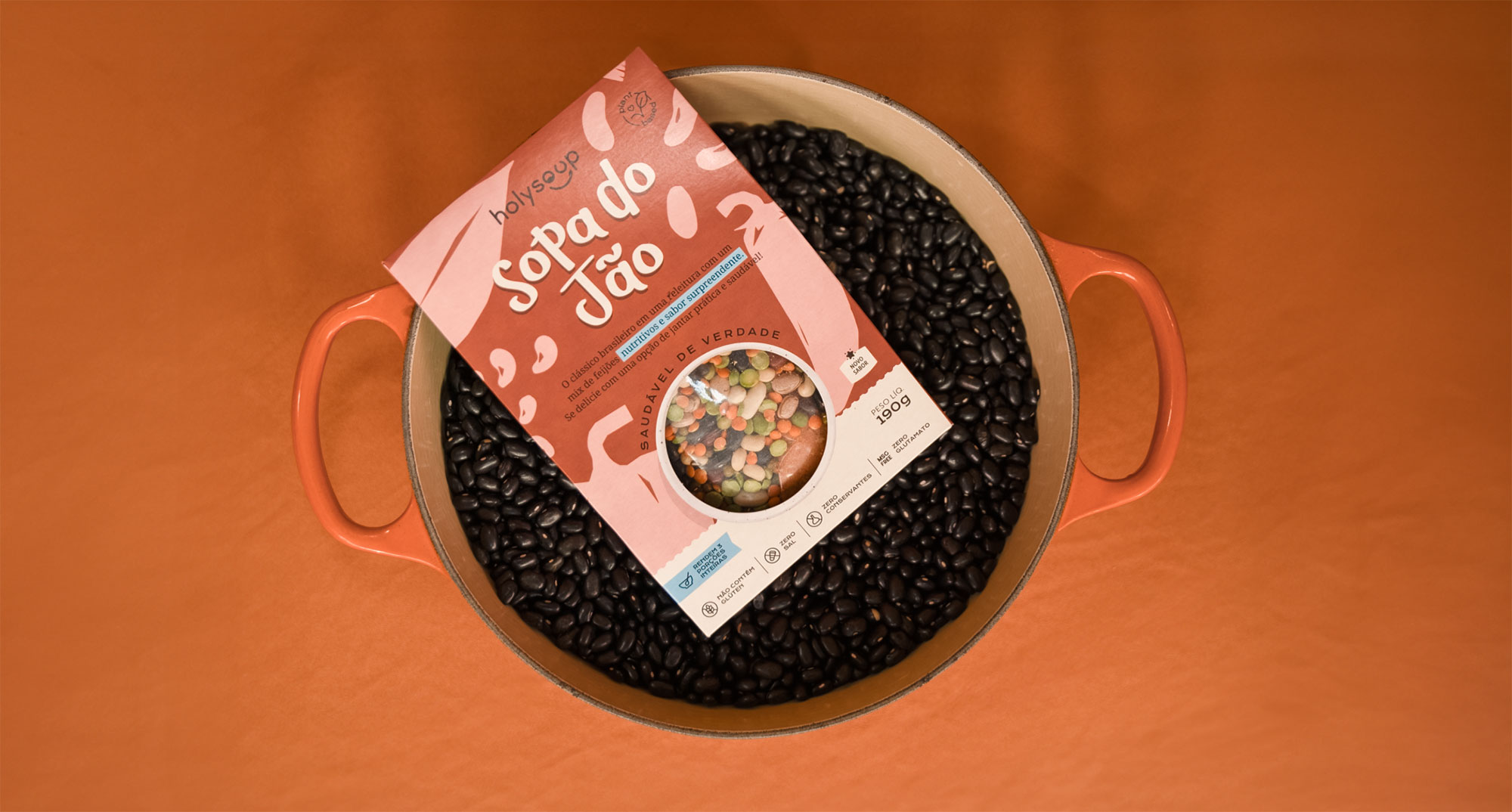
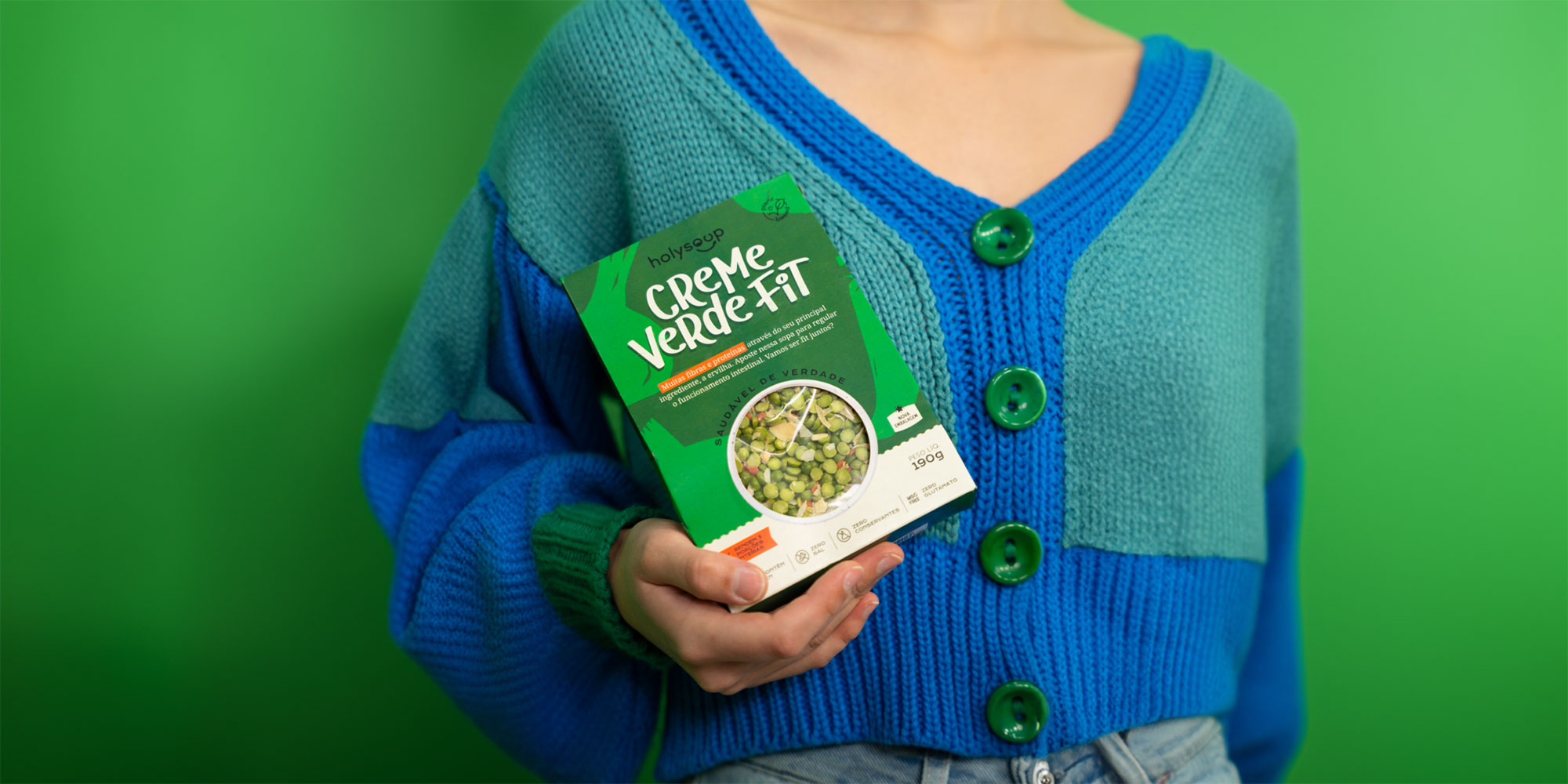
The new design, proposed by MELT, brings exclusive lettering for each soup name, personalized illustrations, and colors that allow for numerous combinations. Additionally, the dieline display helps satisfy the curiosity of consumers who want to see the product before deciding to make a purchase.
The healthy nature of the recipes was reinforced by hand-drawn letters, which, combined with illustrations of the silhouettes of the ingredients, provide uniqueness and represent the product's contents. Its features are highlighted through icons on the front and bottom of the packaging.
The secondary packaging emerged to address a concern: the protection of the contents, as the previously adopted plastic bag often failed in this function.
With the colorful and cheerful layout, the new packaging also helps adorn the shelves and attract the attention of consumers at the point of sale and on social media.

When Holy Soup contacted us, they already had a logo and did not want to change it. Therefore, we made subtle refinements to make it visually more appealing. Can you notice the difference? It's interesting how small changes can make shapes more harmonious, making the logo friendlier to the eyes without undergoing drastic alterations.