OBA FLATBREAD CRACKERS
Year: 2021
Category: Food

Context
Inspired by Italian cuisine, Oba Flatbread Crackers always come in handy and can be consumed at any time. The packaging had to be appetizing and casual but limited to a two-color printing process.
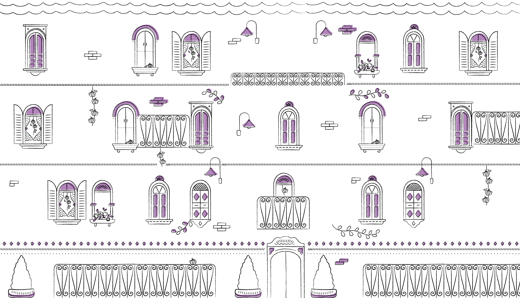
The dieline, previously defined by the supplier, got a makeover and its shape was turned into traditional charming Italian houses, full of details, bringing to life a lovely Italian scene.
What we did in this project
Packaging design.
Development
The first challenge we've faced in this project was the two-color limit for printing each package. To build the visual identity system, black was kept on the whole packaging line, and a second color was used as a highlight, while also making a reference to each product’s main ingredient.
Besides, the dieline had been previously defined and no changes were allowed to be made in it. In order to design an appealing packaging that would stand out at the point of sale, we’ve created a visual storytelling using Italy’s architectural style, visually taking the customer on a trip through the flavors of Italy, and therefore turning the challenges we’ve faced into opportunities.
We’ve included a few “easter eggs” – the main ingredients of each product are hidden in the illustrations –, which made the Italian scenes even more charming and boosted the fun factor for the consumer.
The packages we’ve designed do not only protect the products, they are appealing, easy to carry and stand out at the point of sale. Their design motivates the consumer to buy more products, since they can be used by the whole family to play with. That way, they are given a second life, being reused instead of thrown away.