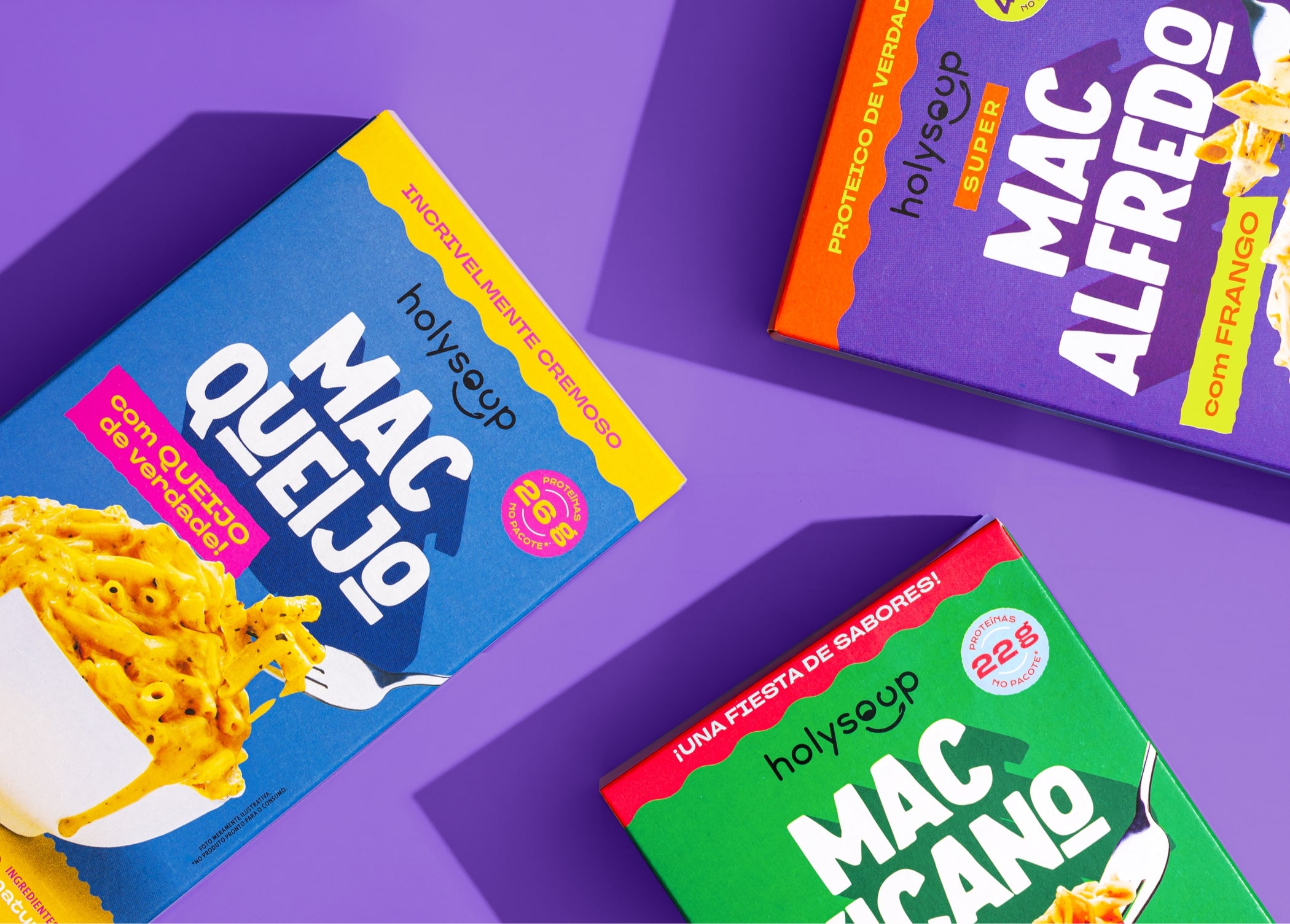
HOLY MAC
Year: 2024
Category: Food
Context
Following the tremendous success of its dehydrated soups, Holy Soup has expanded its product line with an exciting new addition: a range of protein pasta in three mouthwatering flavors. These new products follow the same principles as the existing product line—gluten-free, salt-free, and with very low sodium levels—while staying true to the brand's commitment to creating comfort foods that are both convenient and delicious.
What we did in this project
Packaging design.
Development
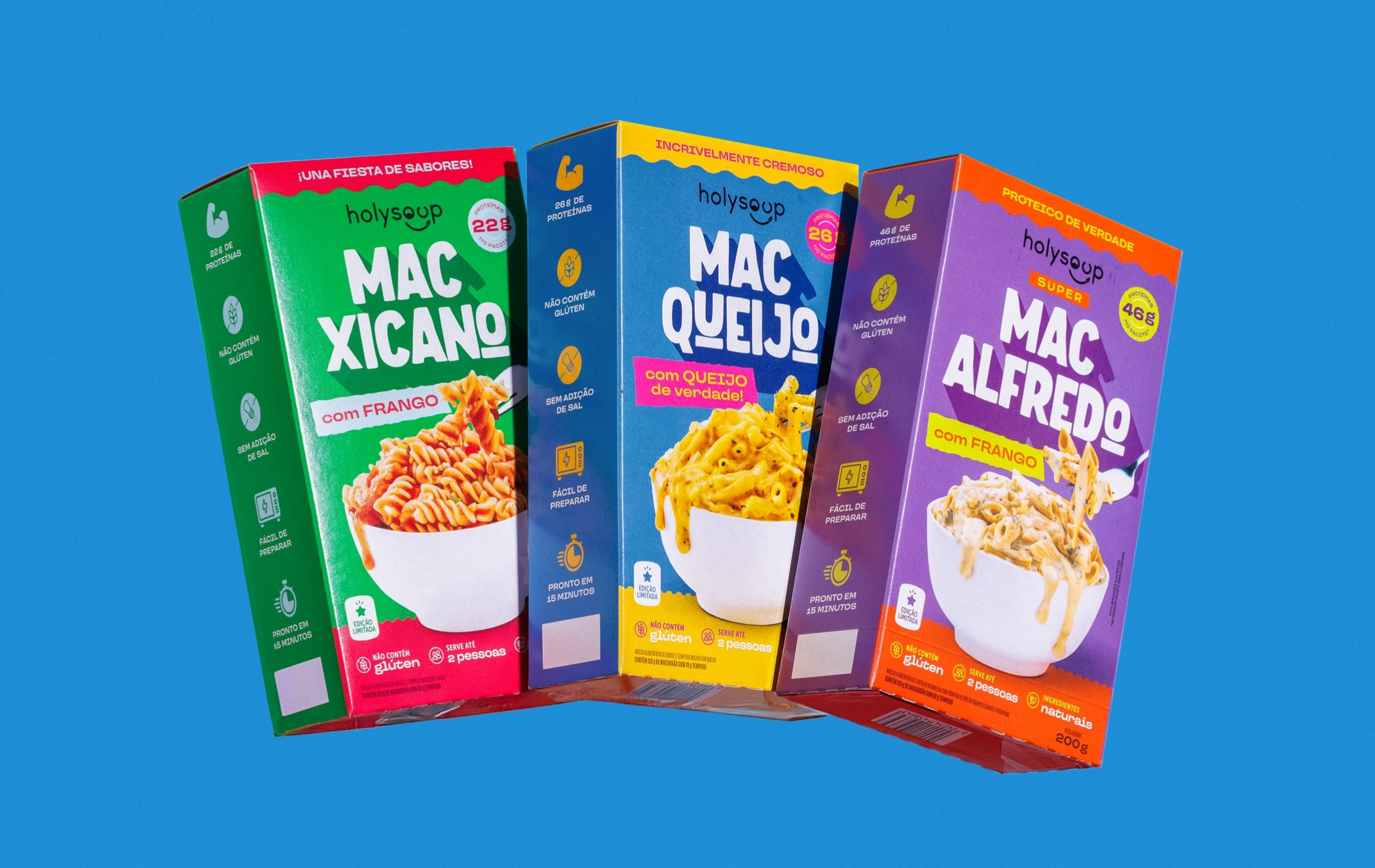
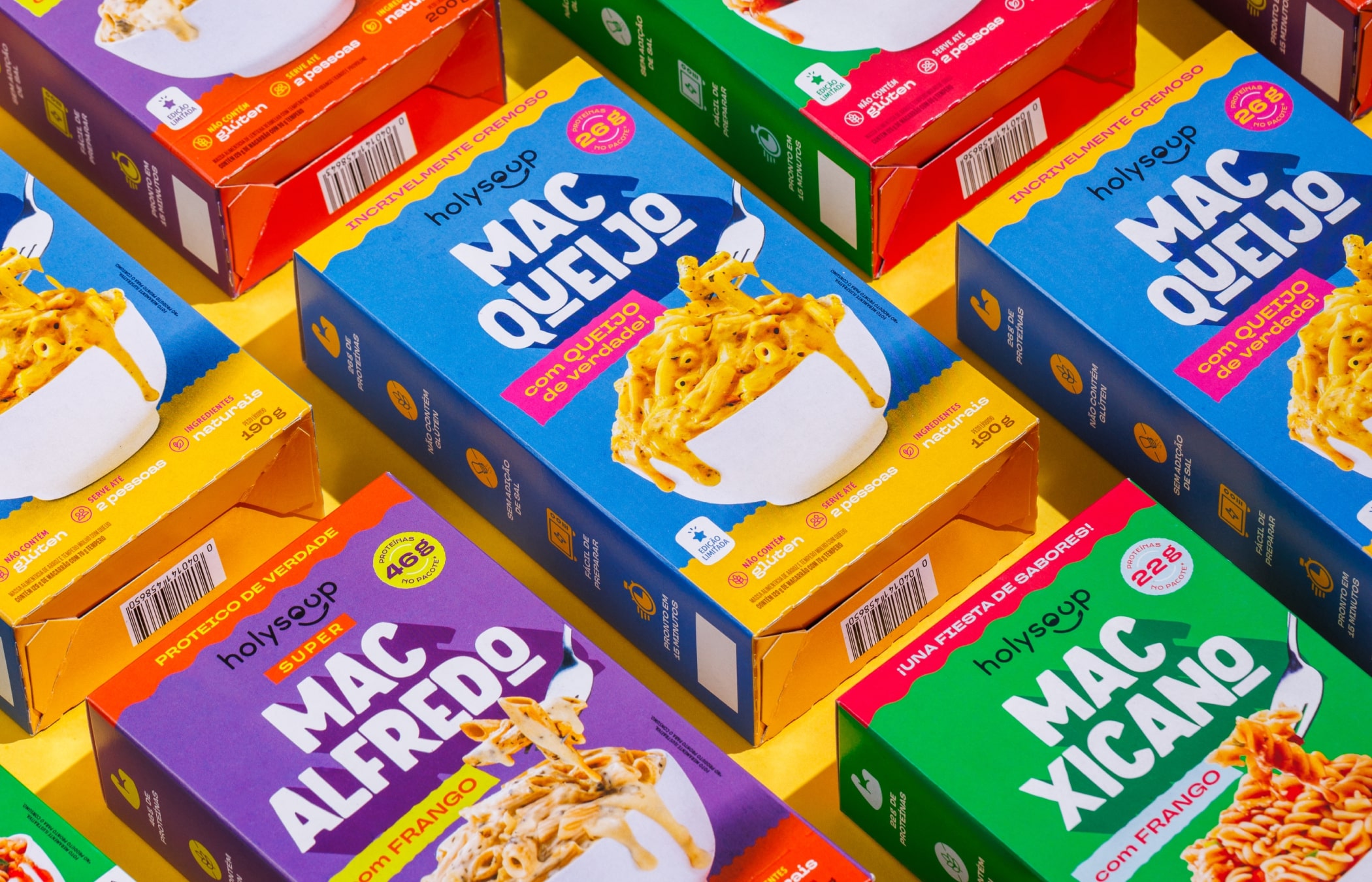
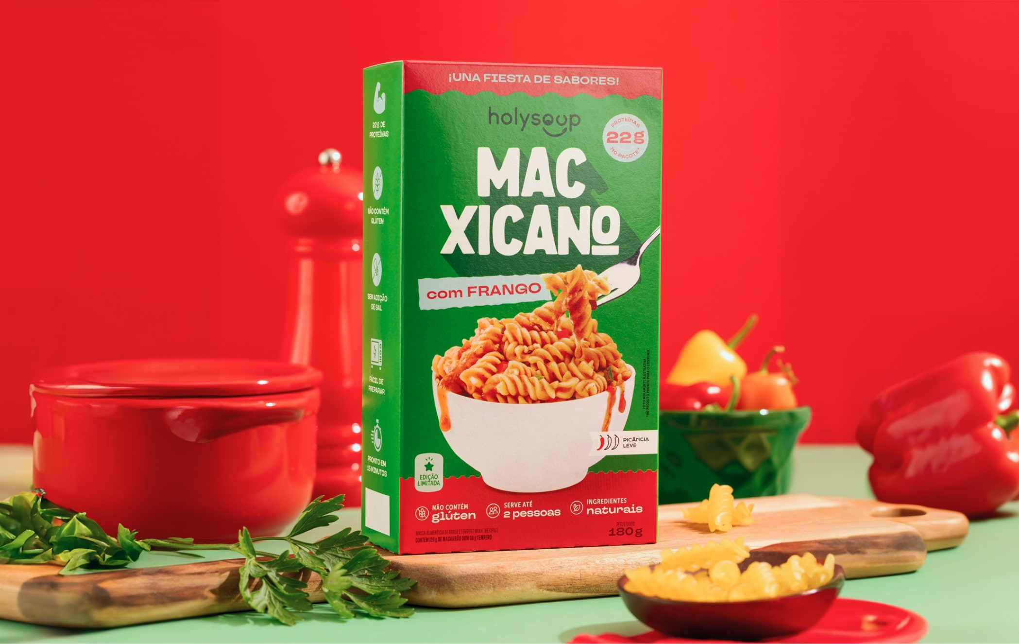
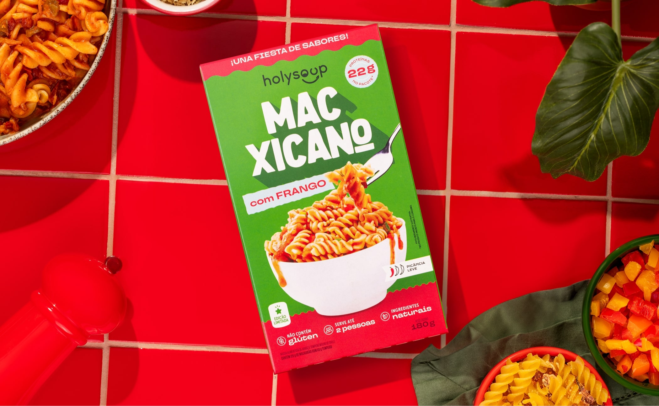
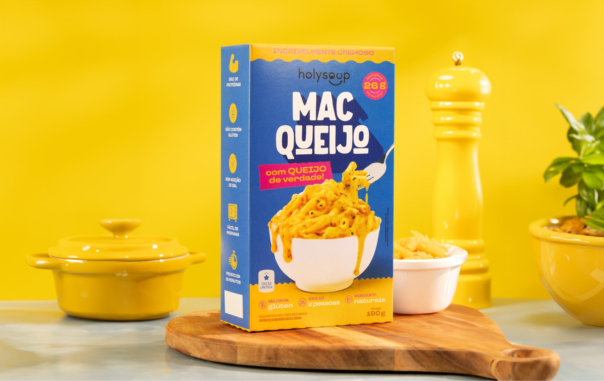
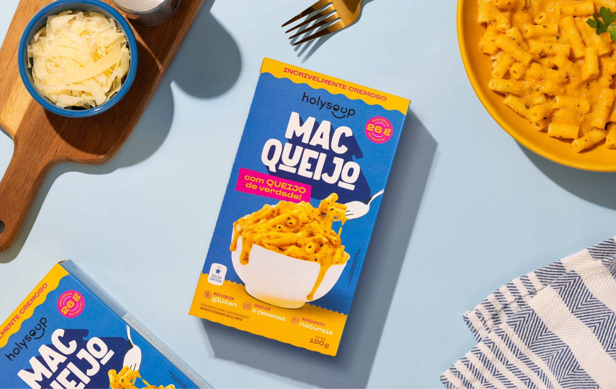
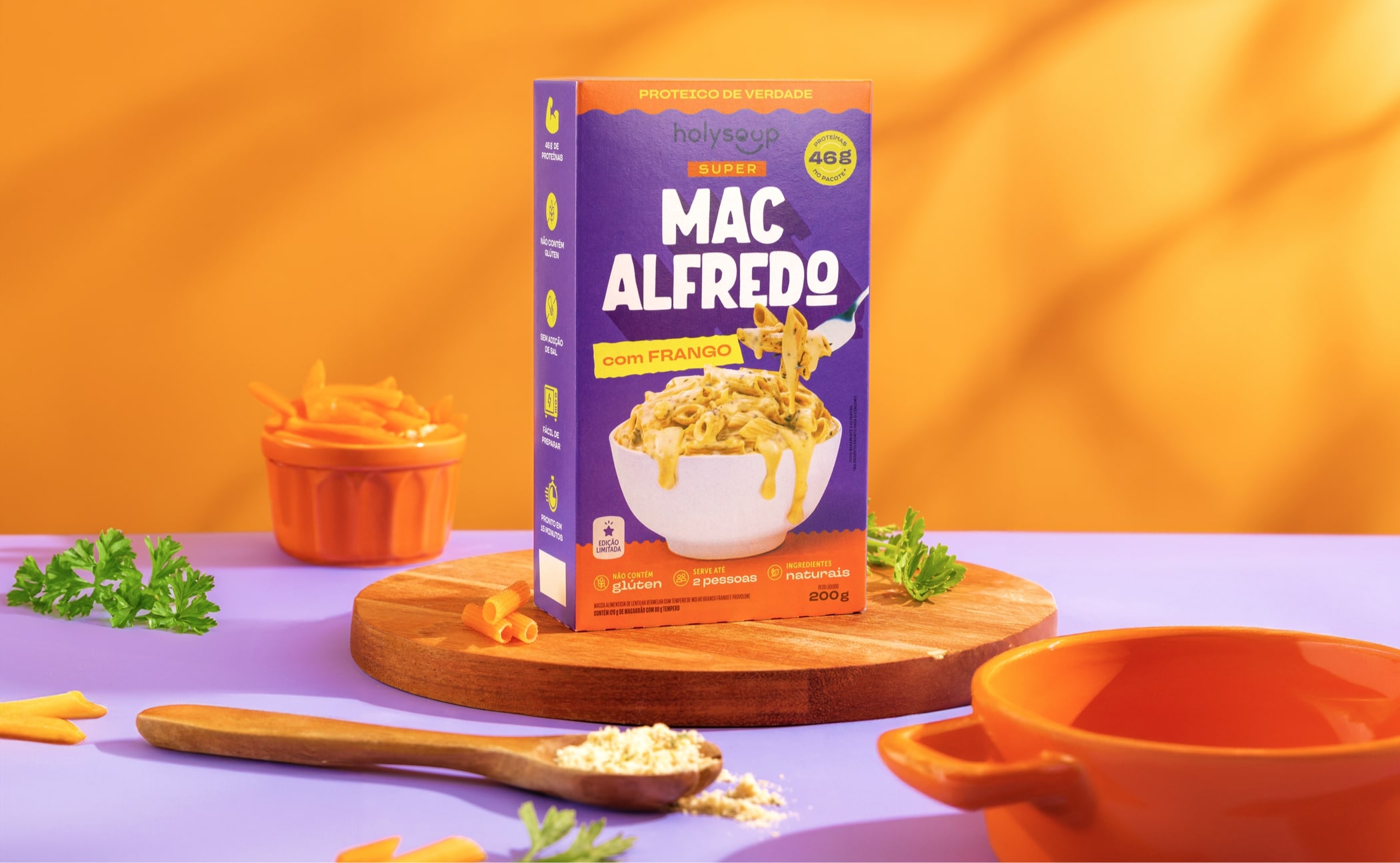
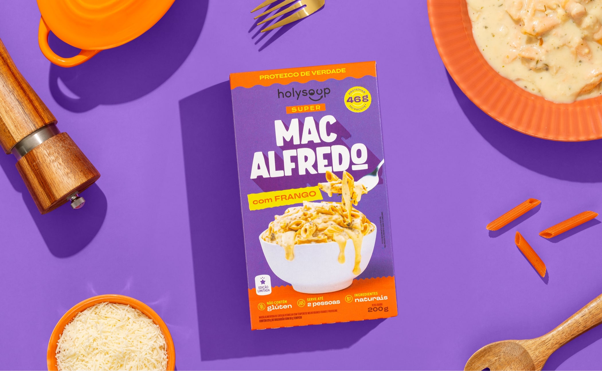
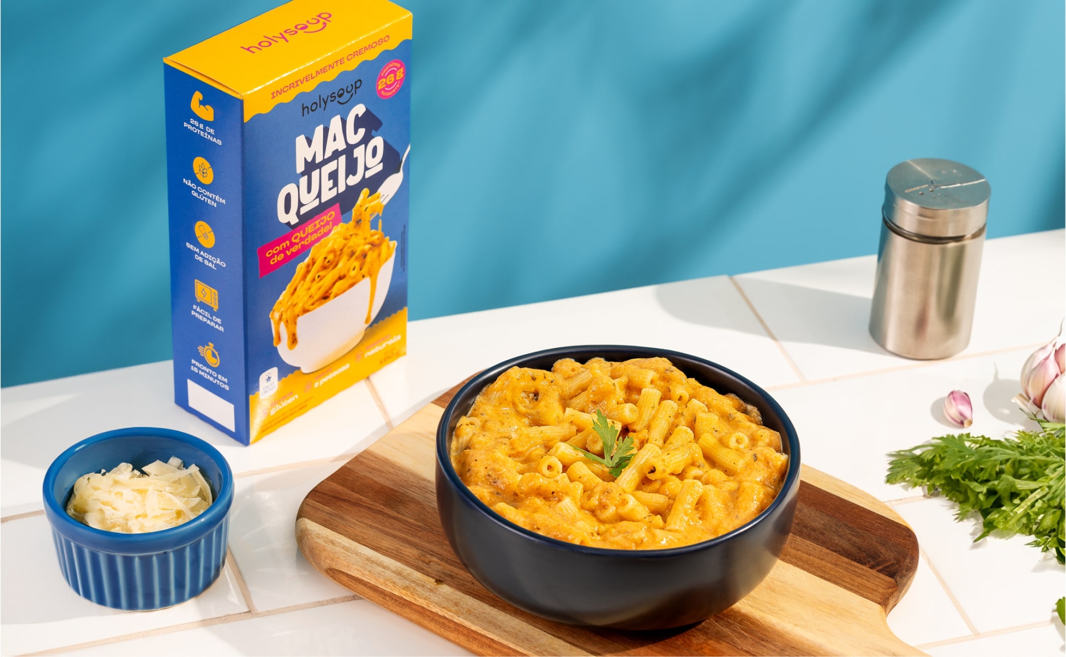
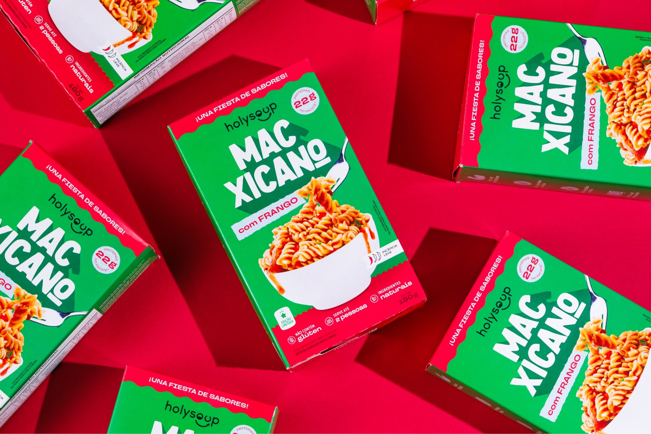
Holy Soup's latest launch features three pasta flavors: Mac Alfredo with a creamy white sauce, Mac Cheese as a healthier twist on the classic mac n’ cheese, and Mac Xicano, inspired by Mexican cuisine with a bell pepper-based sauce.
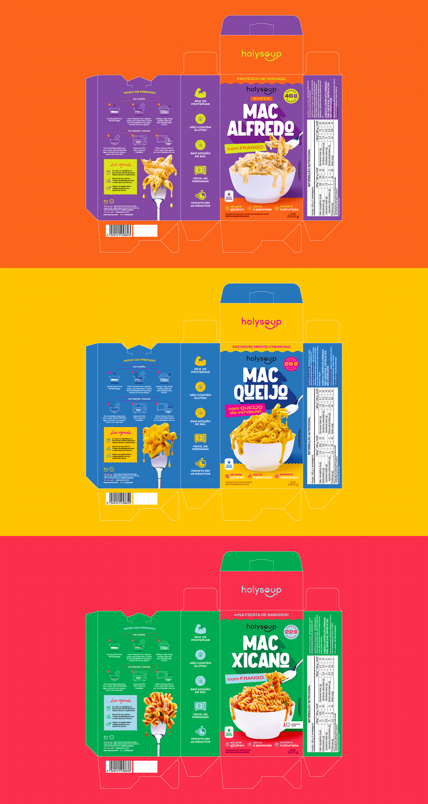
For the packaging design, Holy Soup aimed to maintain continuity with its soup line, which is known for its vibrant color scheme that stands out on store shelves. We extended these vibrant colors to the pasta, enhancing the packaging’s visual appeal and helping to differentiate each flavor.
Designed for a younger audience, the pasta offers functional benefits with its high protein content, making it perfect for pre- or post-workout meals. The design brings a bold and charismatic typography that highlights each flavor name, while the photos showcase the creamy texture of the pasta, making sure consumers see how the dish looks when prepared. Unique product features are communicated through a clear iconographic system on the packaging, making it easy for consumers to understand the benefits at a glance.
