
CASA DA SOBREMESA
Year: 2026
Category: Food
Context
For 30 years, Casa da Sobremesa has been part of the emotional fabric of Campinas, São Paulo, the city where it was founded. Its desserts have been present at family celebrations and shared moments of joy, building a connection that spans generations. More than a well-known name, it has become a beloved brand for those who grew up with it.
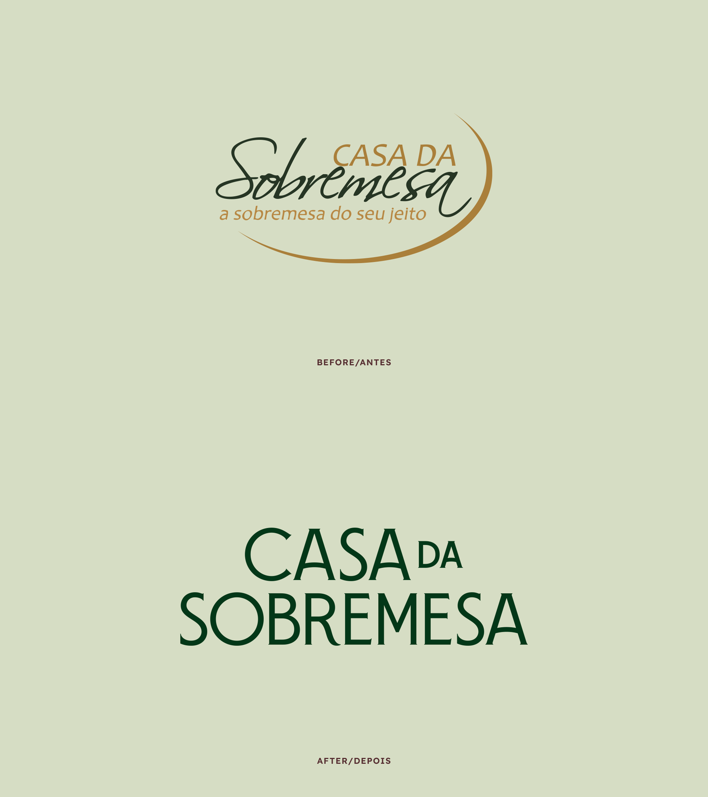
As the brand reached its 30th anniversary, there was a need to update its visual identity and more accurately reflect the quality and sophistication already associated with its products. The challenge was to evolve without breaking away from the history it had built: preserving a sense of familiarity for long-time customers while making the brand relevant to new audiences.
It was also important to create a consistent presence across every touchpoint, from online communication to packaging, preparing Casa da Sobremesa for the next chapter of its business.
What we did in this project
Visual Identity and Packaging Design
Development
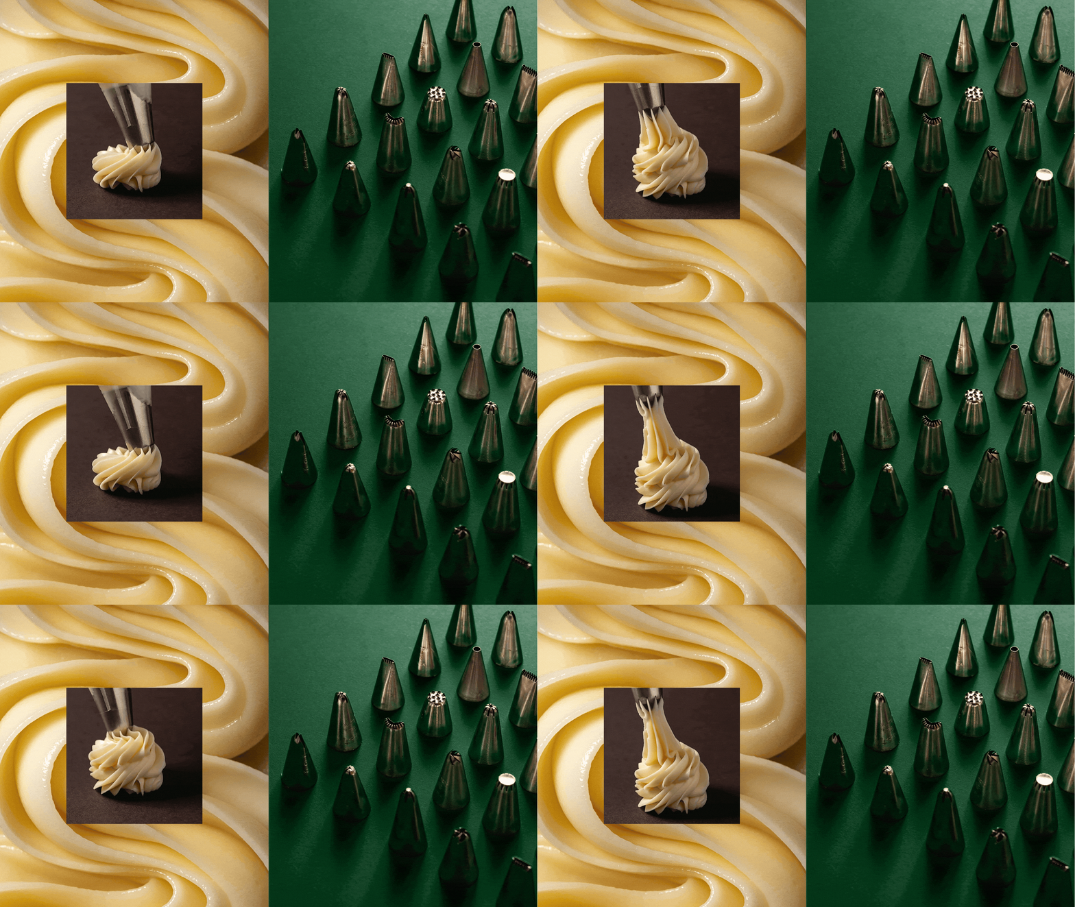
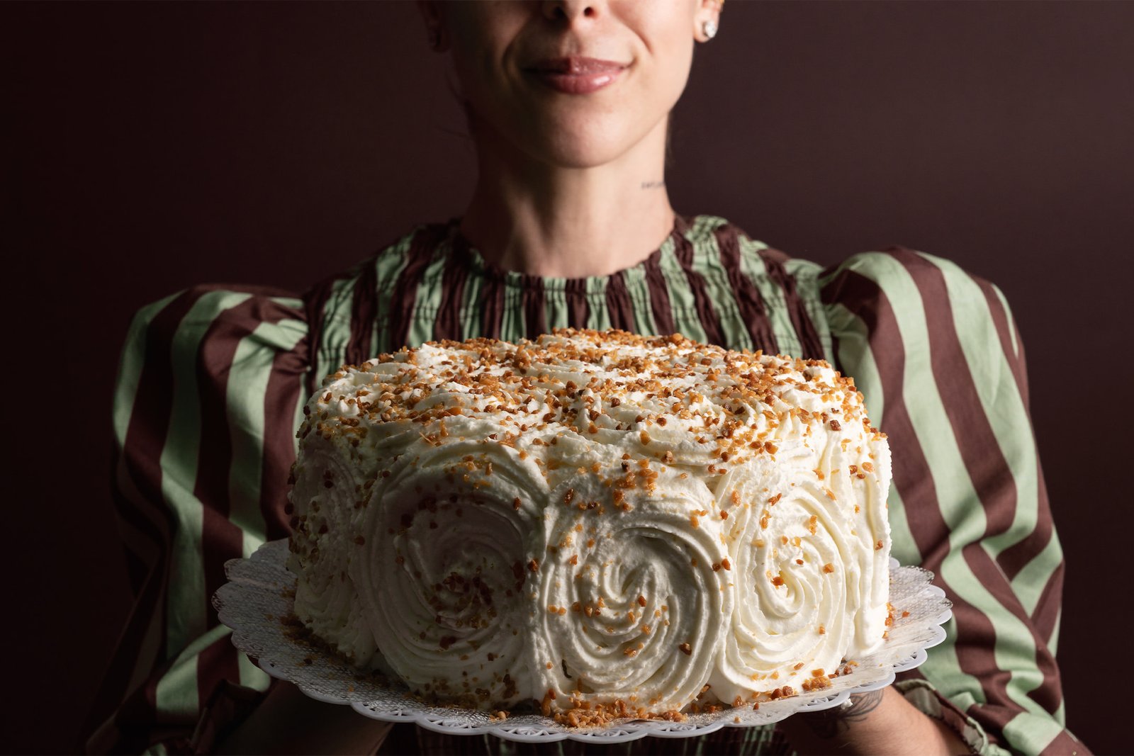
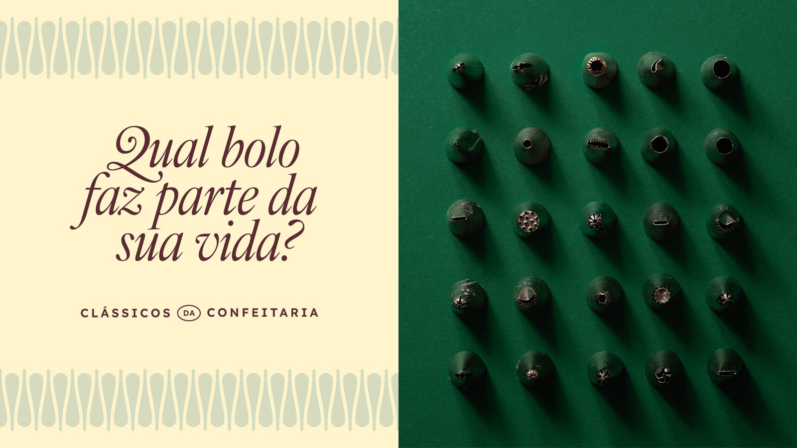
Before we started designing, we went into the kitchen in search of the visual codes that already belonged to Casa da Sobremesa. For several hours, we closely followed the entire production process. Among batters, fillings, and finishing touches, our attention turned to the pastry chefs, who decorated each cake by hand using precise, repeated circular movements. These gestures require technique, skill, and care, giving each cake the unique touch of the hands that decorate it. That was where we found the graphic essence of the brand.
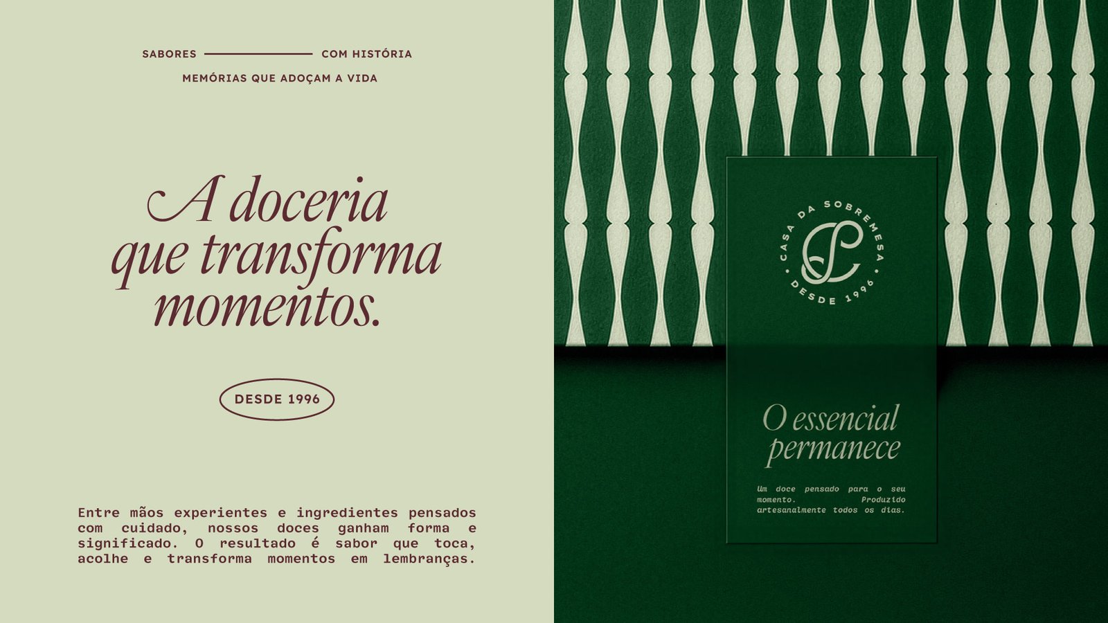
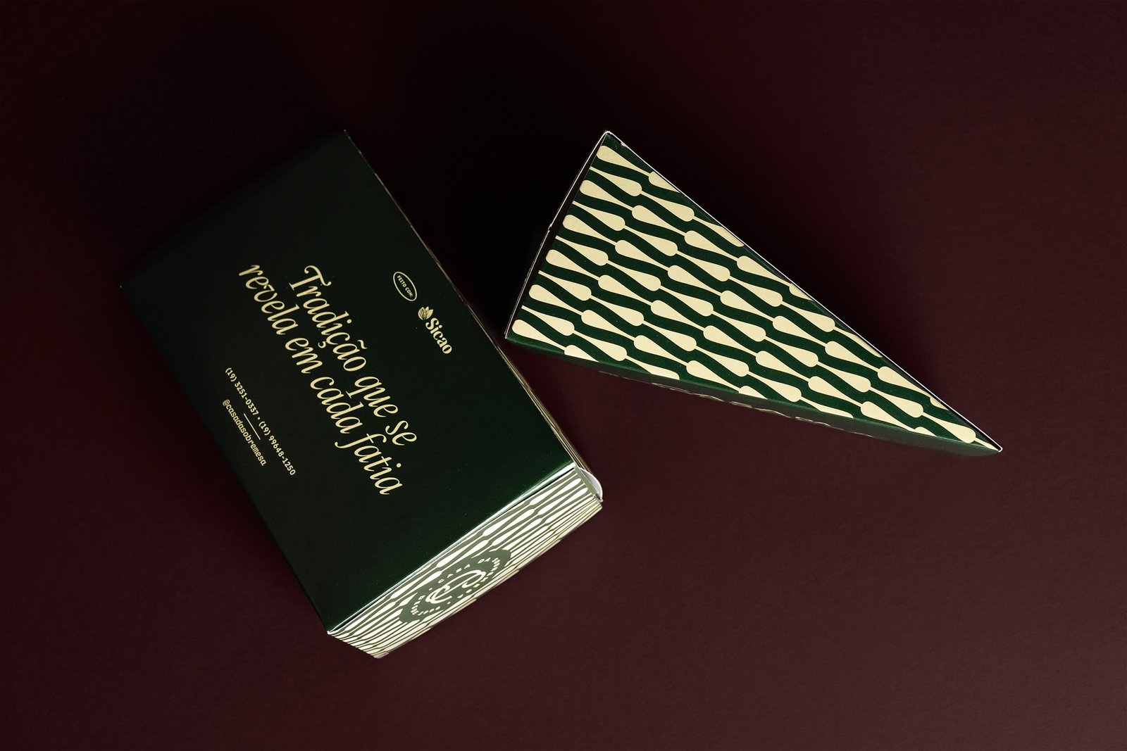
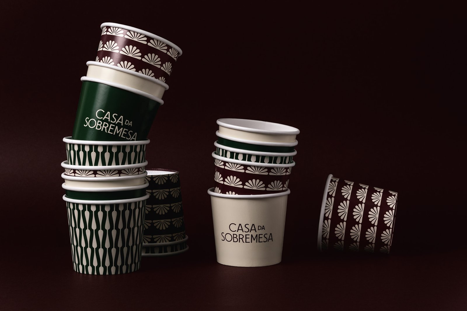
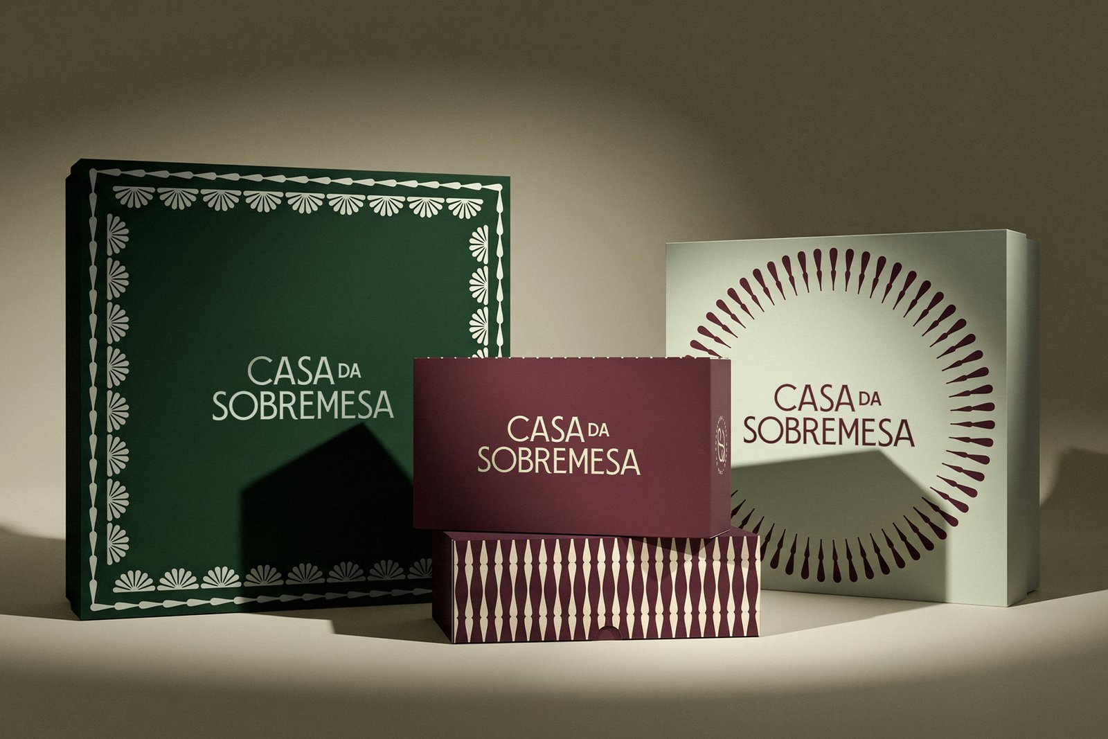
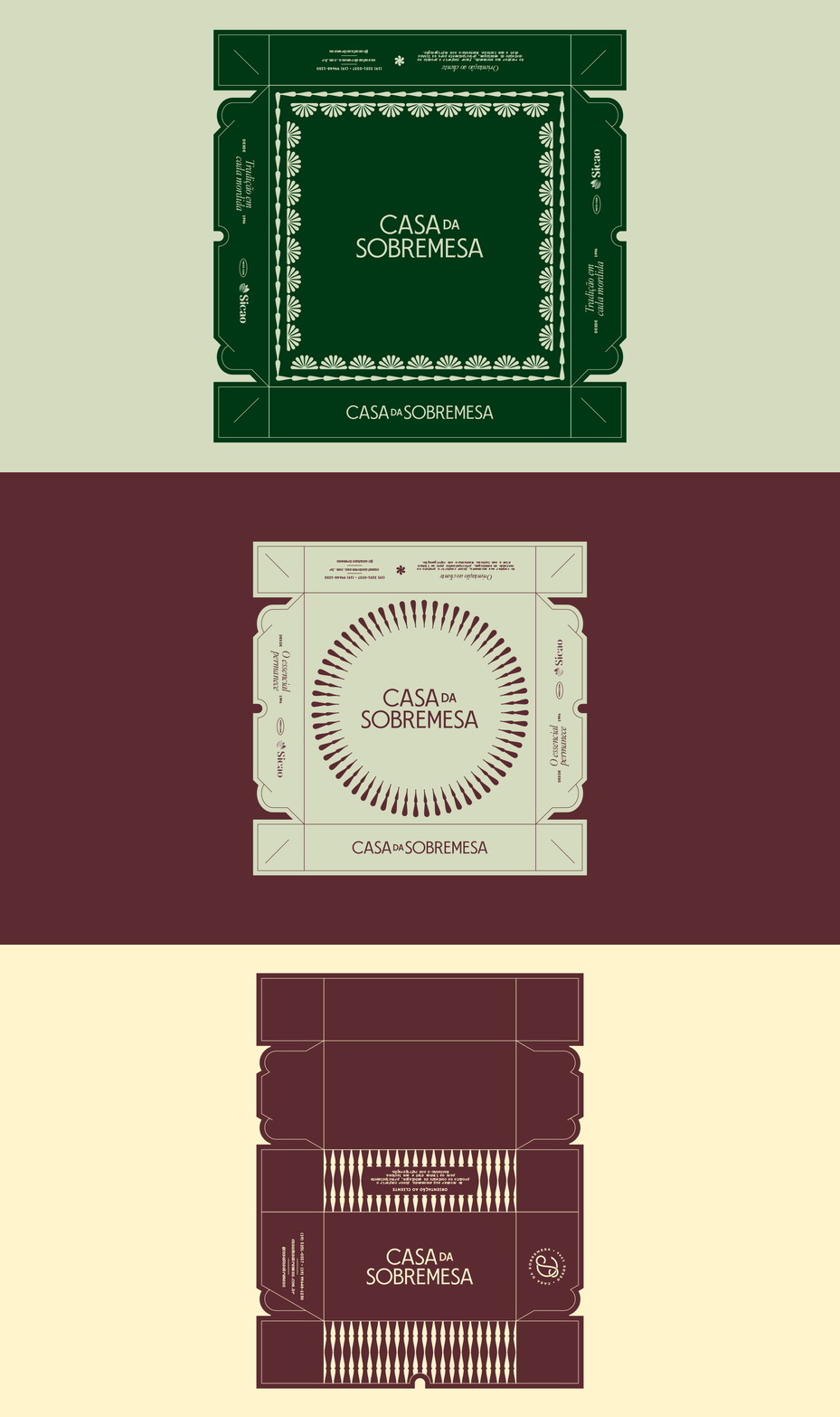
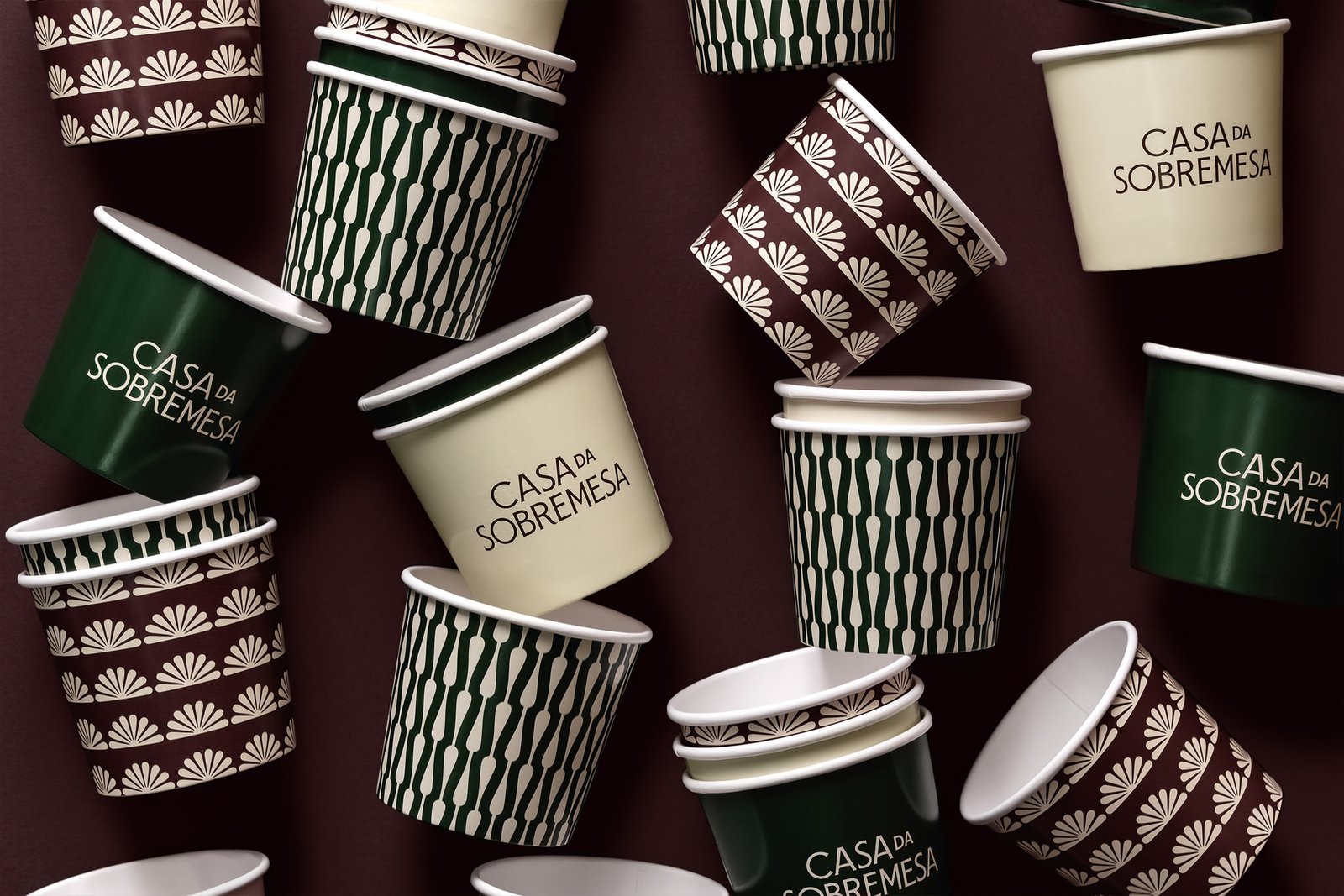
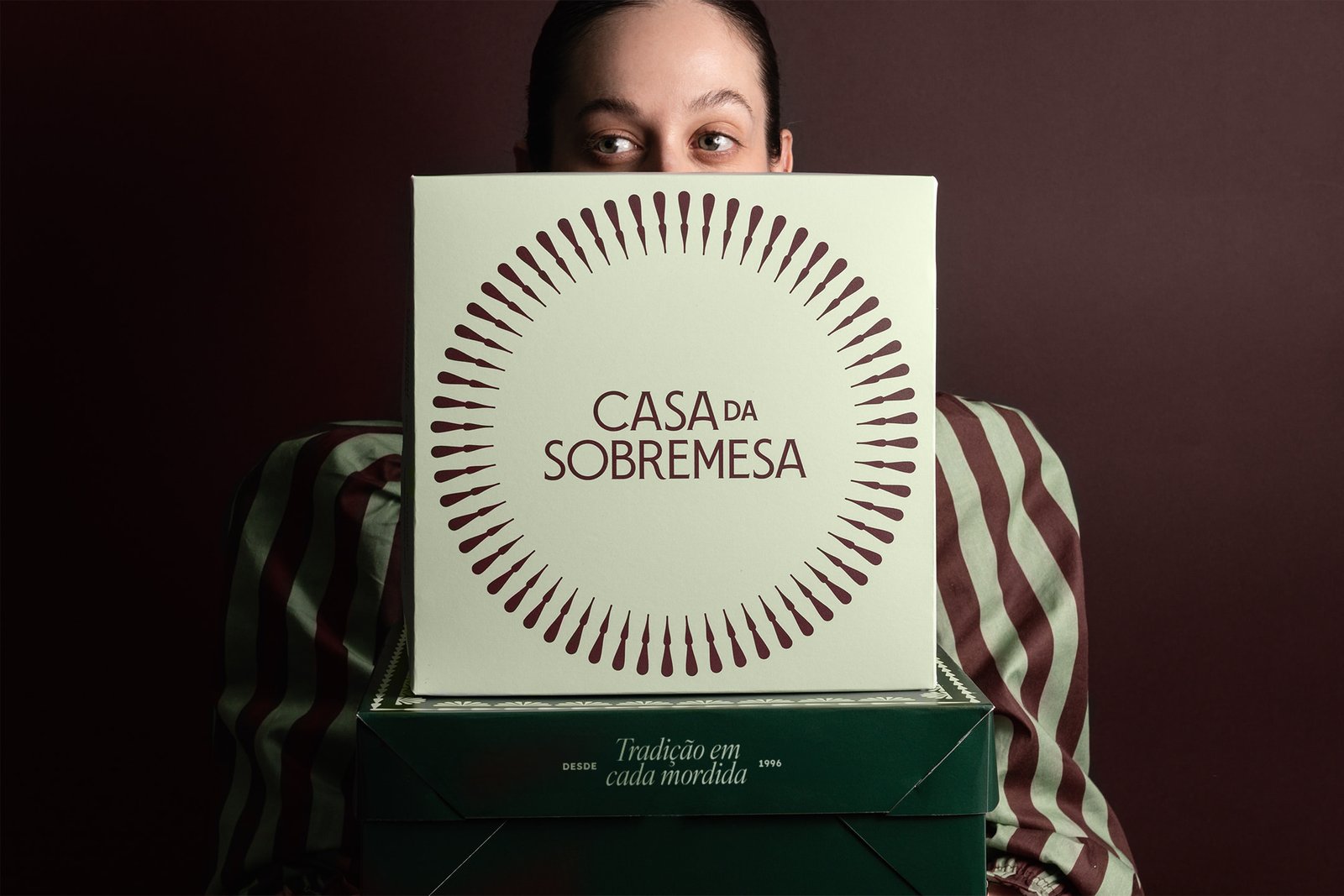
The shapes created by different piping tips were mapped and transformed into modules, patterns, seals, and frames. This repertoire became the foundation of a distinctive visual system, built from observing the brand’s everyday processes and a craft that is uniquely Casa da Sobremesa’s. The same gestures that shape its desserts now also shape the brand.
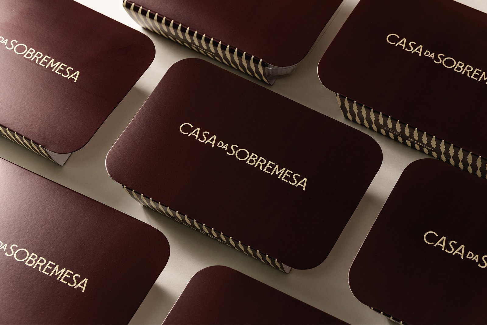
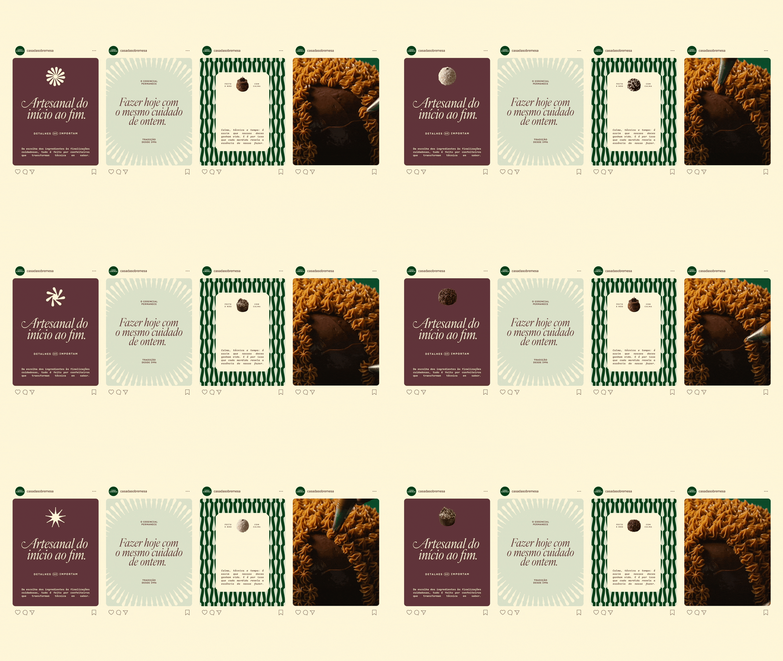
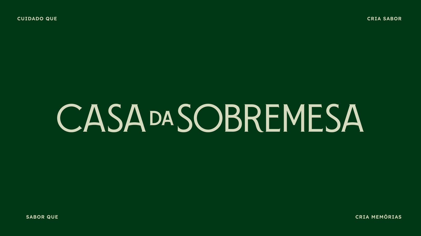
The new identity preserves important elements of the brand’s history while presenting them from a new perspective. Green, already familiar to customers, was retained in deeper, more elegant shades. The palette was expanded with colors inspired by chocolate and buttercream, creating a warm and sophisticated universe. The typography balances the classic spirit of the pastry shop with contemporary compositions, while the art direction places the products at the heart of the experience.
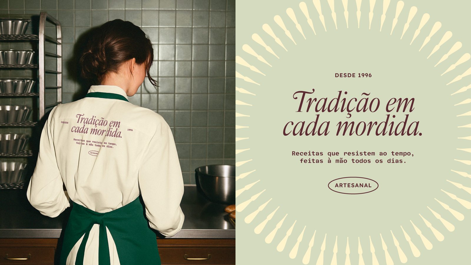
Designed to work seamlessly within the day-to-day business, the graphic system adapts to different formats and scales, from seals to storefronts, packaging to uniforms and social media. Every application reinforces the identity without competing with the desserts, which remain the true protagonists.
The result brings a contemporary expression to what Casa da Sobremesa has always been at its core: a brand built on tradition, care, and craftsmanship, now translated into a recognizable, consistent, and truly distinctive visual language.