Mama Irene
Year: 2025
Category: Food

Context
Mama Irene is an award-winning Greek brand of artisanal pasta, present in Michelin-starred restaurants and prestigious retailers such as Galeries Lafayette in Paris.
With the growth of exports and global visibility, the founding family decided to invest in a new visual identity, one that would highlight the quality of their products while reinforcing their international presence.
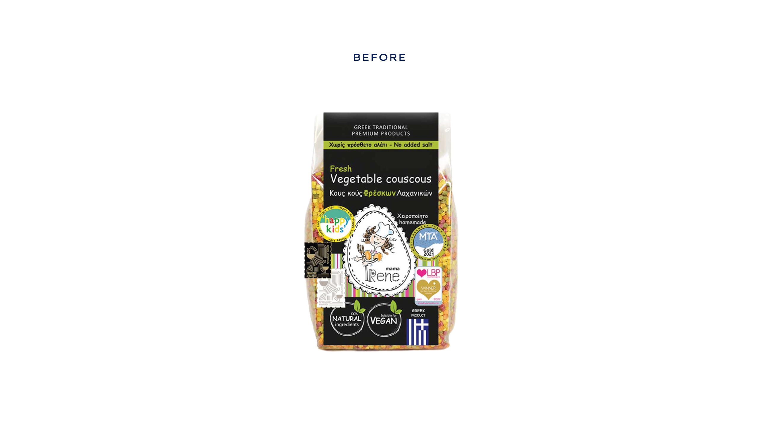
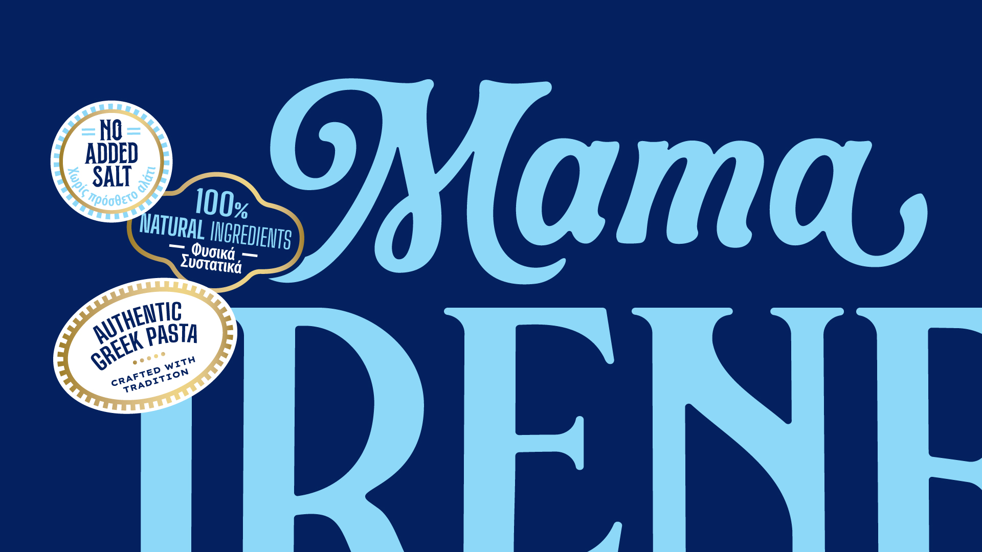
Over time, as more elements such as awards and certifications were added to the packaging without a clear system, the design became cluttered. The lack of hierarchy compromised product recognition, resulting in packaging that no longer reflected the sophistication of a brand acclaimed worldwide.
What we did in this project
Visual Identity and Packaging Design
Development
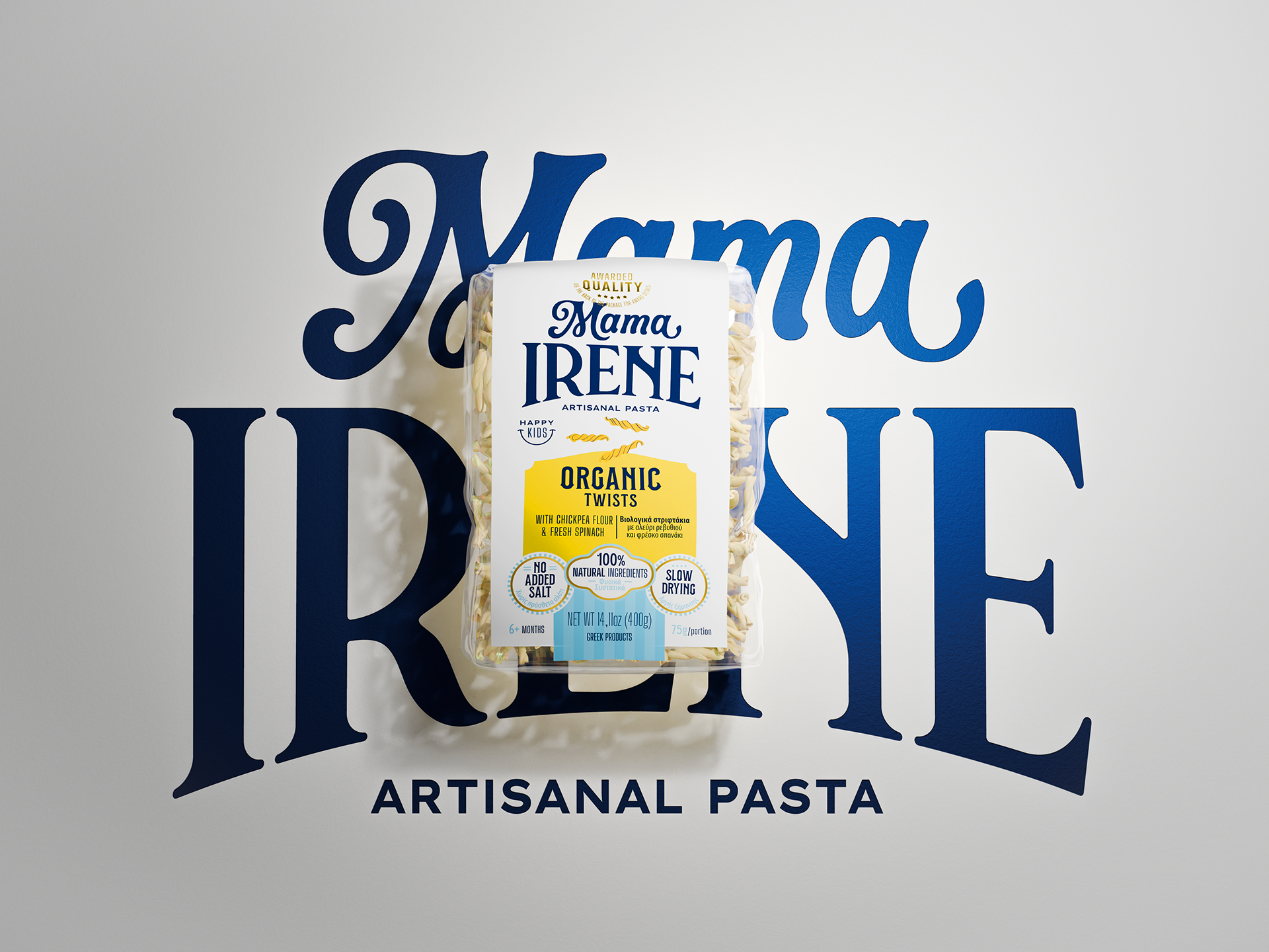
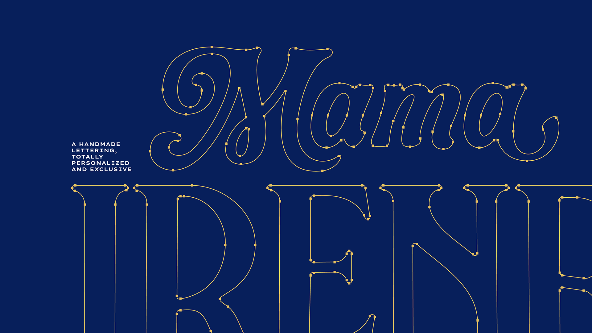
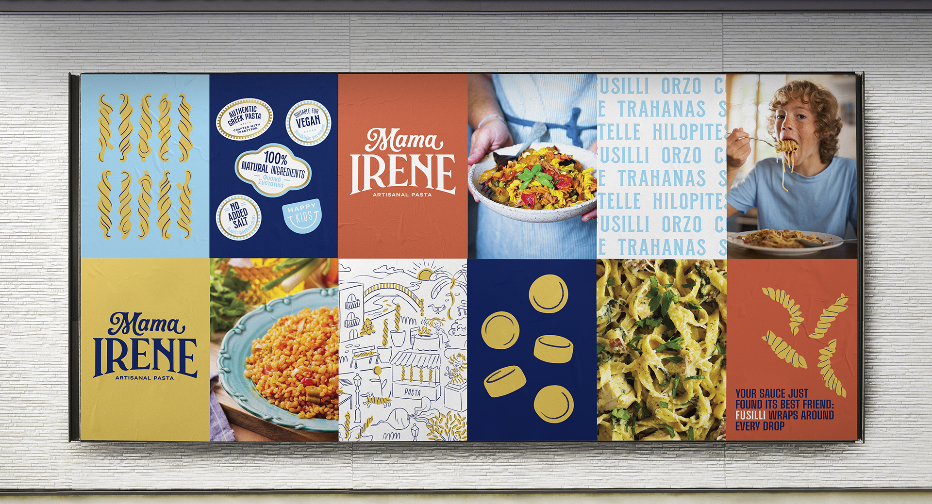
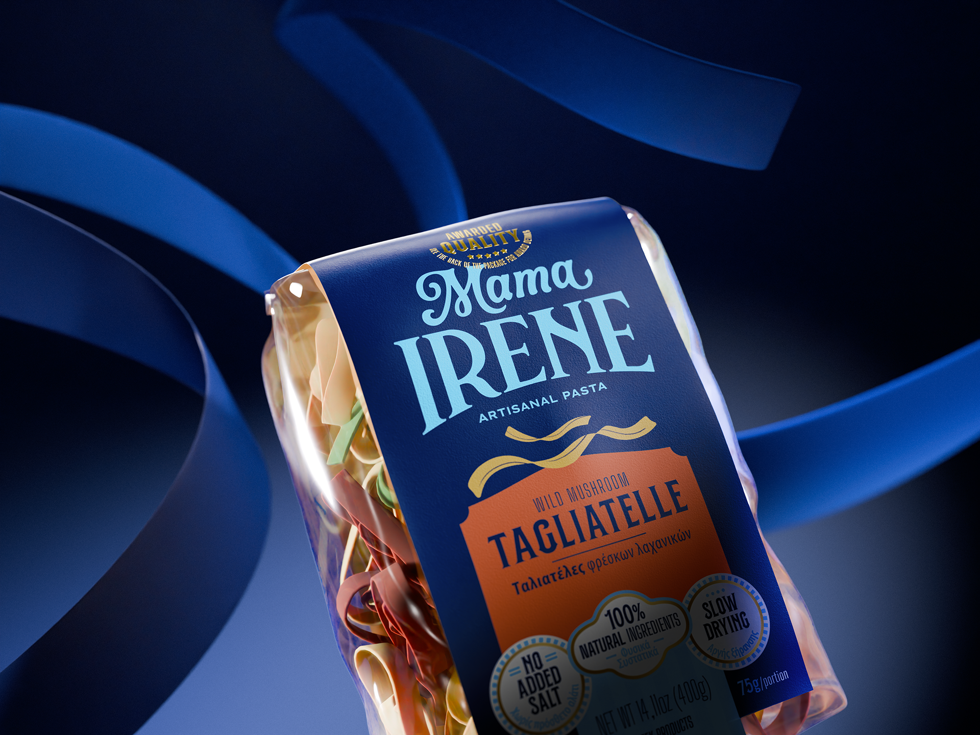
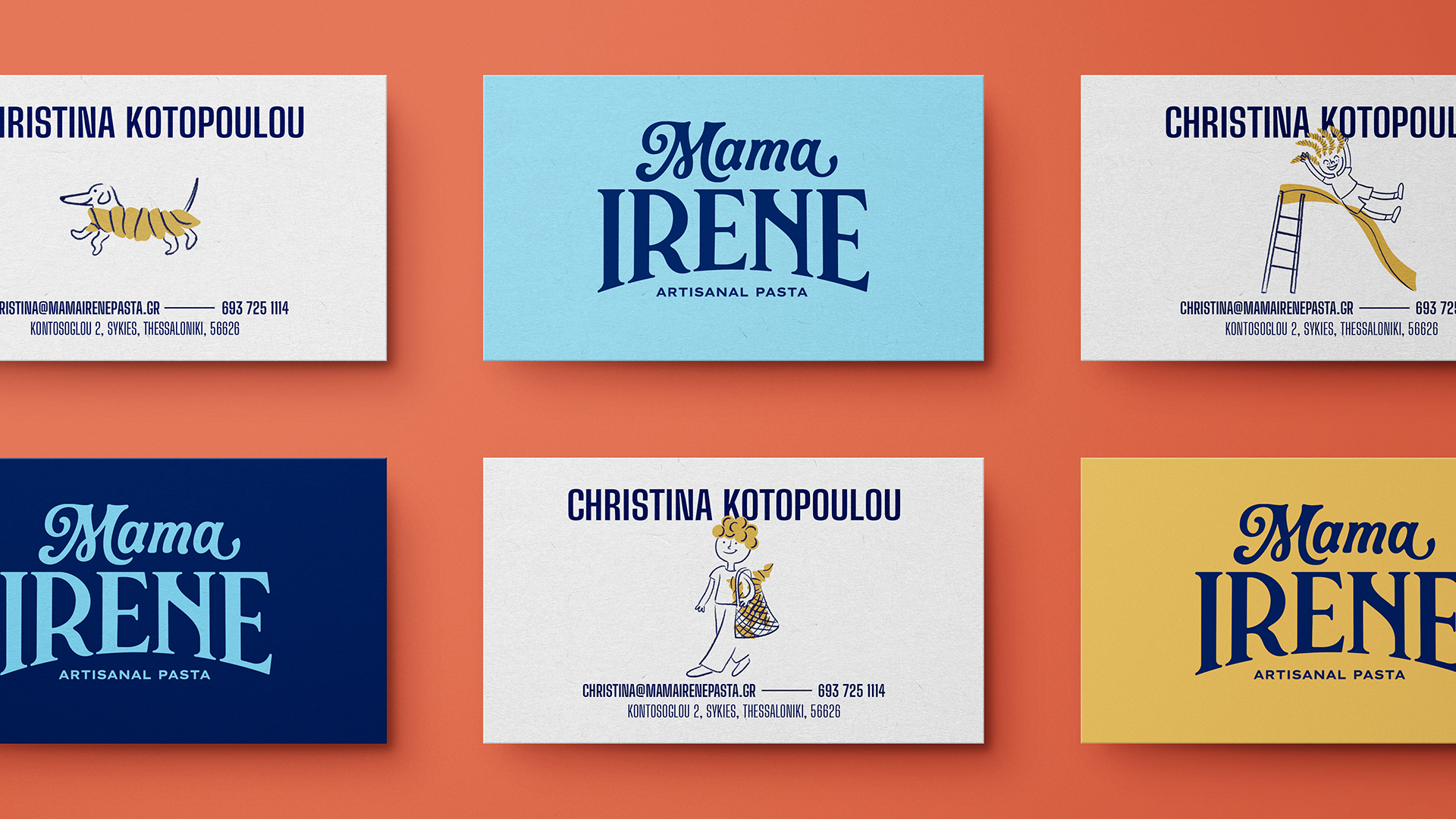
The new brandmark was designed to capture the handcrafted essence of artisanal pasta while honoring the family’s tradition. It stands out on the packaging and leaves a lasting impression on consumers.
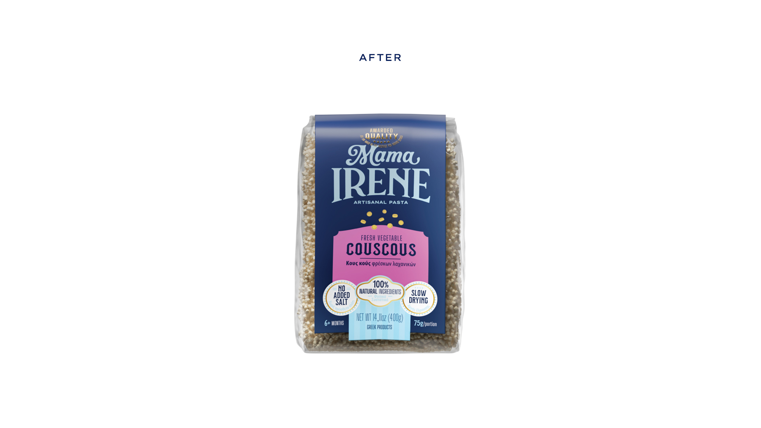
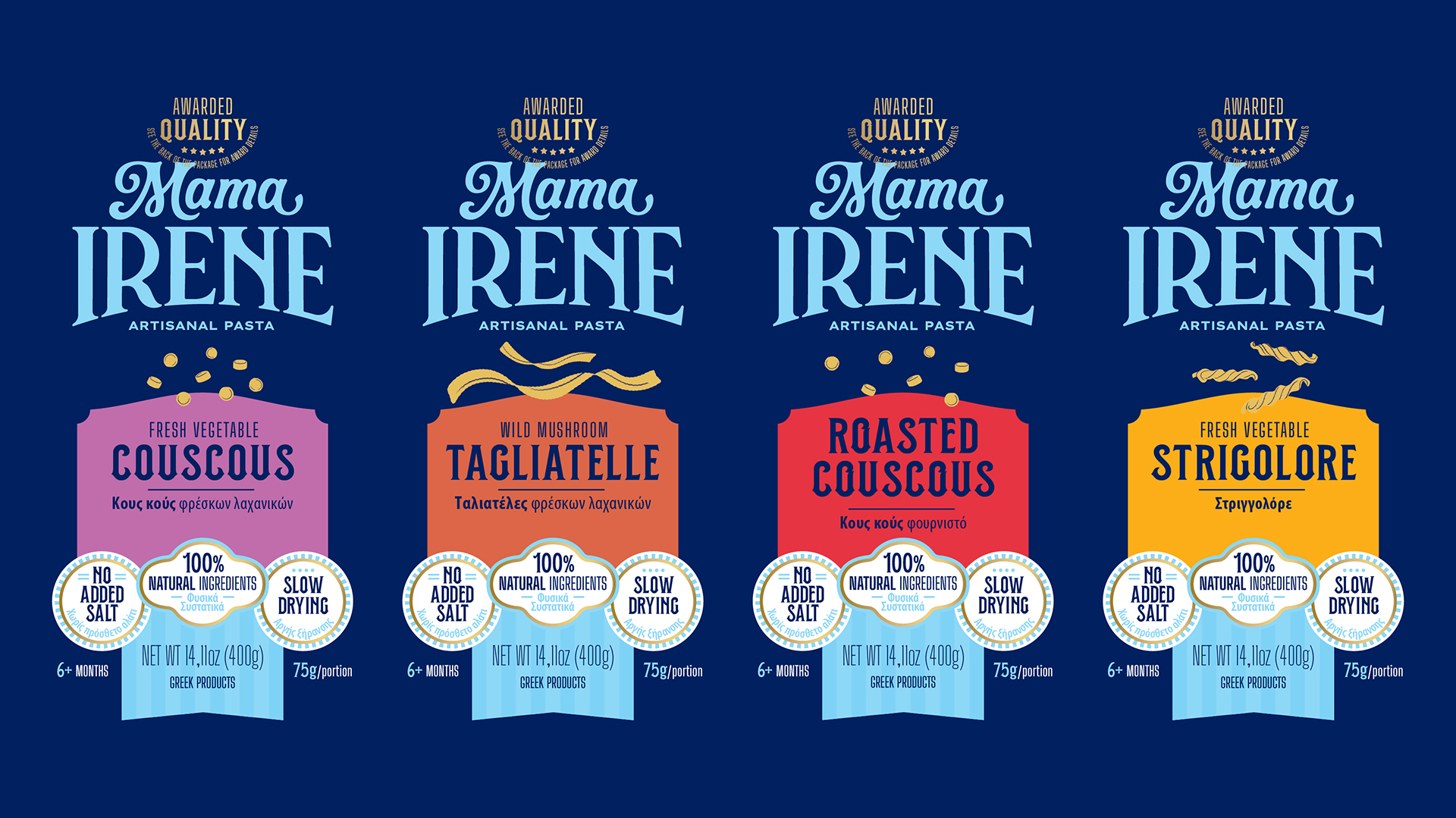
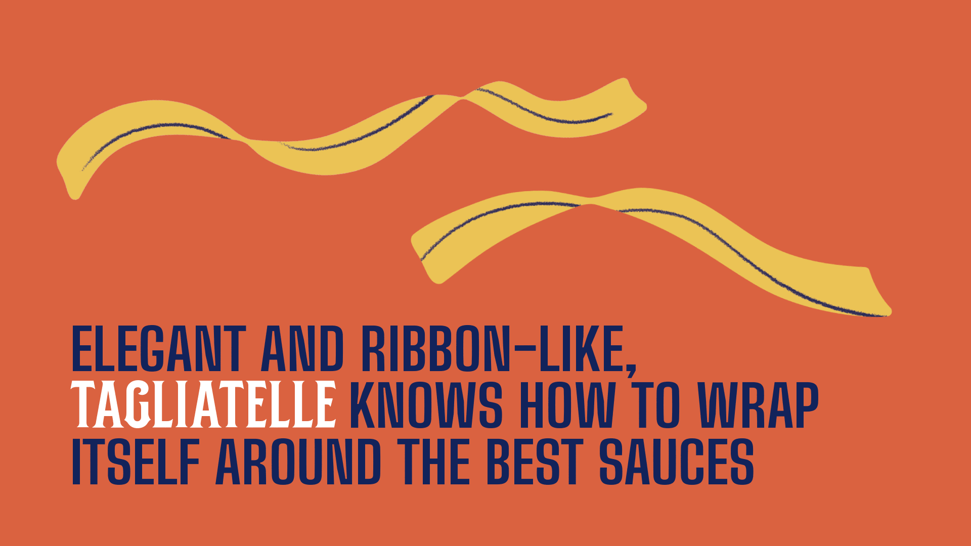
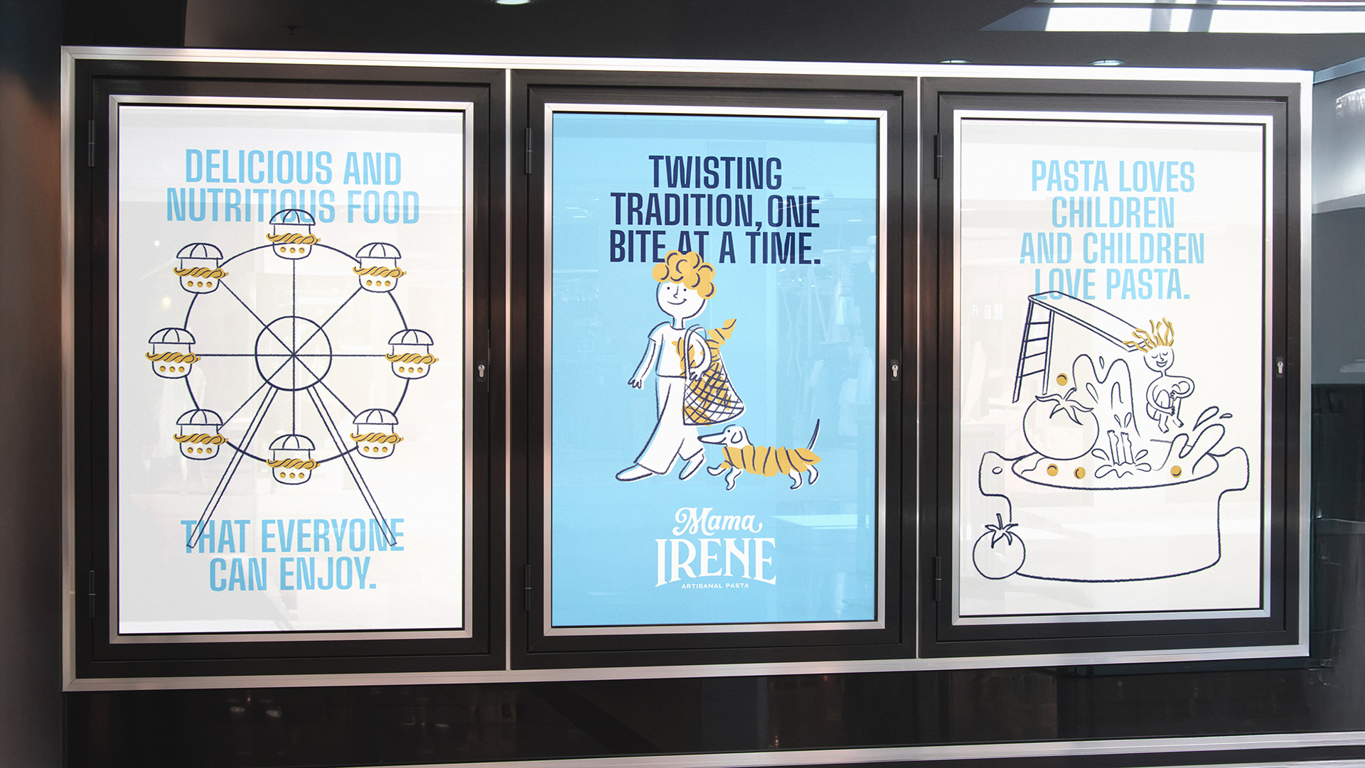
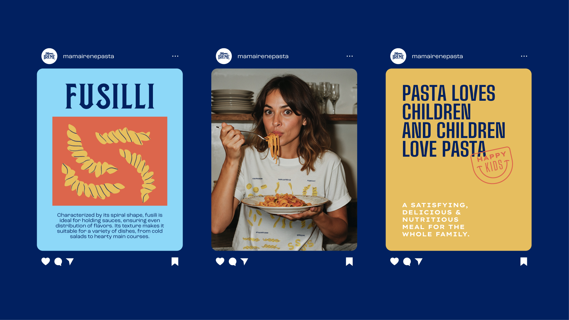
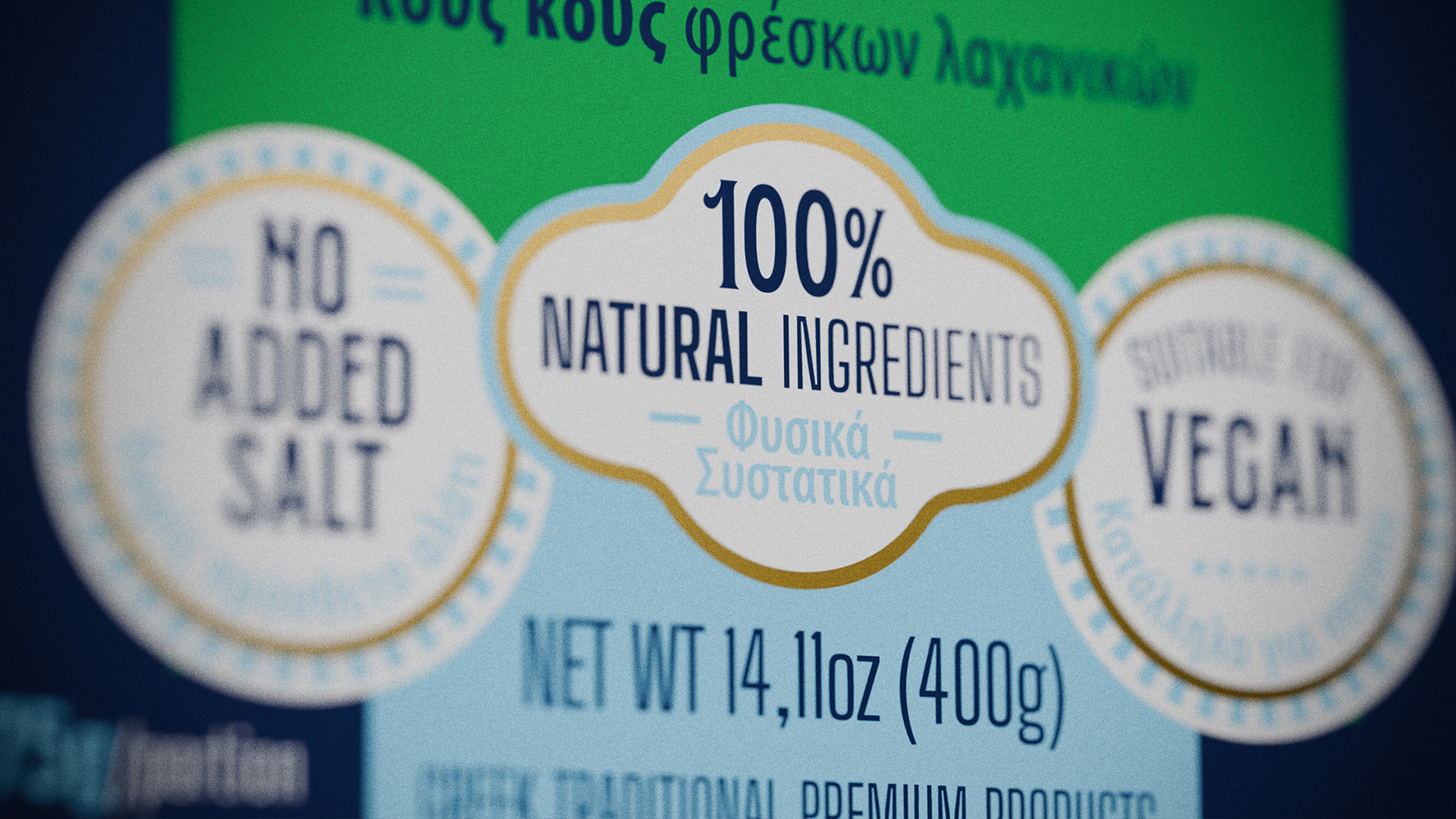
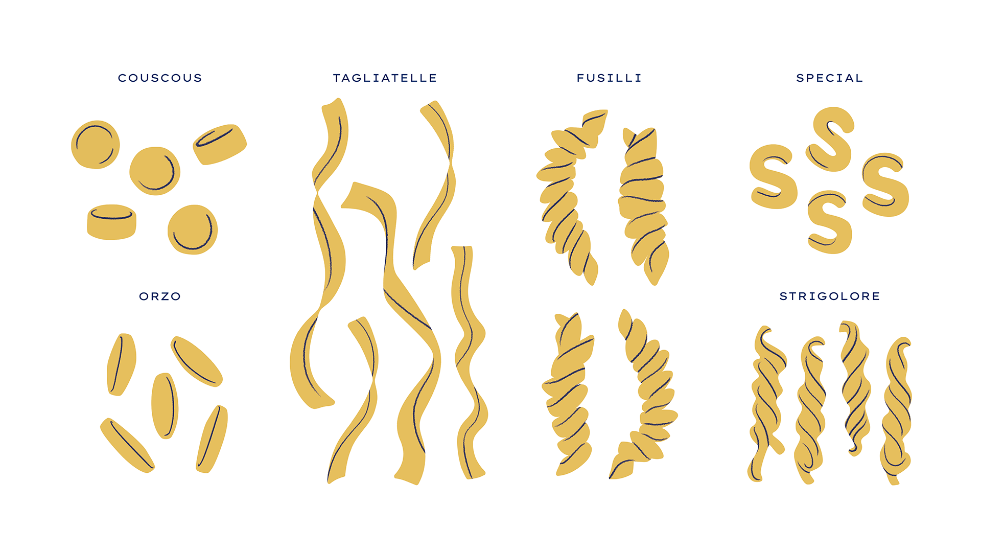
Illustrations were created to bring each pasta variety to life: fusilli became curly hair, orzo formed the treetop, and together they built Mamaland, a whimsical world where one can slide down a tagliatelle or dive into a pool of tomato sauce. Each product received its own illustrated representation, making the different varieties easier to distinguish.To organize the wealth of information the brand needed to communicate, we developed a system of seals and badges. This structure made it easier to present details in both Greek and English, eliminating the clutter of previous layouts.
The main challenge was to convey the brand’s playful spirit without slipping into childishness, balancing lightness with sophistication in line with the high quality already recognized by consumers worldwide. The brand palette combines the Greek flag’s colors with vibrant accents of orange and light blue, creating contrast and freshness.
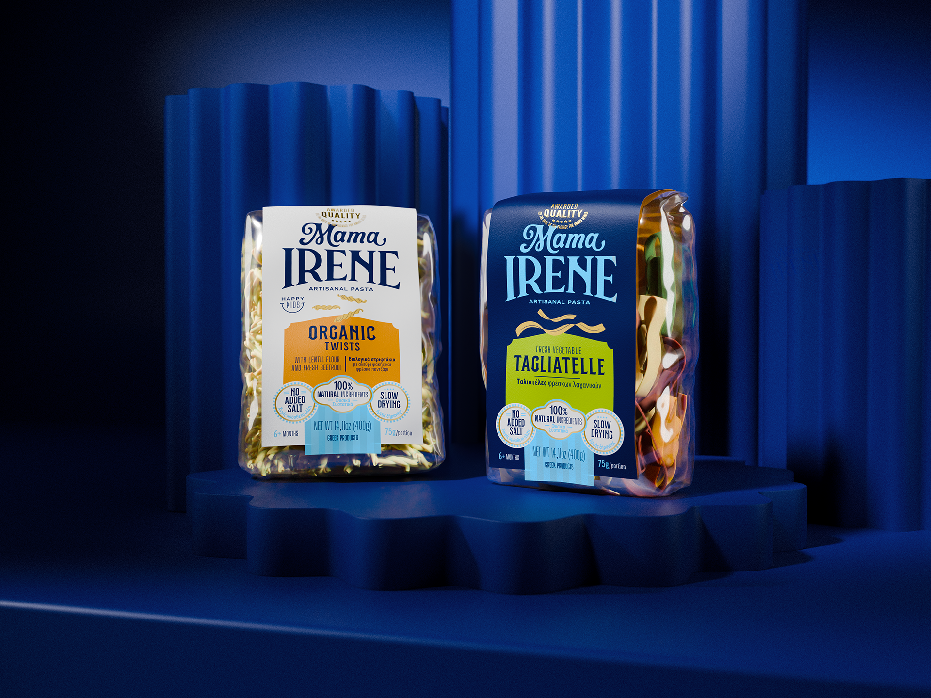
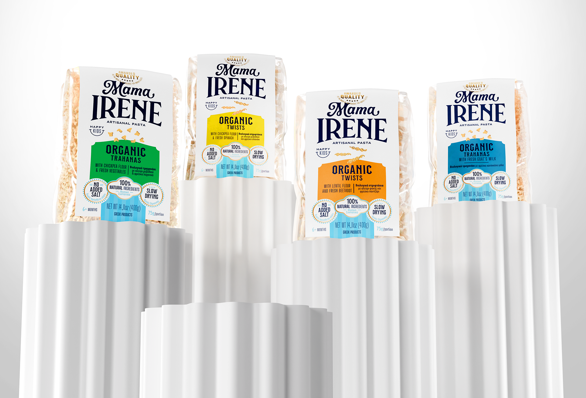
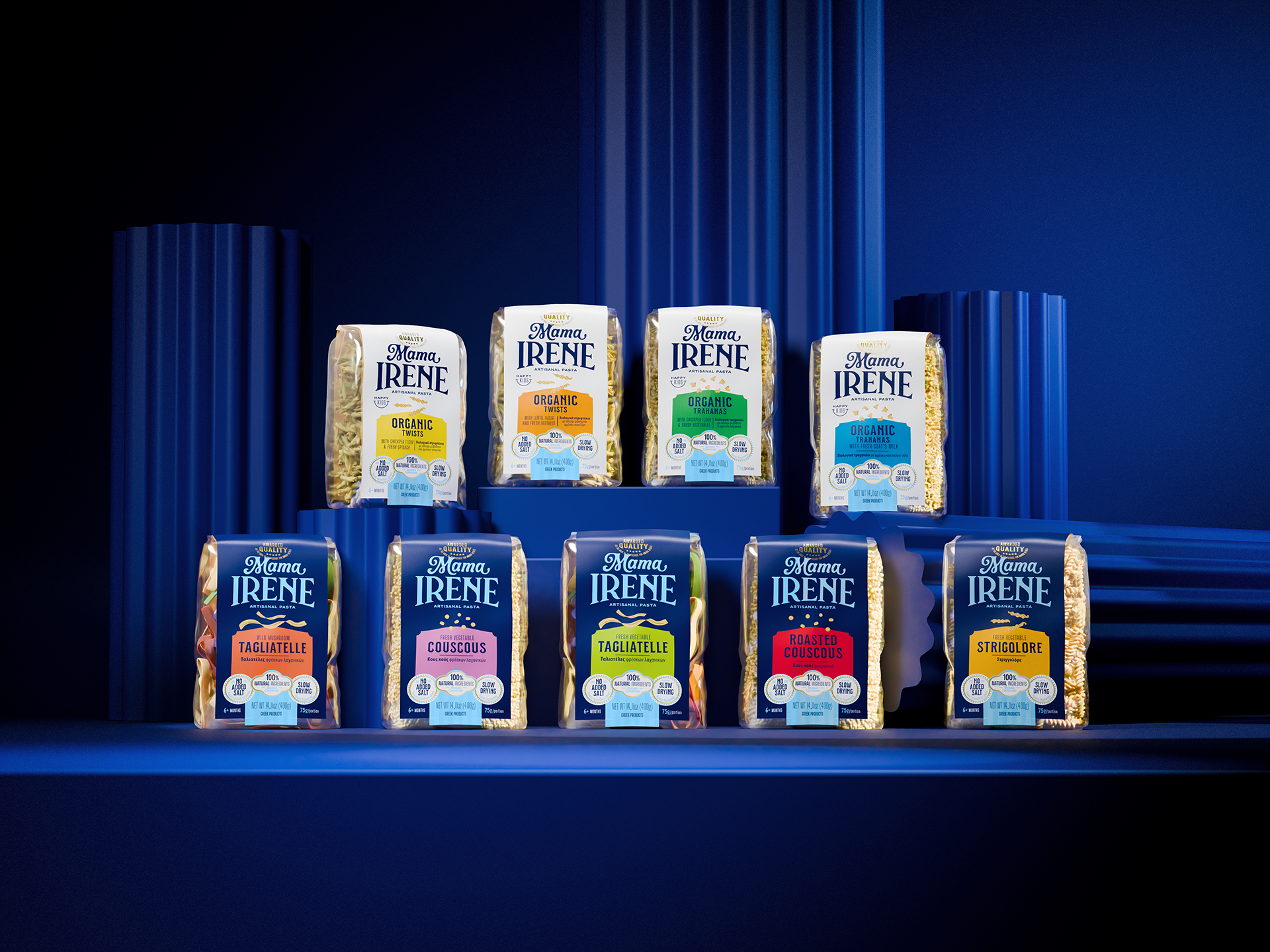
Typography reinforces this universe, blending modernity and tradition to express a unique positioning in the global market. On the packaging, all visual elements were restructured with clear hierarchy, ensuring easy navigation and communication. A dedicated product color palette was also introduced: vivid tones distinguish each SKU, while base colors play a key role across ranges—navy blue for the traditional line and white for the organic line.
The process struck a balance between Greek heritage and the founders’ spontaneity, resulting in a brand that is vibrant, authentic, and proud of its origins. By avoiding Italian clichés commonly used in the pasta category, Mama Irene asserts its Greek identity with confidence—standing out for its uniqueness, memorability, and cultural expression.