MARIA ANTONIETA TEAS
Year: 2024
Category: Food
Context
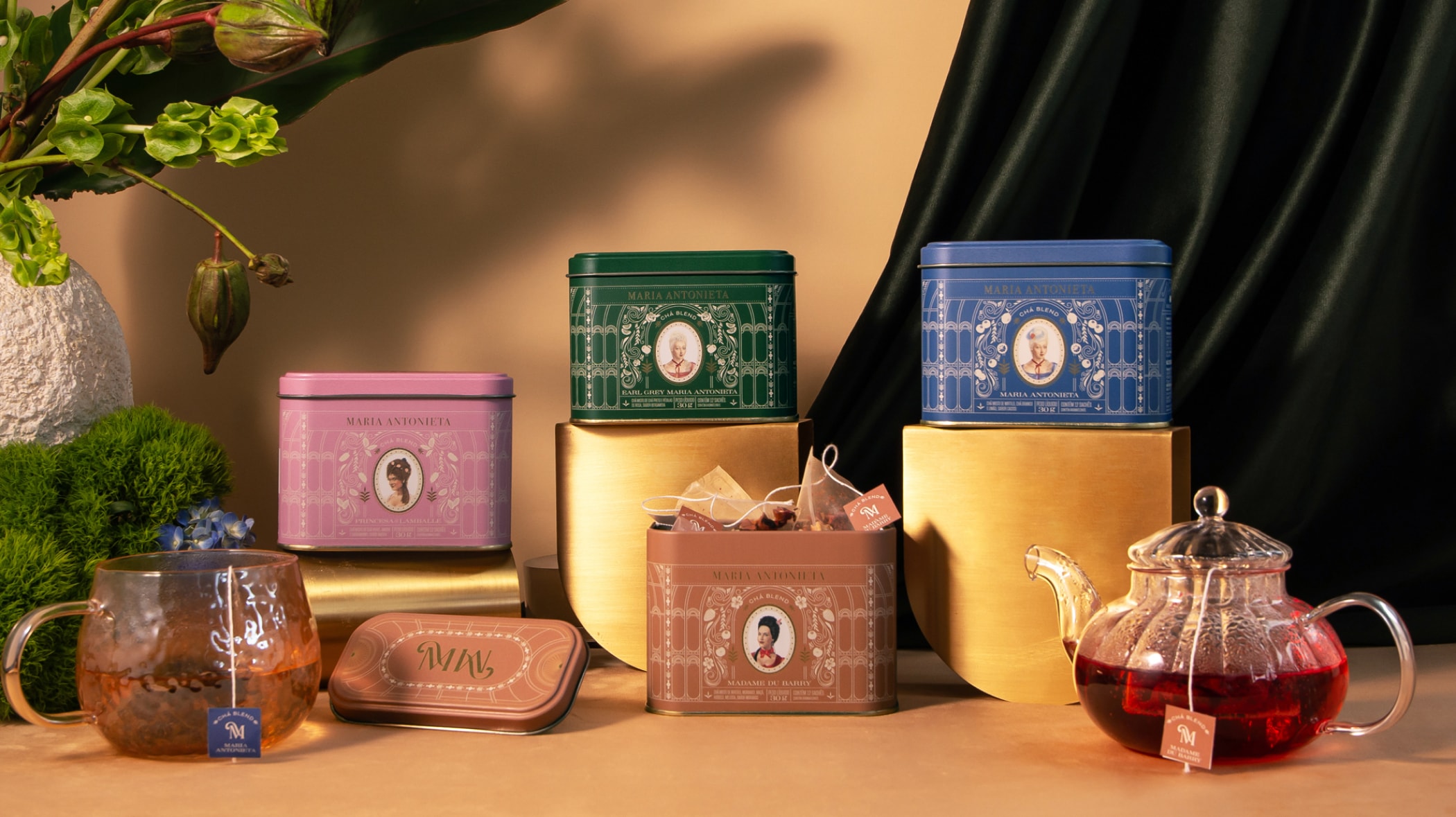
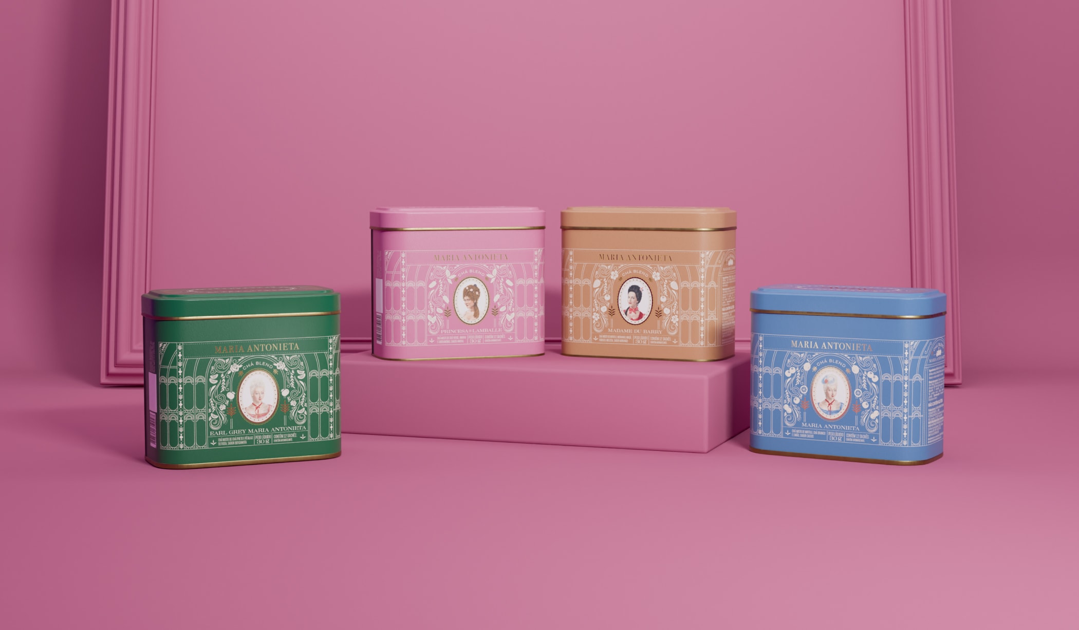
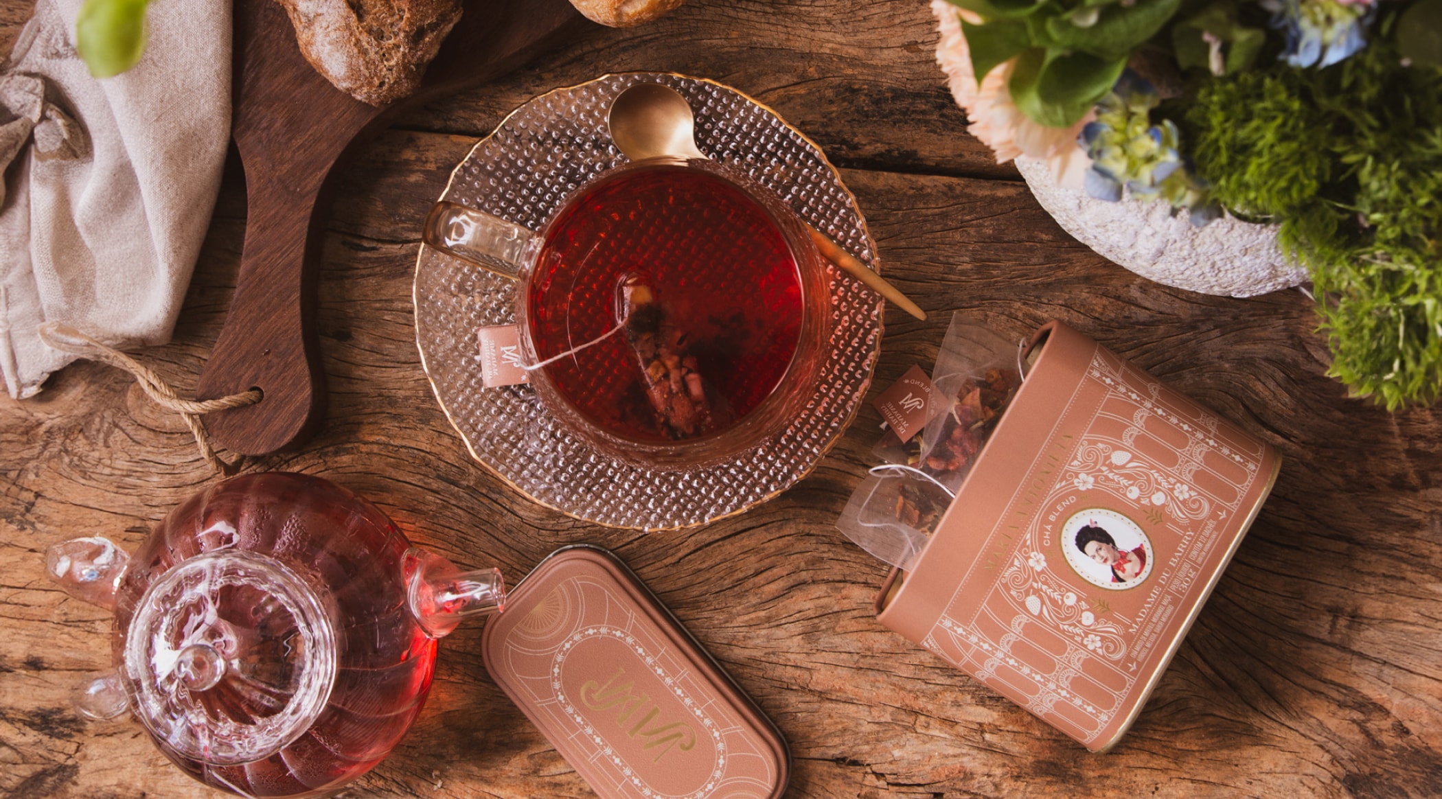
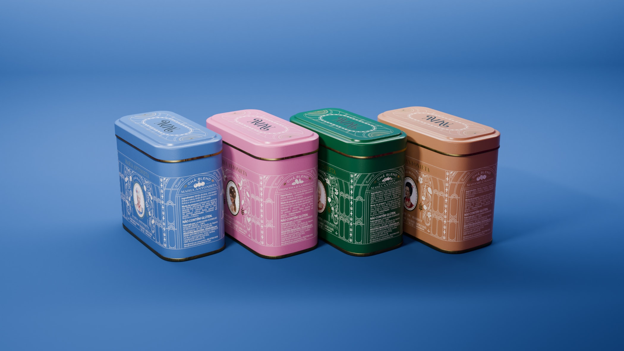
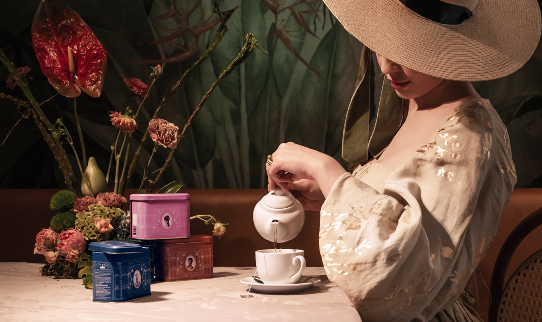
Tea cans for luxury brand Maria Antonieta. Despite the challenge of limited space for layout, the design successfully tells an enchanting story.
What we did in this project
Packaging design.
Development
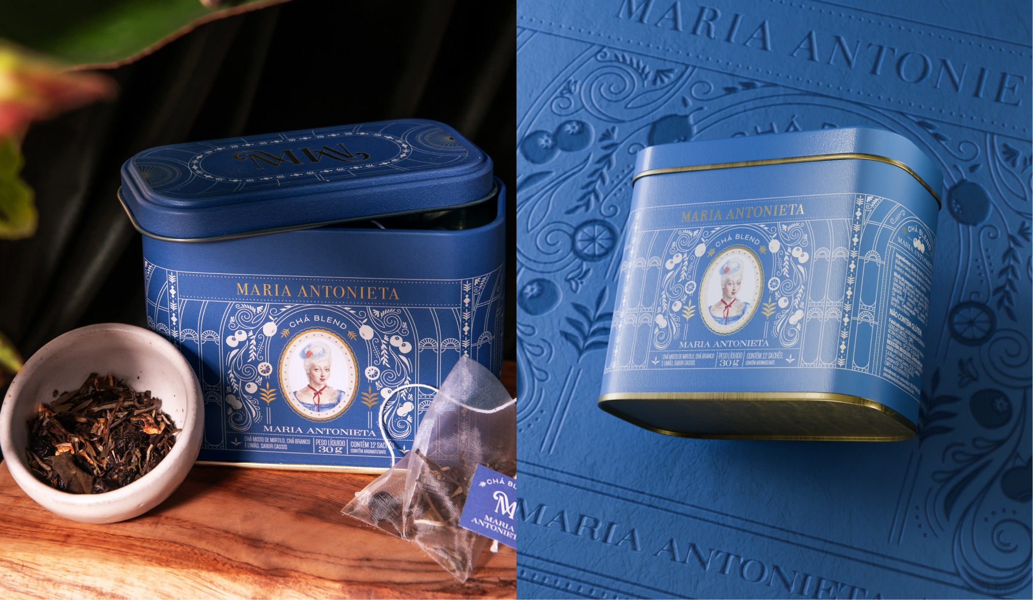
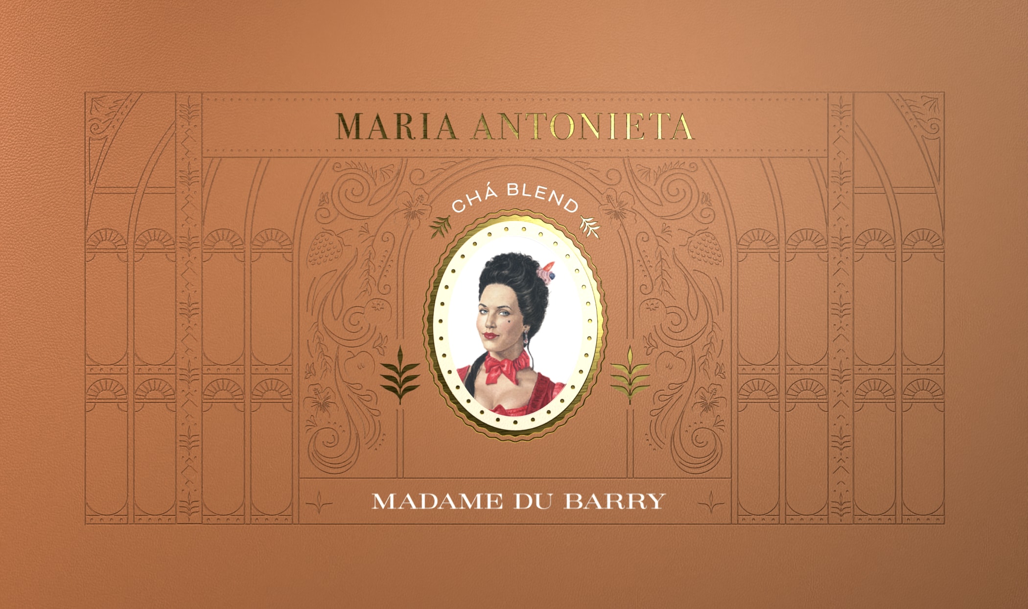
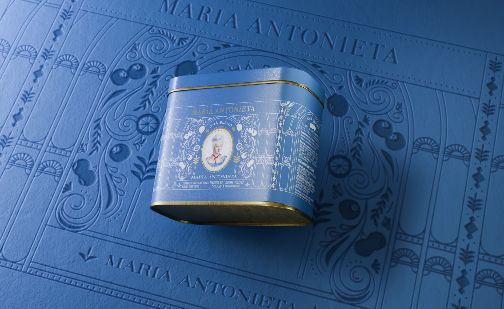
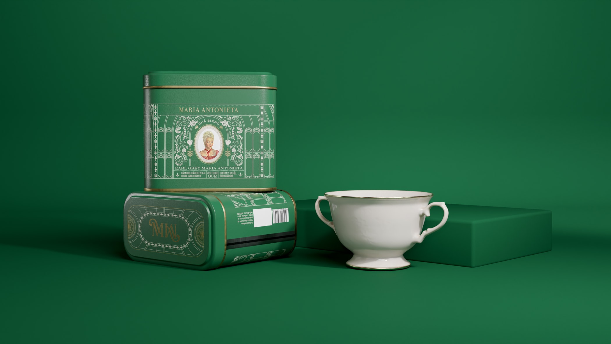
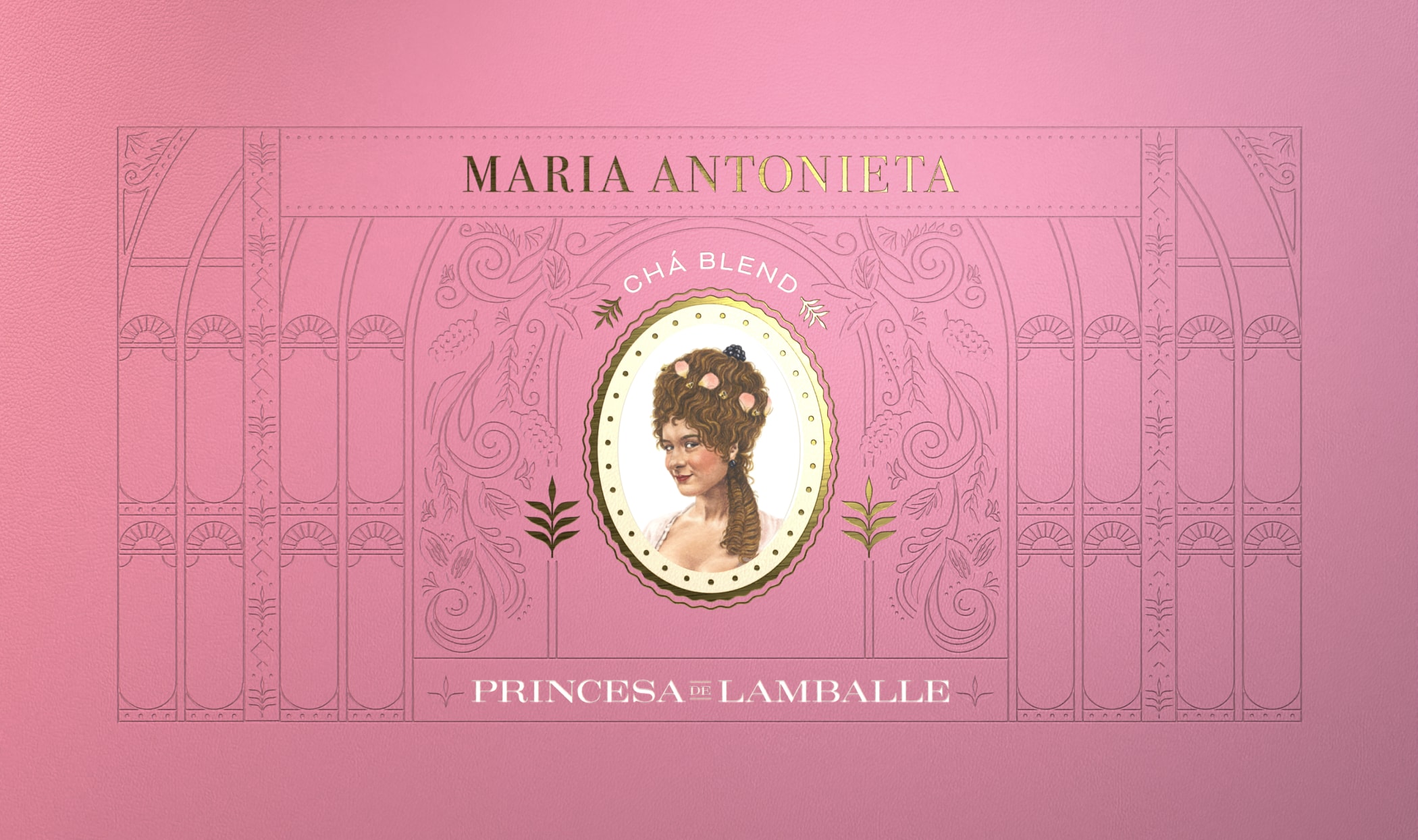
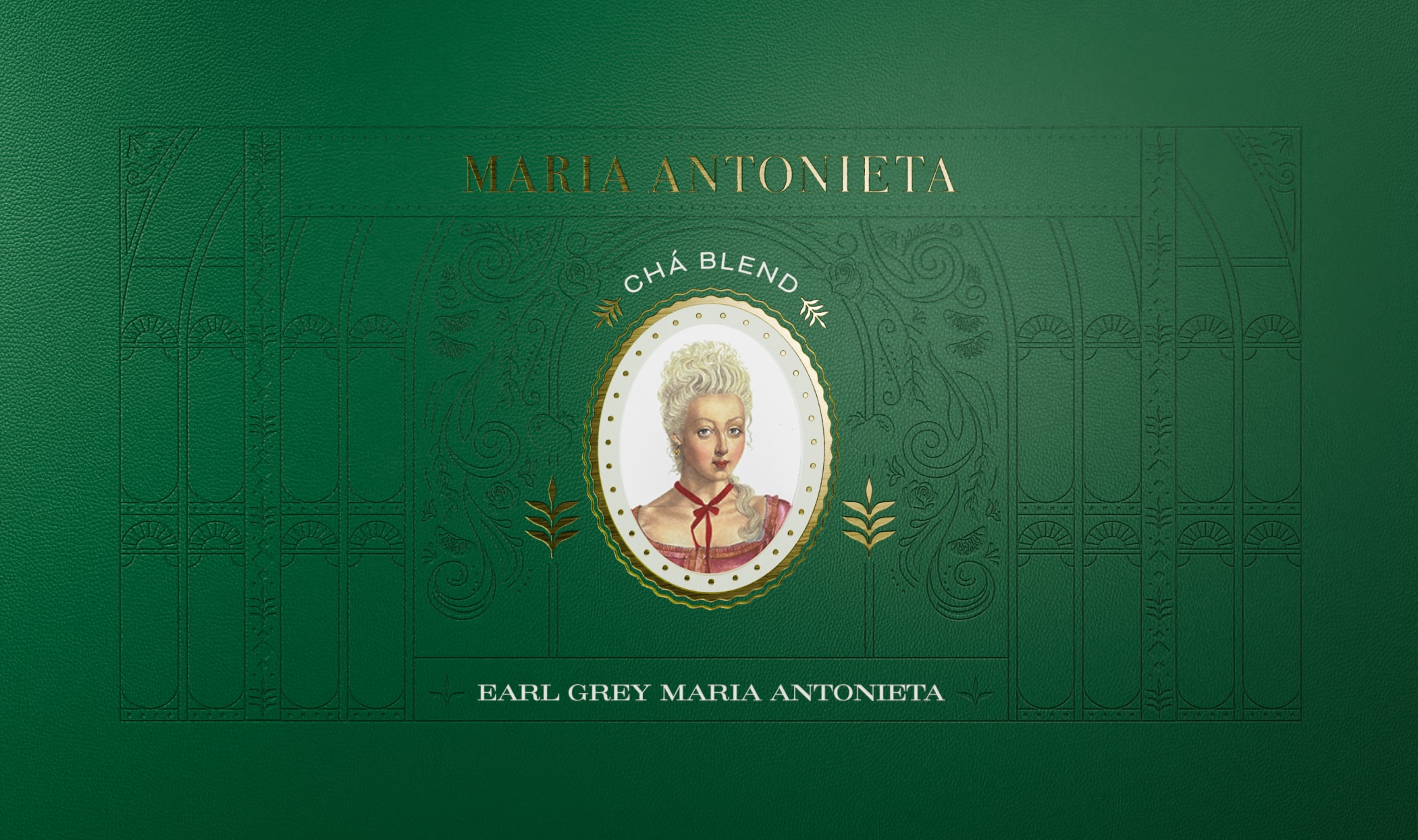
While we often use striking elements and ultra-saturated colors to make packaging stand out, this project took a different approach. Here, the focus was on the delicacy of the shapes, the subtlety of the font size, and the graceful adornments and curves. The design of each can in Maria Antonieta's tea line invites consumers to explore every detail and feel special about owning such an exclusive product.
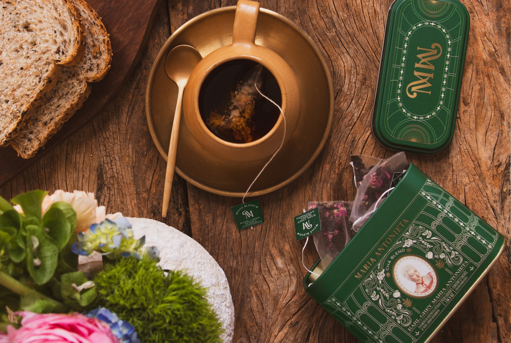
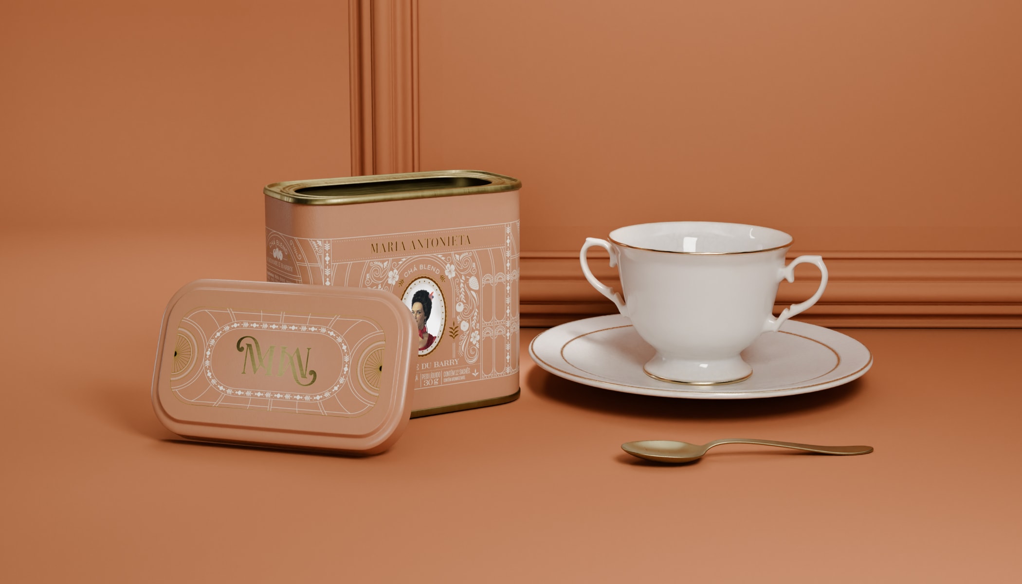
We drew our main inspiration from art nouveau garden greenhouses, with their metal and gloss structures. Imagining these as the perfect setting for an afternoon tea among the ladies of the French court, we set out to create our own representation of these architectural marvels found in various European palaces.
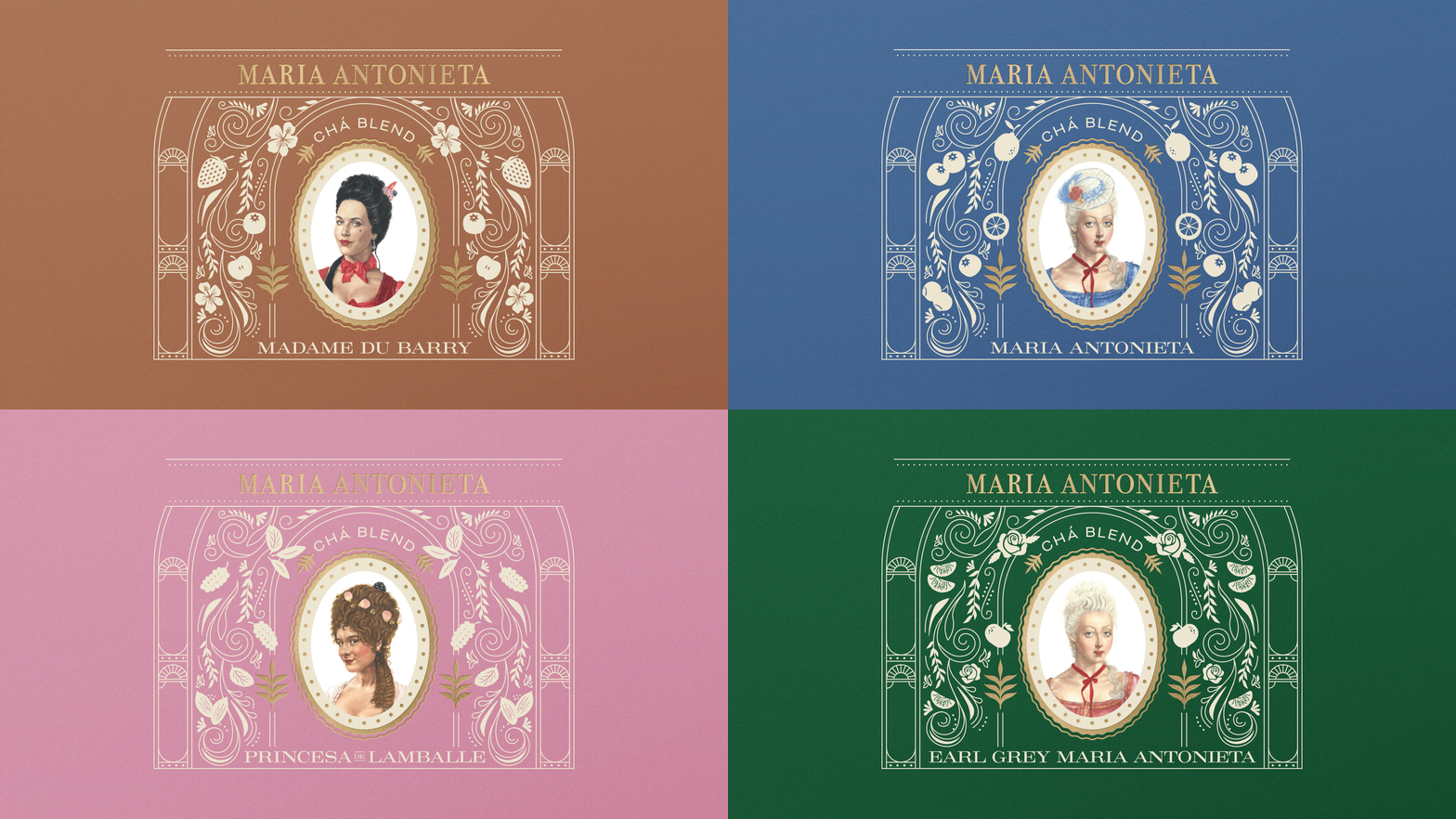
Each tea flavor was assigned a unique color to distinguish it from the others, along with illustrations of elements related to the ingredients, and a cameo of a character such as Queen Marie Antoinette, Princess of Lamballe and Madame Du Barry. The lids of the cans feature designs reminiscent of the roofs of these beautiful garden domes, adding to the storytelling.
