玛丽·安托瓦内特咖啡.
Maria Antonieta Coffee
年份/Year:2024
行业/Category:饮品/Beverage
MELT是一家总部位于巴西和美国的平面设计工作室,成立于2010年。我们拥有一个多学科团队,专注于为全球产品打造美丽且引人注目的包装设计。
MELT is a graphic design studio based in Brazil and the U.S., founded in 2010. With a team that has a diverse skill set, we specialize in creating beautiful and captivating packaging designs for products worldwide.
背景
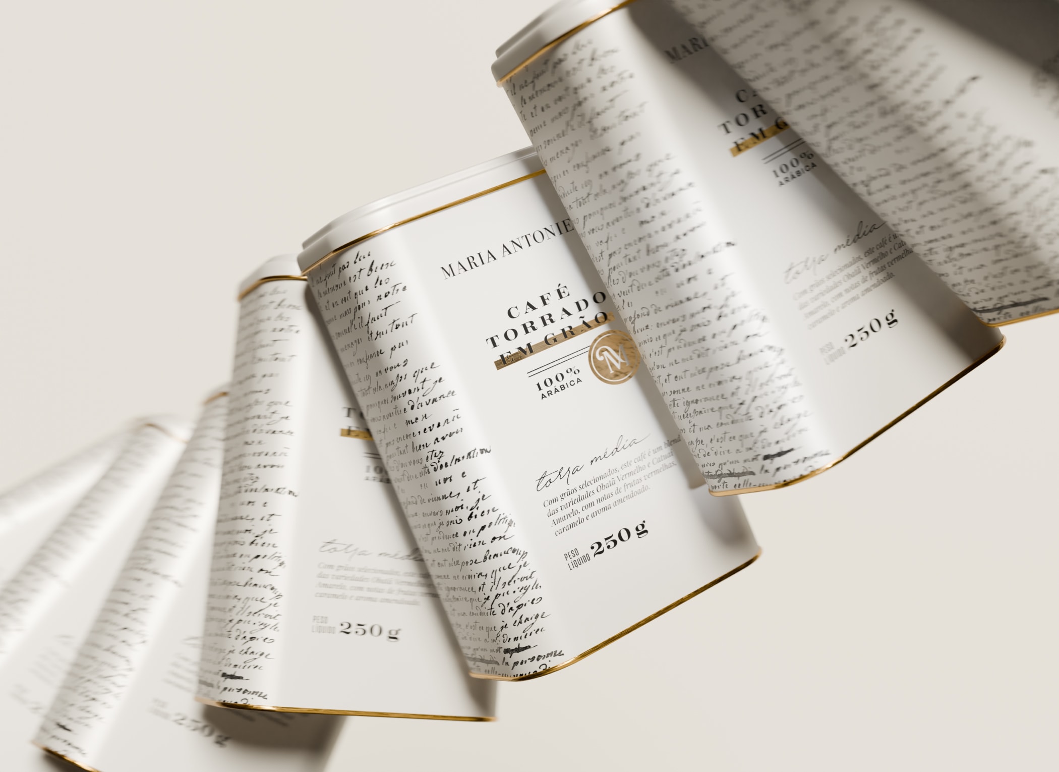
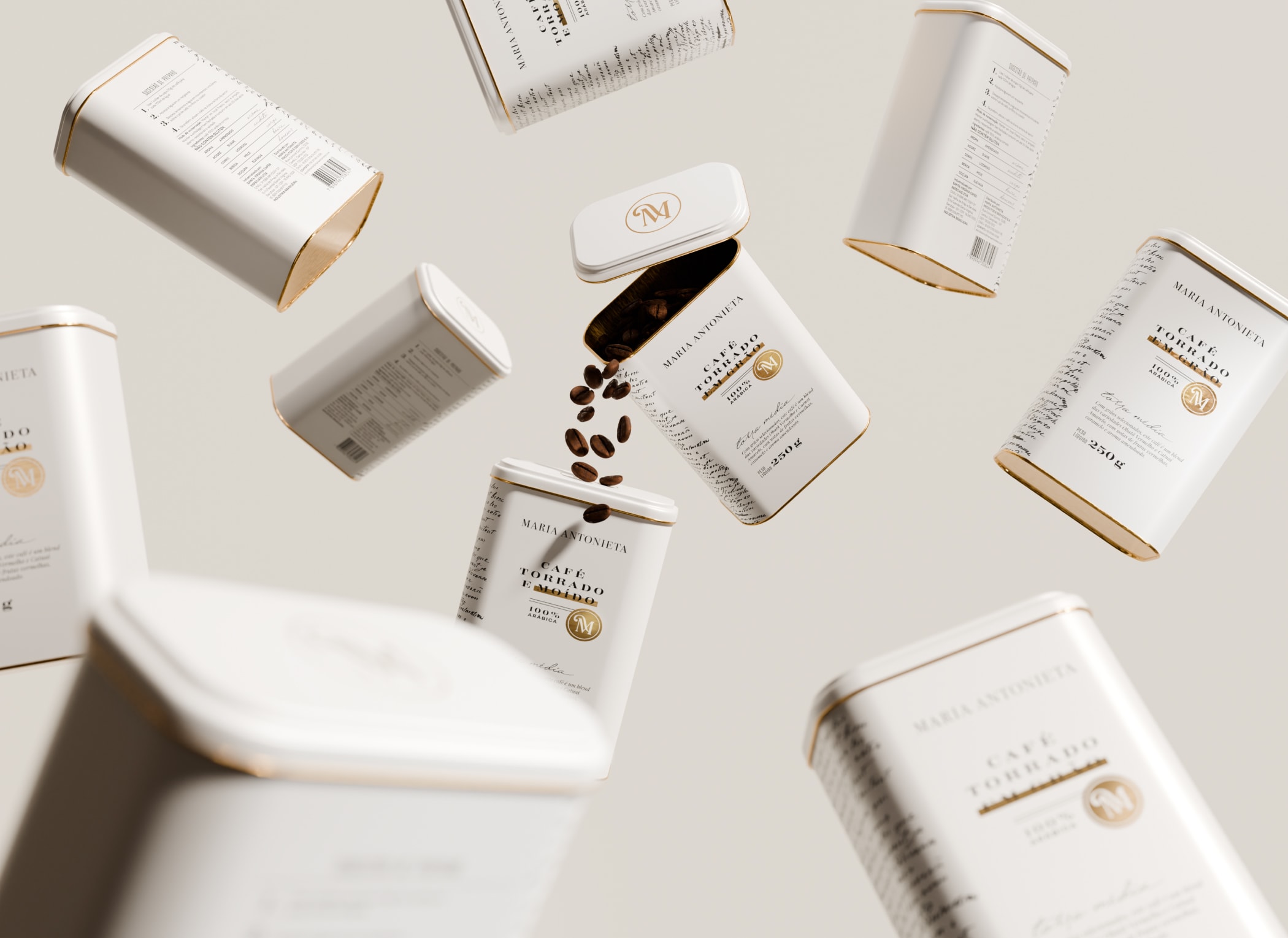
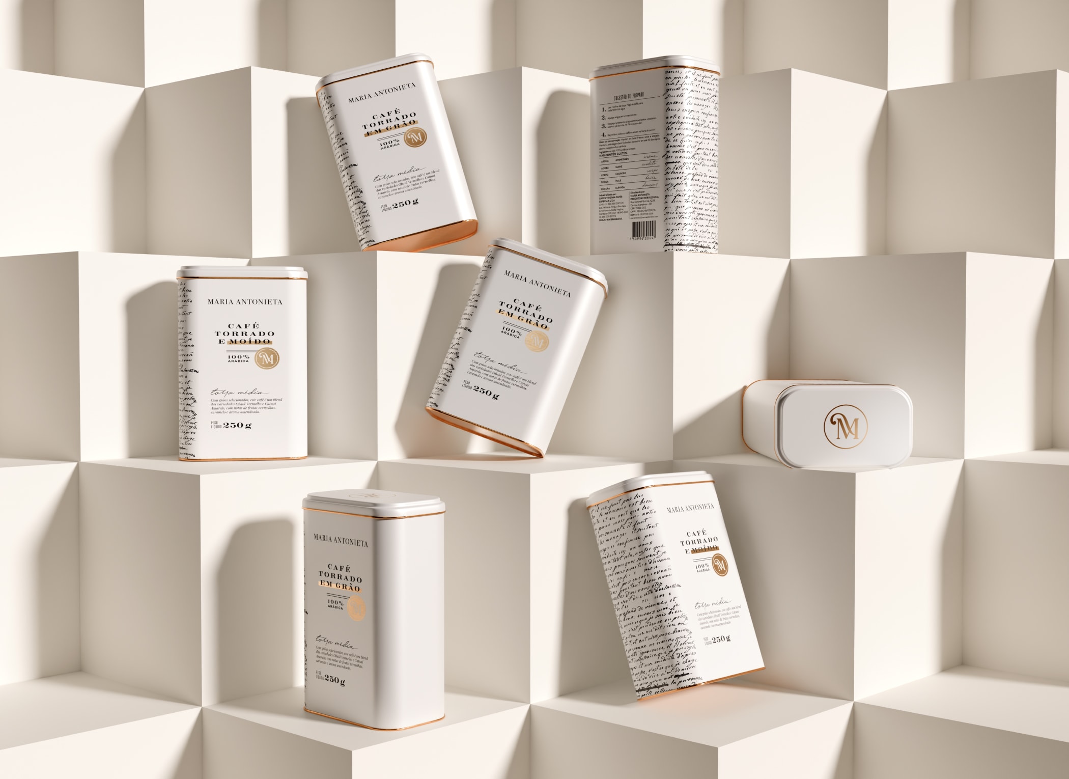
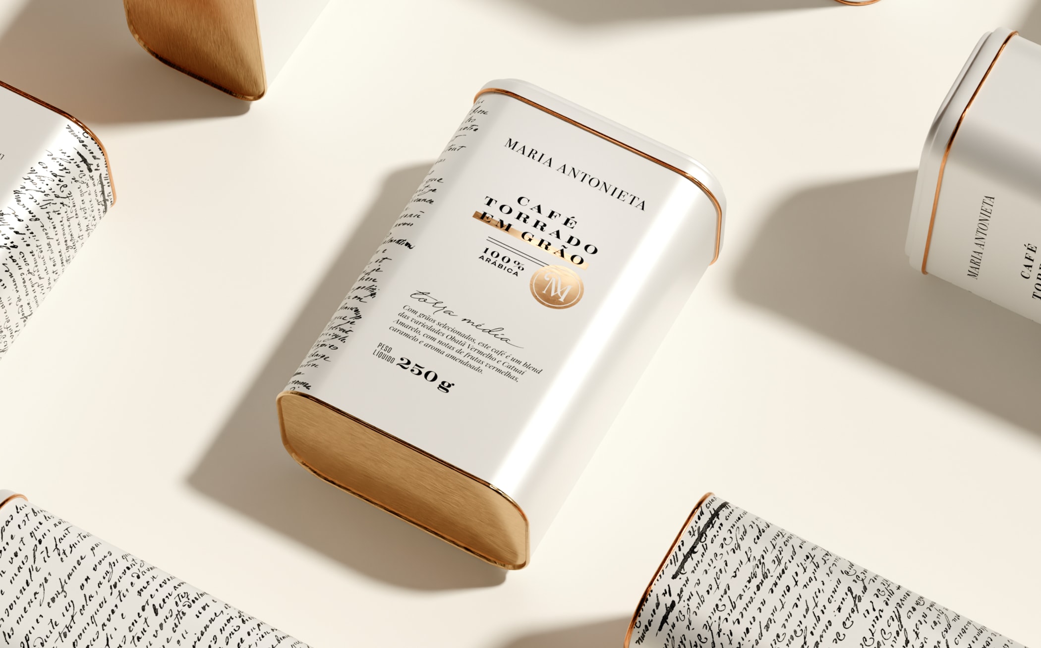
在开发 Maria Antonieta 咖啡包装时——这是一个法式风格的餐馆、面包房、糕点店和巧克力店,拥有自己的品牌——我们希望打造一种简洁而优雅的美学。我们的想法是,让咖啡成为整个产品组合中的一个“呼吸空间”,在大多数设计繁复且极具装饰性的包装中,为品牌注入一丝轻盈感,同时仍保持其高端市场的品牌定位。包装的灵感来源于玛丽·安托瓦内特与她的传闻情人阿克塞尔·冯·费尔森伯爵之间秘密交换的涂改和加密信件。
我们的工作
包装设计。
设计过程
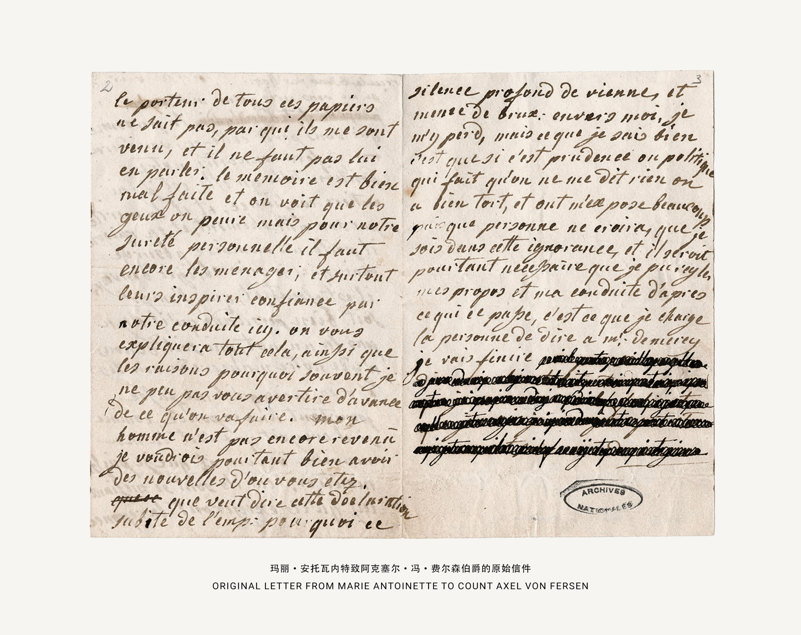
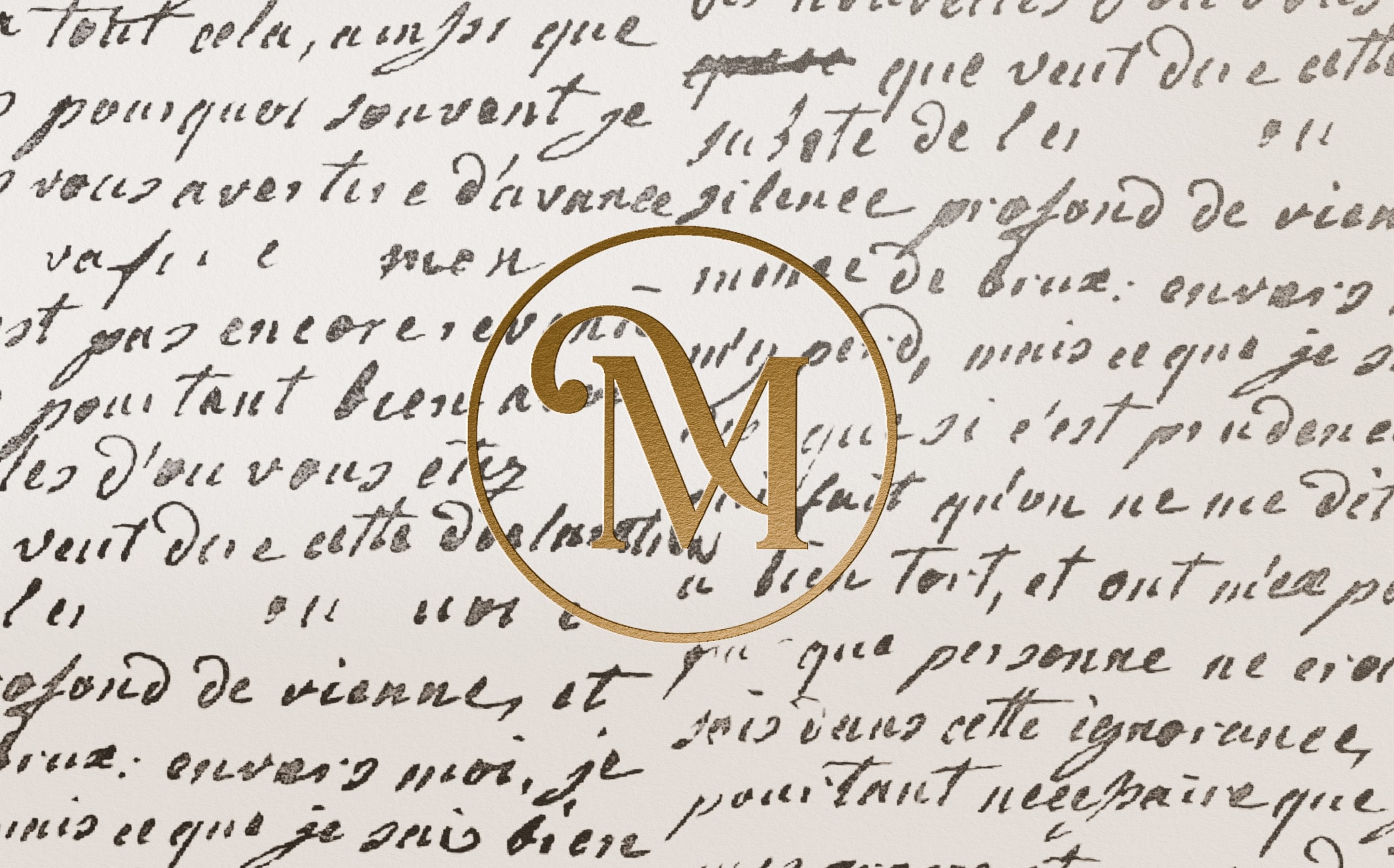
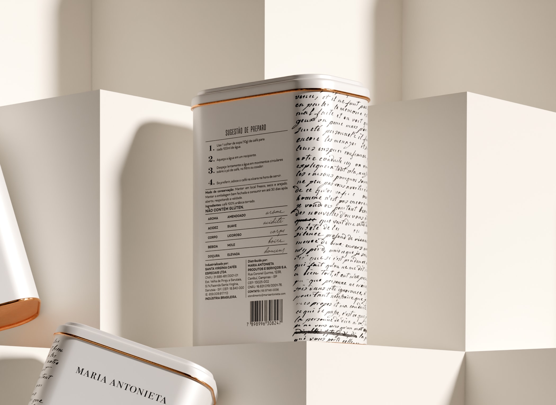
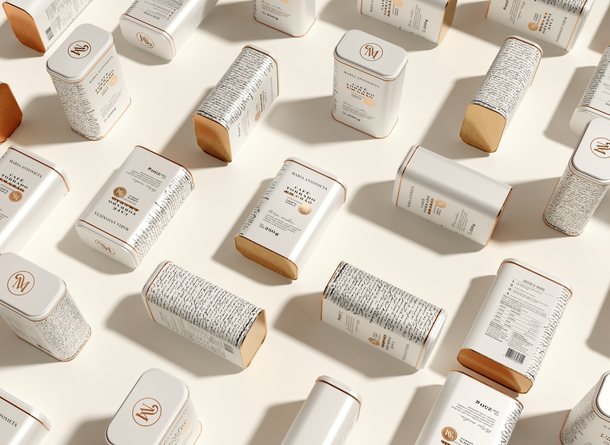
还有比“信件”更浪漫的方式来表现法国——Maria Antonieta 品牌的灵感来源——以及它的“爱情之都”巴黎吗?在我们看来,这正是最合适的象征。但我们决定更进一步,深入研究这位王后与信件之间的故事。我们发现,在 1791 年至 1792 年间,玛丽·安托瓦内特曾与她的传闻情人阿克塞尔·冯·费尔森伯爵互通书信。为了防止信件内容被发现,他们使用了密码,将随机字母插入单词中,甚至涂抹和删除部分内容。几十年后,研究人员解读出了部分词语,如“挚爱”、“亲密朋友”和“疯狂地(爱你)”。这个故事被永久铭刻在咖啡罐的侧面,以一种简洁而不失奢华的设计风格,捕捉了法国的浪漫与精致。罐子的侧面印有一封原始信件的复制品,其文字在白色背景上脱颖而出,并延伸至正面和背面,形成和谐的视觉连续性。包装上特定位置还精心加入了烫金工艺,为整体增添了一抹奢华感,使其成为一款极具赠送价值的包装设计——这一点对于品牌和消费者而言都至关重要。
Context
For the development of Maria Antonieta’s coffee packaging — a bistro, boulangerie, pâtisserie, and chocolaterie with its own brand — we sought for a clean yet charming aesthetic. Our goal was to make the coffee stand out as a refreshing contrast within a product portfolio, which was fulfilled by rich and maximalist designs, while also maintaining the brand’s positioning in the luxury market. The packaging design was inspired by the coded and redacted letters secretly exchanged between Marie Antoinette and her alleged lover, Count Axel Von Fersen.
What we did in this project
Packaging design.
Development
Is there a more romantic way to represent France – the inspiration behind the creation of Maria Antonieta – and its City of Love, Paris, than through letters? For us, this felt like the perfect symbolism. However, we decided to go further and deeply explore the queen’s history and her connection to letters.
We learned that, between 1791 and 1792, Marie Antoinette exchanged a series of letters with her alleged lover, Count Axel Von Fersen. To keep the content of their messages secret, they used codes, adding random letters to words or censoring entire phrases with redactions. Decades later, researchers uncovered words such as “beloved,” “dearest friend,” and “madly.” This story was immortalized on the sides of coffee cans through a clean yet luxurious layout that captures the romance and sophistication of France.
The side of the can features a reproduction of one of the original letters, with the words standing out against a white background and extending across the front and back views, creating a seamless visual flow. Golden details, carefully applied to specific areas of the packaging, add a touch of luxury and sophistication, making the packaging a highly presentable piece – an important aspect for the brand and its consumers.
让我们成为您精彩项目的一部分吧!
LET US BE A PART OF YOUR AMAZING PROJECT?


![[PT] As embalagens de Zaytas, desenhadas aqui na MELT, vem com o propósito de trazer algo novo, sem romper com a essência da marca, já tão familiar para o público.
Cor, layout, ilustrações, textura: tudo faz parte da comunicação, fortalecendo o posicionamento de que, sim, alimento saudável é gostoso.
////////
[EN] The packaging for Zaytas, designed here at MELT, was created to bring something new without breaking with the brand’s essence, which is already so familiar to its audience.
Color, layout, illustrations, texture: everything is part of the communication, reinforcing the idea that healthy food can, indeed, be delicious.
#graphicdesign #packagingdesign #branding #designbrasileiro #MELTDesign](https://meltdesign.com.br/wp-content/plugins/instagram-feed/img/placeholder.png)