
Context
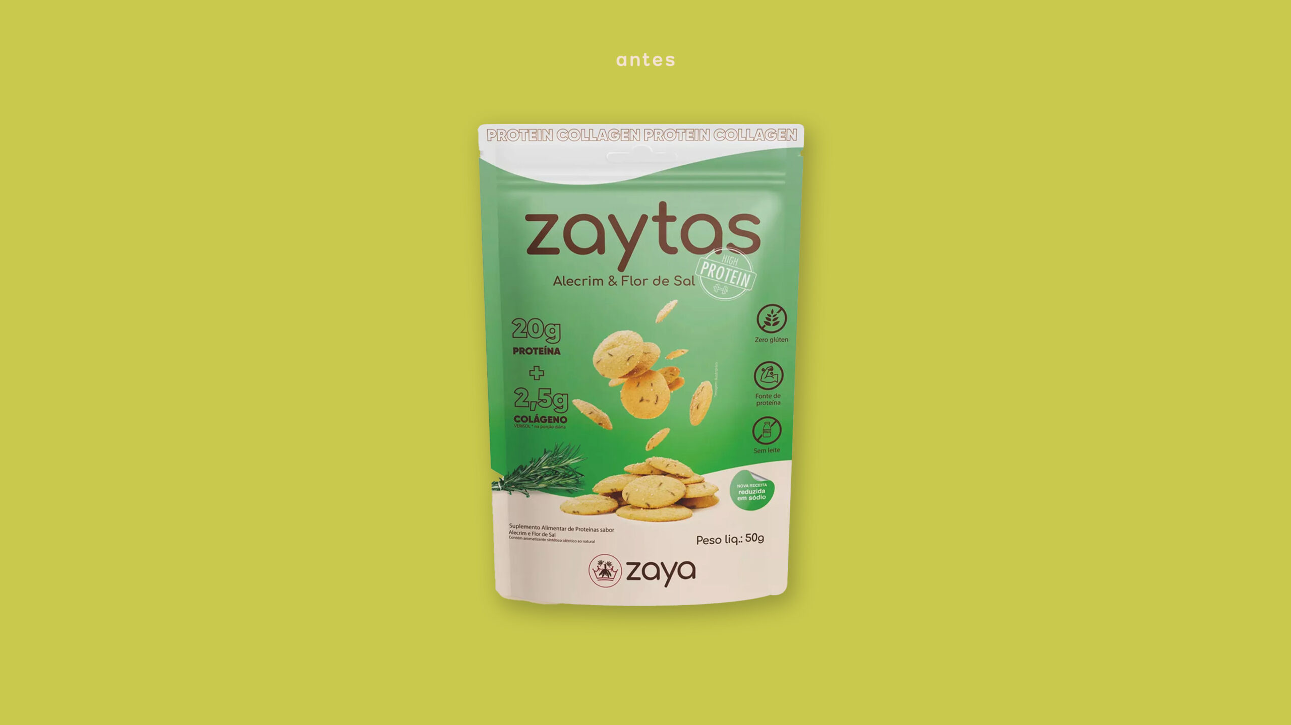
Zaya began as a brand offering a single-ingredient flour: cassava. Over time, it expanded its portfolio, always focusing on products that are safe for people with severe allergies or gluten intolerance, strengthening its position in the “healthy snacks” category. As part of its strategy, the brand seeks to challenge the misconception that “healthy food isn’t tasty” and to show that dietary restrictions are not a barrier to creativity. In 2024, after receiving investment from a group equally committed to healthy eating, Zaya felt the need to reposition its brand, identity, and packaging.
What we did in this project
Brand Strategy, Visual Identity, Typography, and Packaging Design
Development
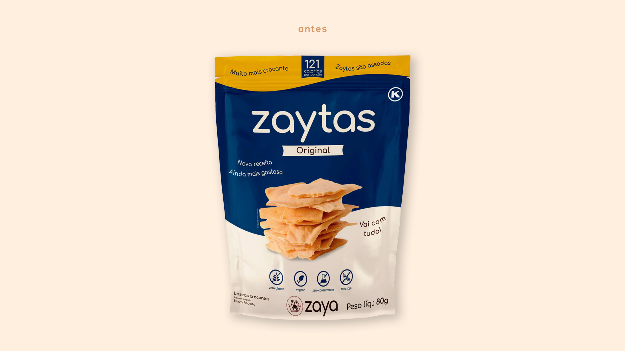
The first step was to strengthen the brand’s presence within the group’s portfolio. The cassava illustration, once part of the logo, was removed to make room for a more plural, less niche identity.
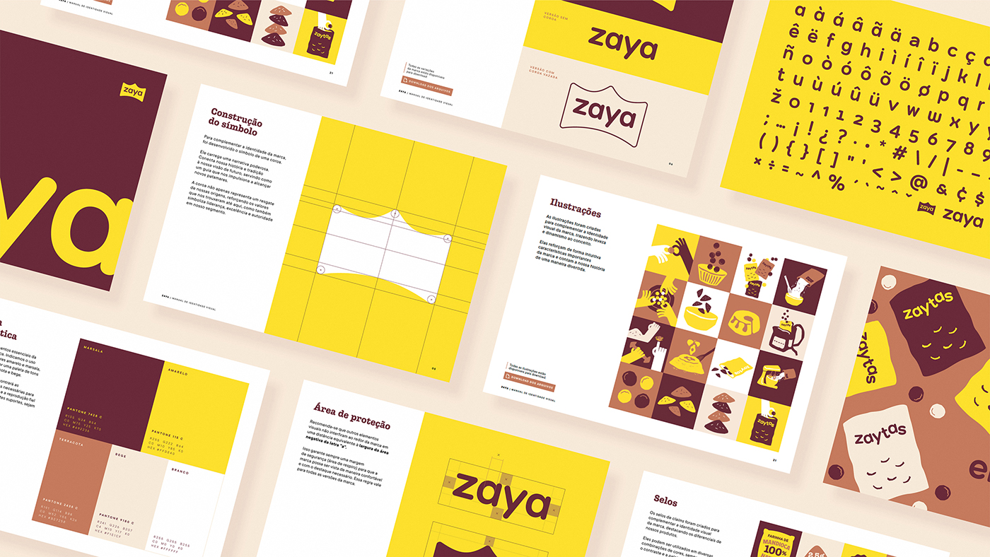
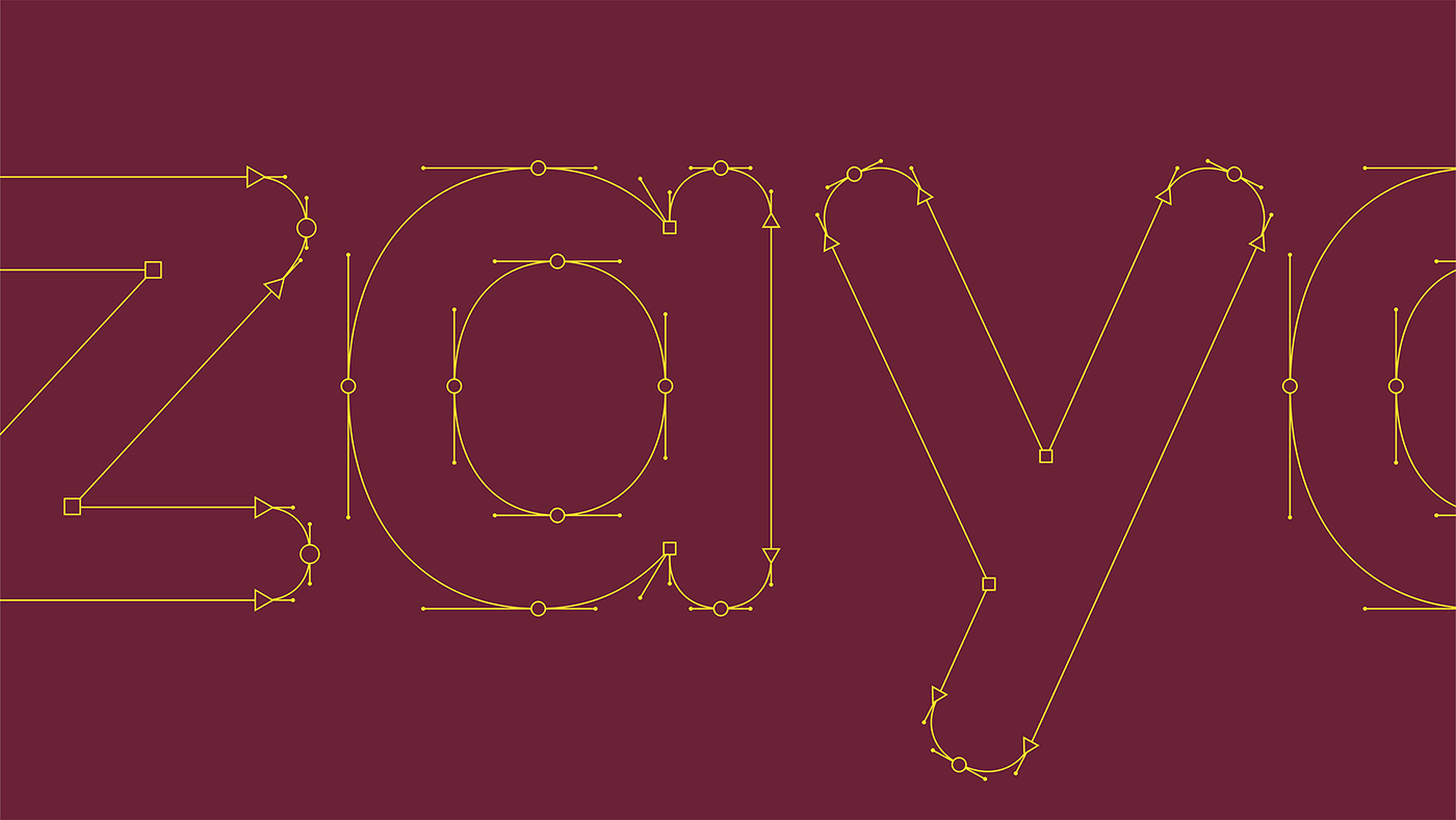
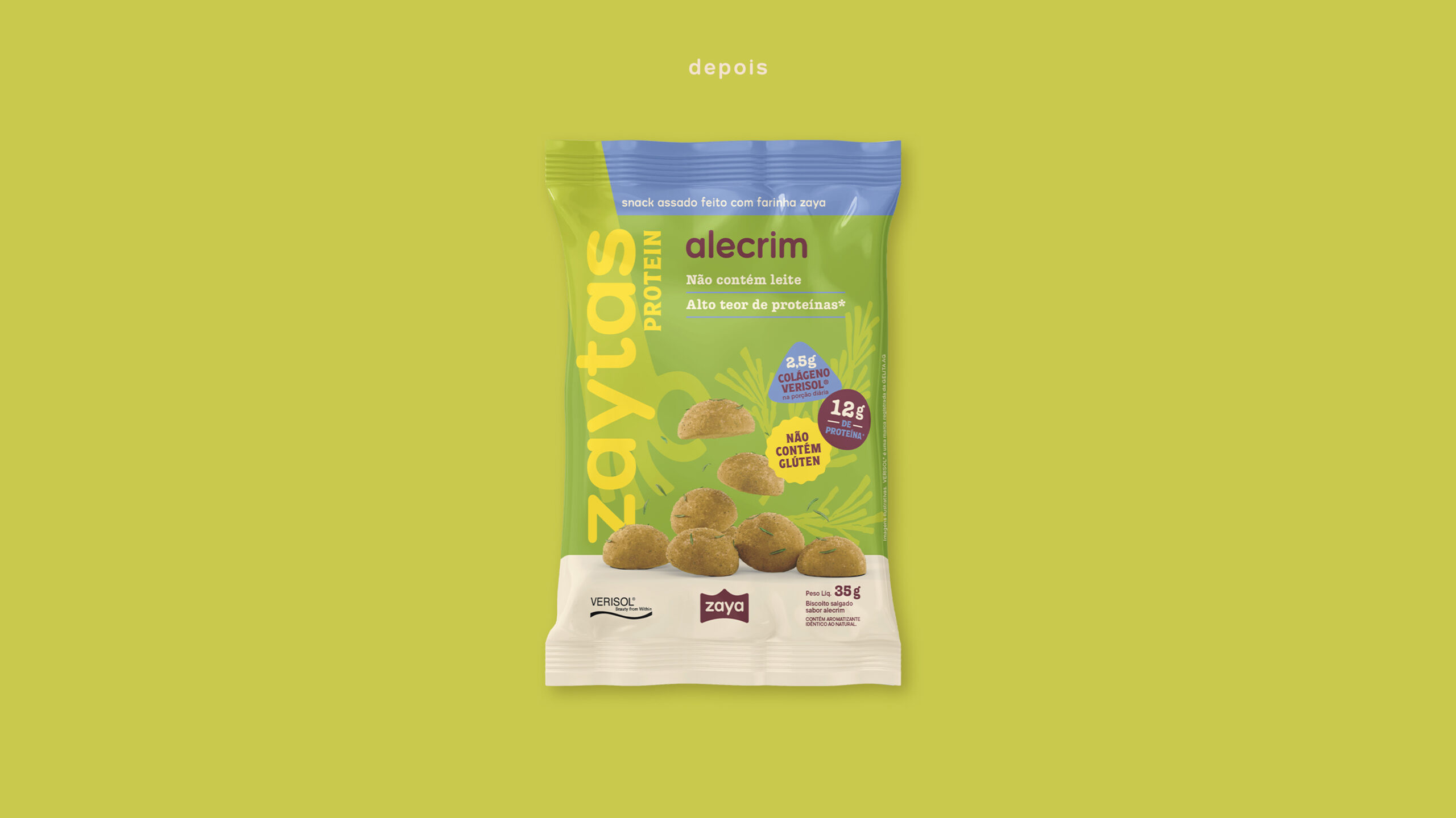
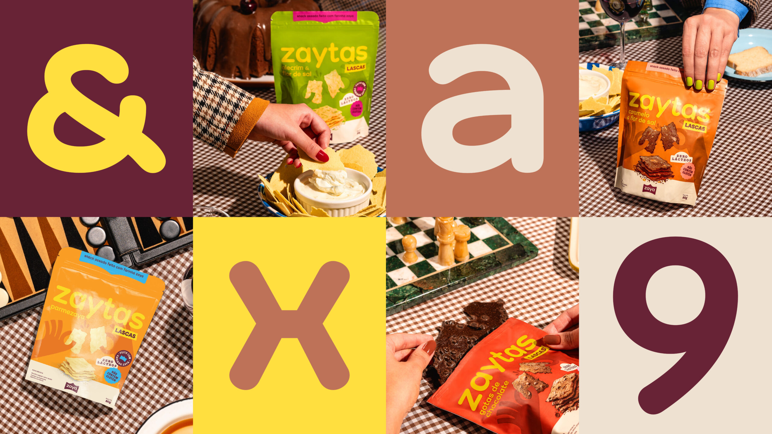
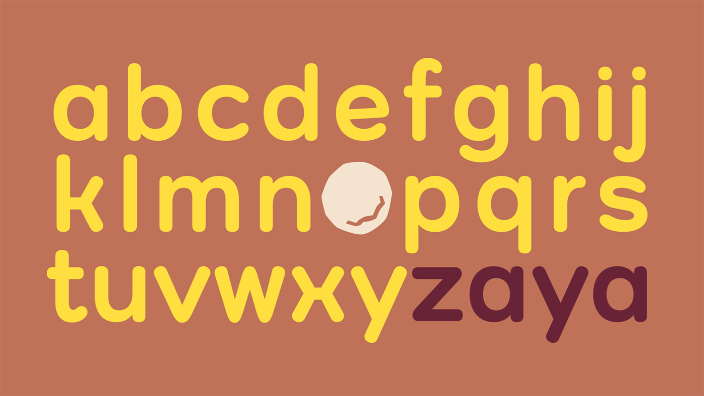
To evolve without losing its essence, the crown, previously placed inside the symbol, became the main element, now embracing the name. To improve legibility, the previously rounded “a” was redesigned, and the entire wordmark gained more weight and confidence.
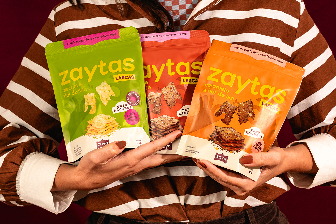
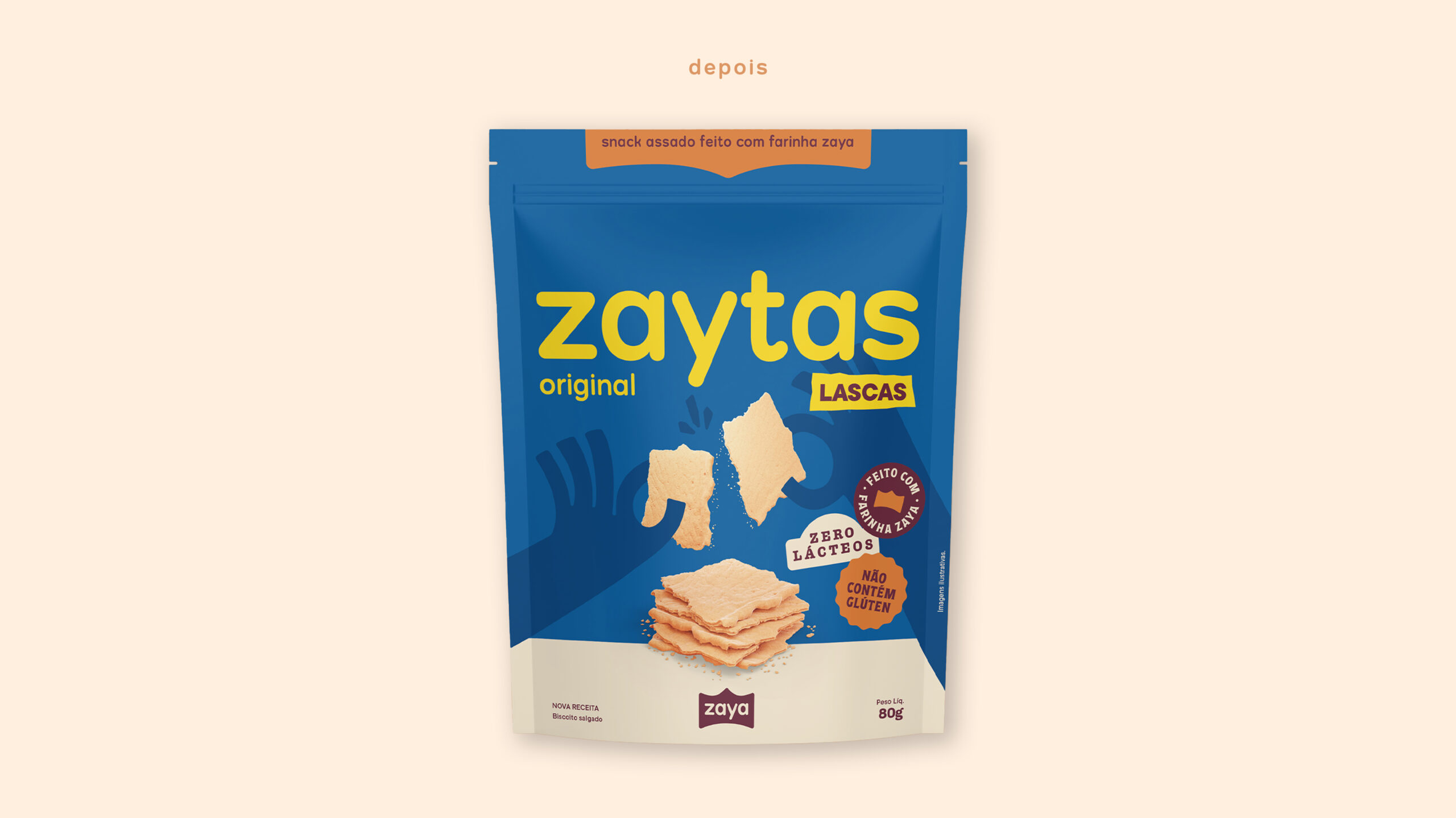
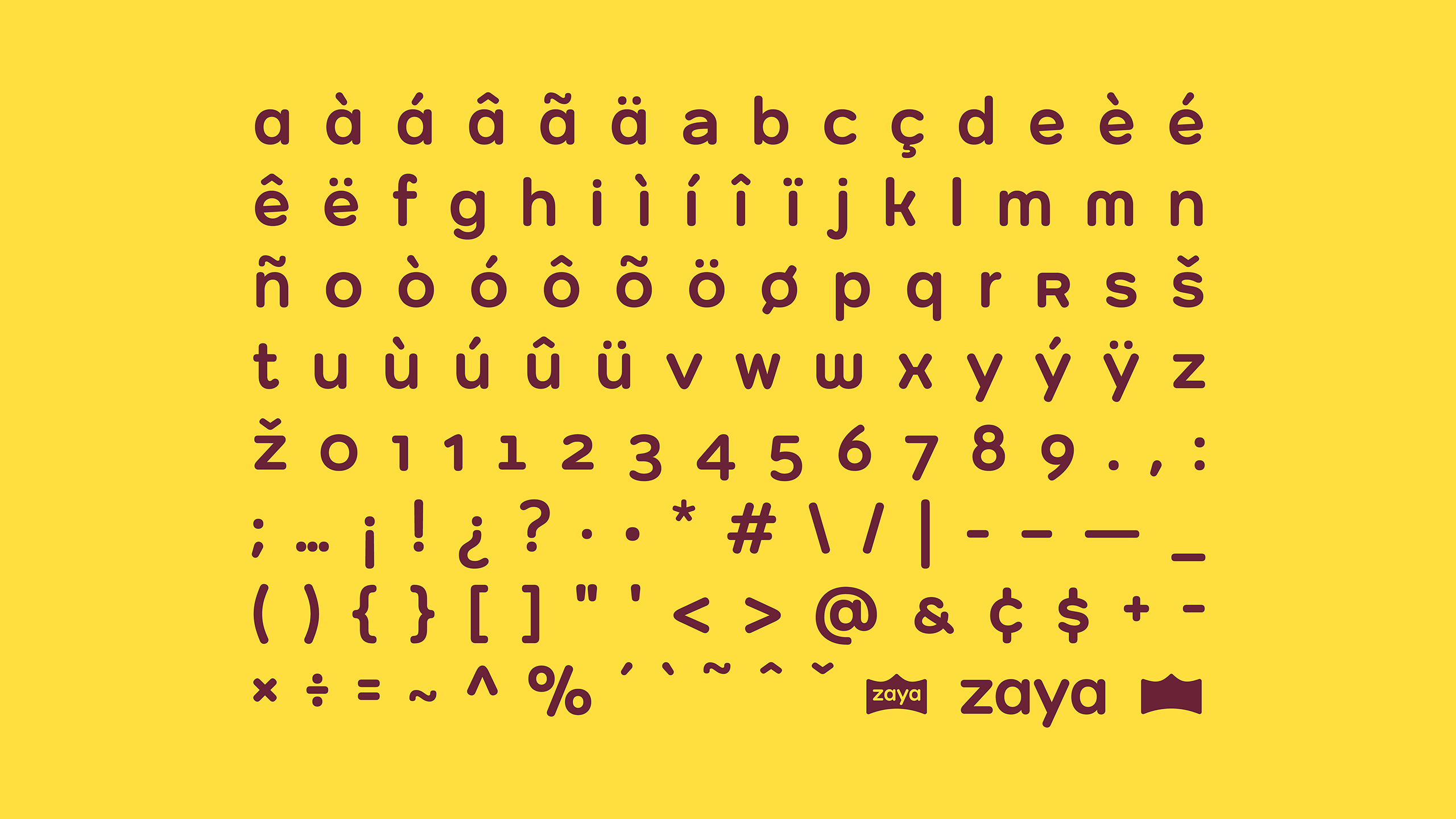
This process gave rise to Zaya Sans, a proprietary and exclusive typeface developed entirely in lowercase. It appears both in the master brand and in the name of Zaya’s signature product, Zaytas, a line of healthy, flavorful snacks. With its rounded terminals (a subtle nod to the previous logo), the font includes oldstyle numerals designed to flow naturally with ascenders and descenders, as well as alternate character pairs that add a touch of “seasoning,” expanding creative possibilities across all brand communications. The family also includes diacritics and symbols to support Portuguese, English, and Spanish, ensuring consistency across markets.
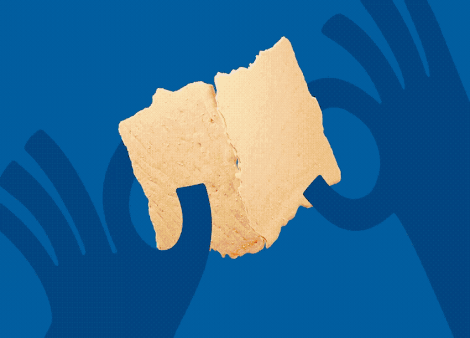
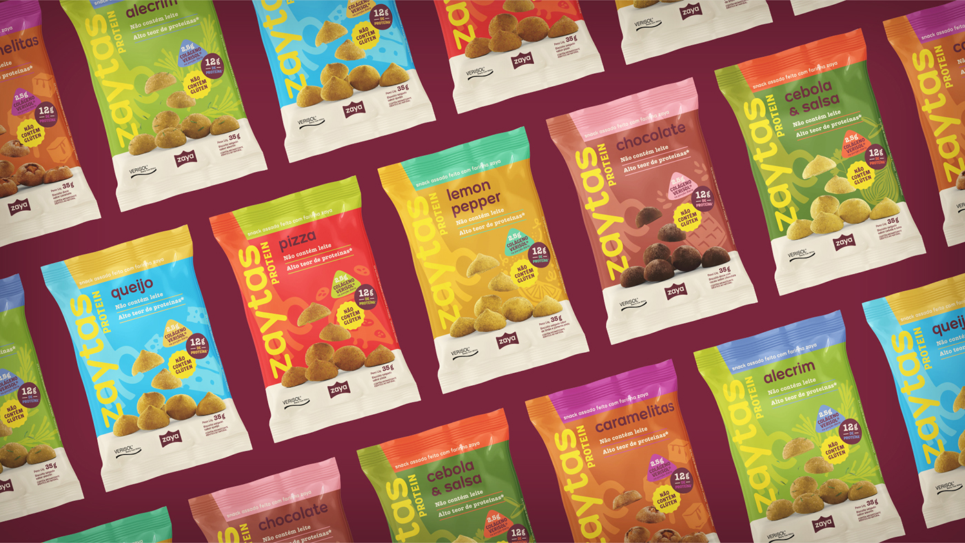
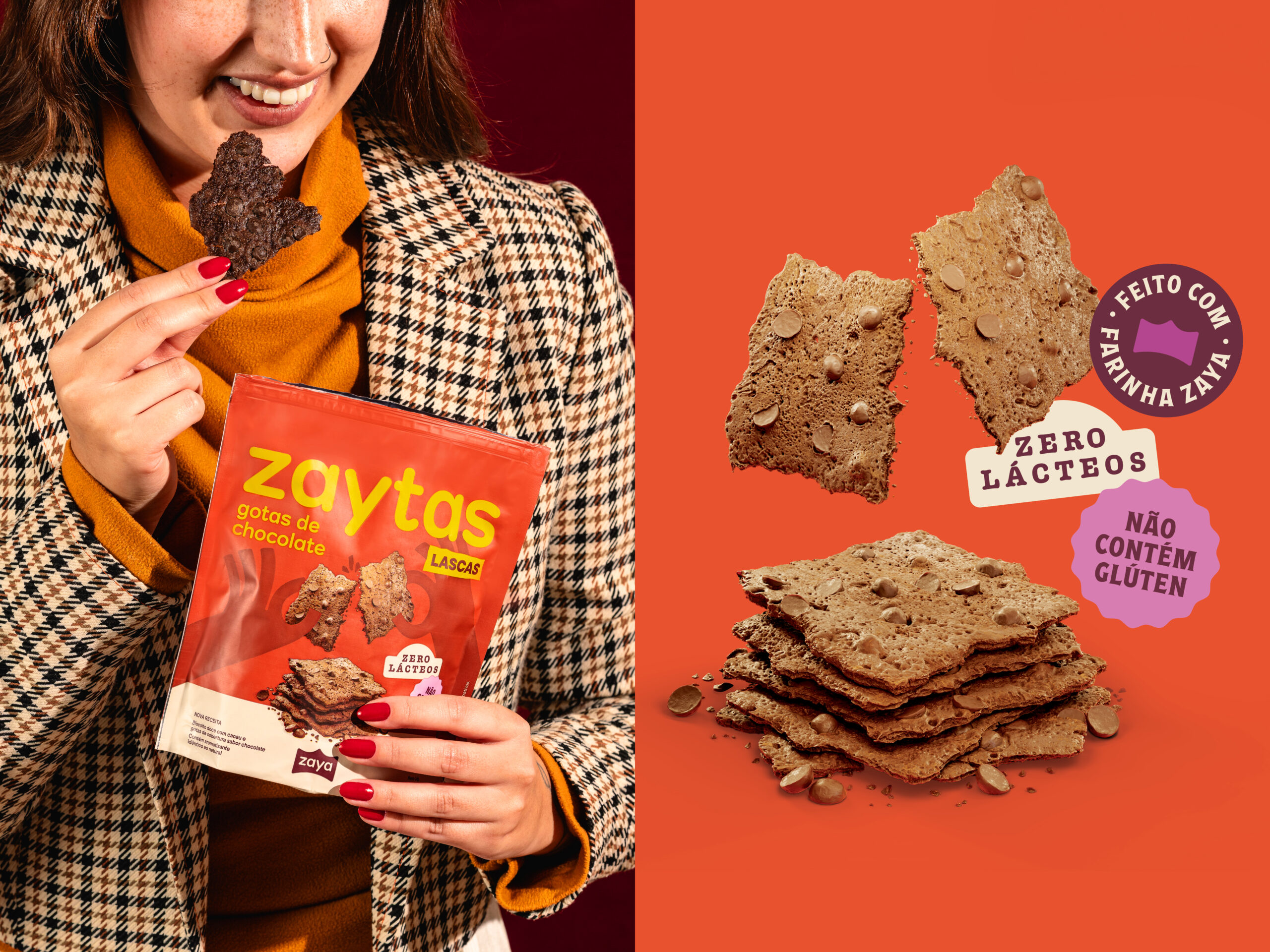
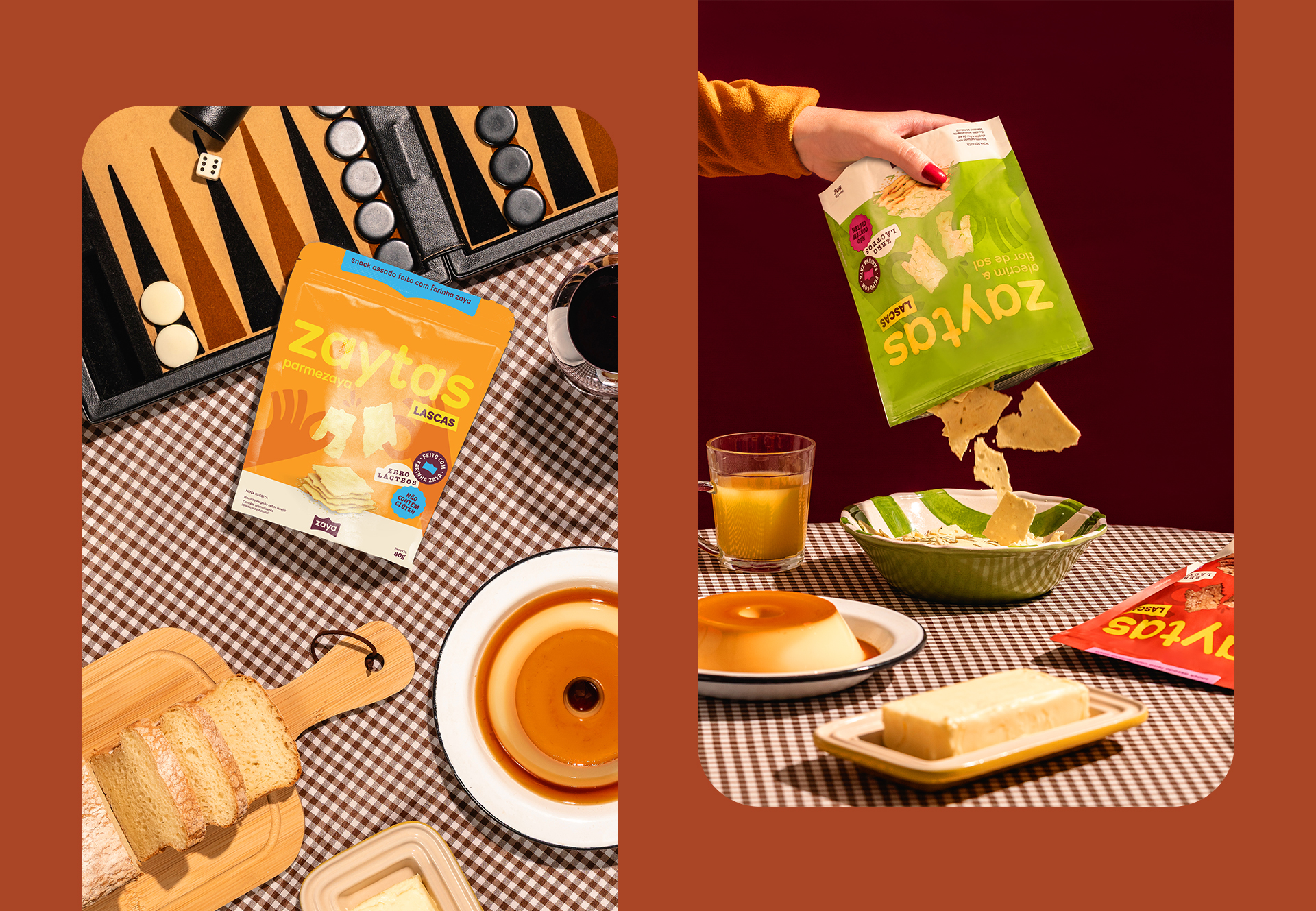
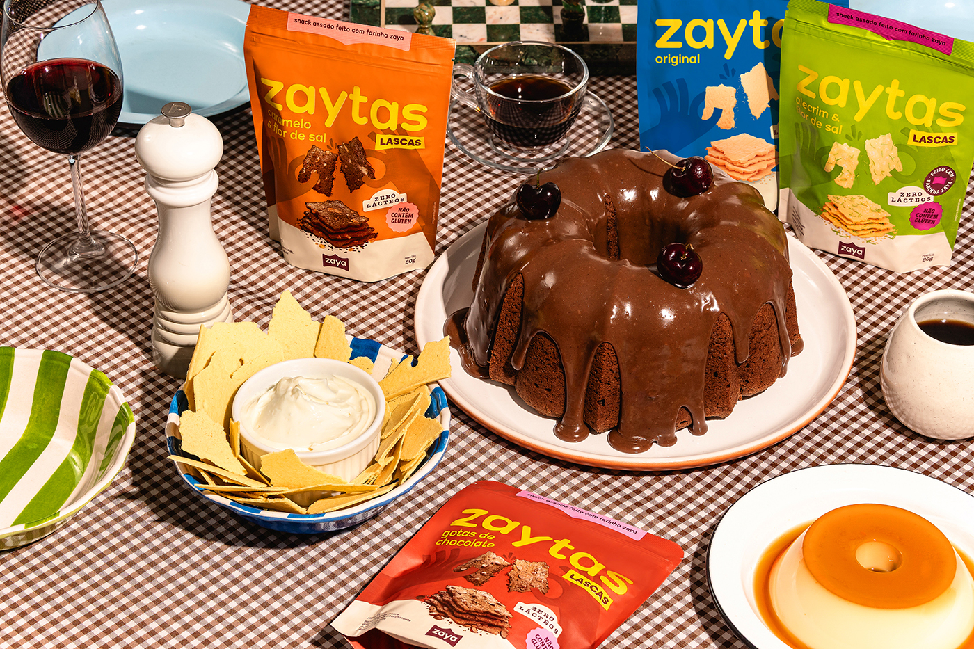
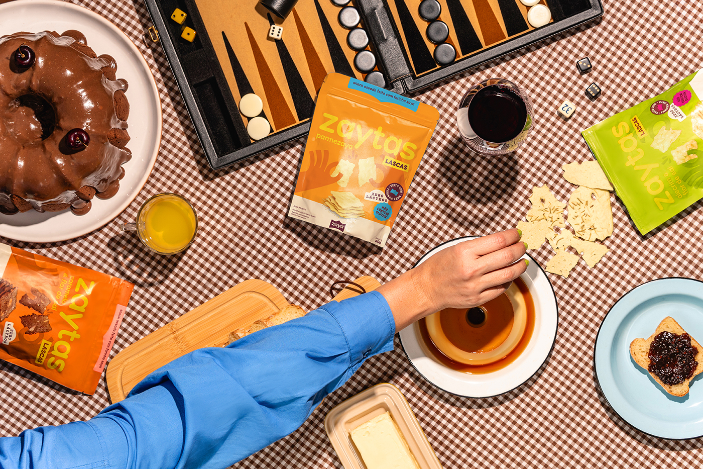
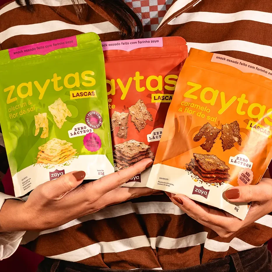
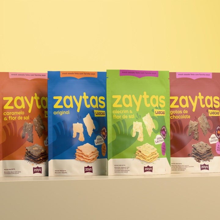
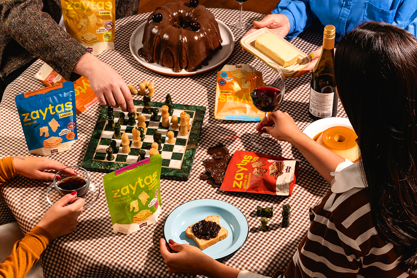
A series of badges highlights the key benefits of Zaya’s products, from being gluten- and dairy-free to their great taste, versatility, and protein content. Playful illustrations bring the brand world to life, from flour to snacks. A hand illustration, full of personality, takes center stage: celebrating with friends around the table, breaking the crisps, or diving straight into the bag, all reinforcing Zaytas’ main attribute, practicality.
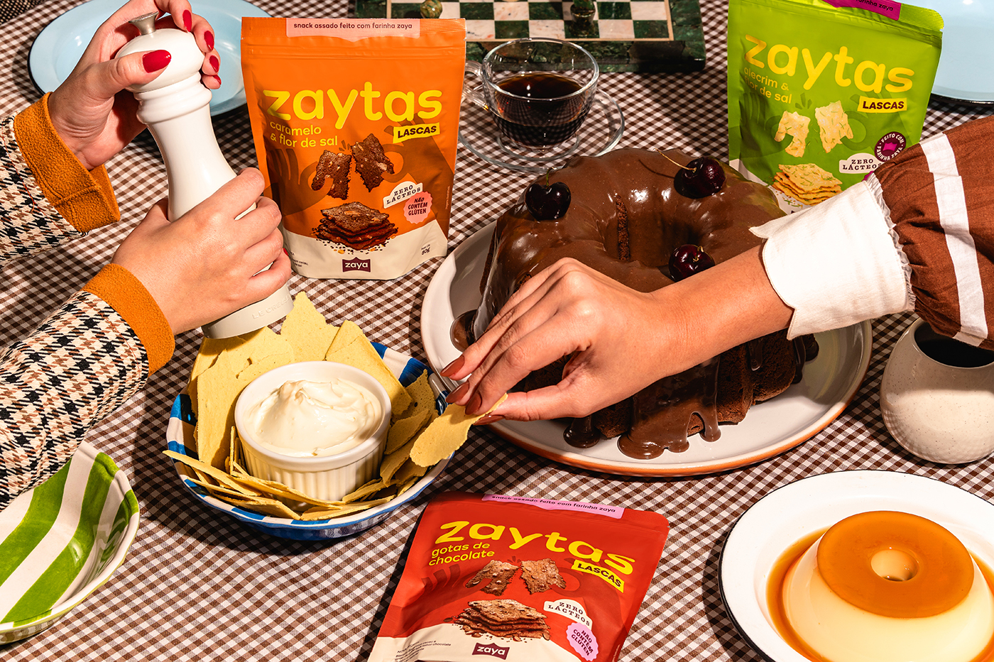
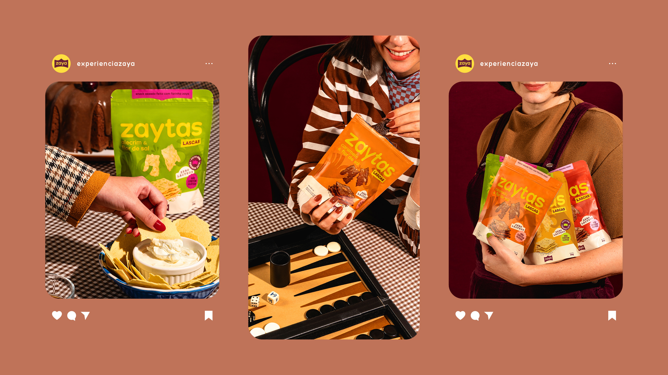
When developing the packaging, we organized and prioritized information, created realistic 3D product renderings, and maintained the strong presence of the Zaytas name from the original layout. Each variant features a distinct main color to represent its flavor, complemented by secondary tones that tie the line together visually.
“At Zaya, everyone gathers around the same table, and no one is left out.” The brand’s essence lies in offering inclusive food: adults, seniors, young people, and children all share the moment, each choosing what they love most. Some might go for a snack, others for a slice of cake, and that’s perfectly fine. What matters most is that Zaya is good for everyone.